Cold Tub Coffee Club
Retro-inspired apparel and sticker graphics for a Tampa Bay cold plunge community that blends ice baths and coffee into a social wellness ritual, capturing the club’s playful, welcoming vibe while celebrating the contrast between chill and warmth.
Logo Iterations
Brand Colors
Tshirt Mockups
8
5
3
Overview
Completed
January 2025
My Role
Graphic Designer
Scope
T-shirt design, sticker design, illustration, typography, apparel graphics, and merchandise mockups.
Tools
Photoshop and Illustrator
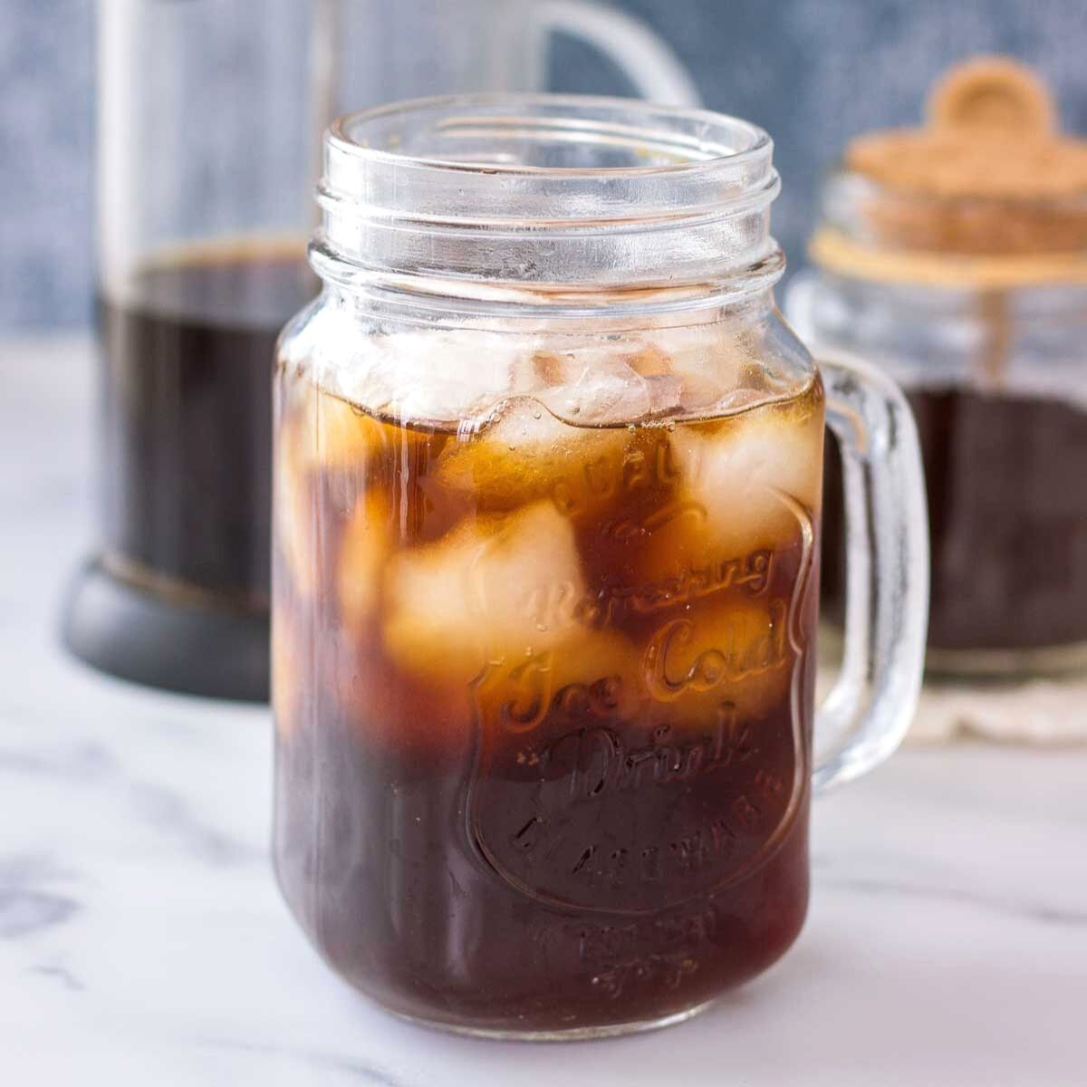
This project translated the Cold Tub Coffee Club’s playful, community-driven energy into wearable and collectible graphics that members could rally around. Inspired by the contrast of icy water and warm coffee, the designs blend retro pin-up illustration with bold, vintage typography to create a look that feels both nostalgic and tongue-in-cheek. The artwork captures the club’s core idea—embracing discomfort together, then rewarding it with connection and caffeine—while remaining versatile enough to work across t-shirts, stickers, and event merchandise.
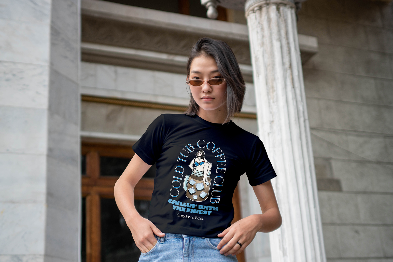
By pairing a classic tattoo-style aesthetic with the slogan “Chillin’ With the Finest,” the visuals reinforce the social, almost cult-favorite vibe of the gatherings. The result is merch that functions as both branding and badge of membership, helping attendees recognize each other, spark conversations, and carry the Cold Tub Coffee Club identity beyond the beach and into everyday life.
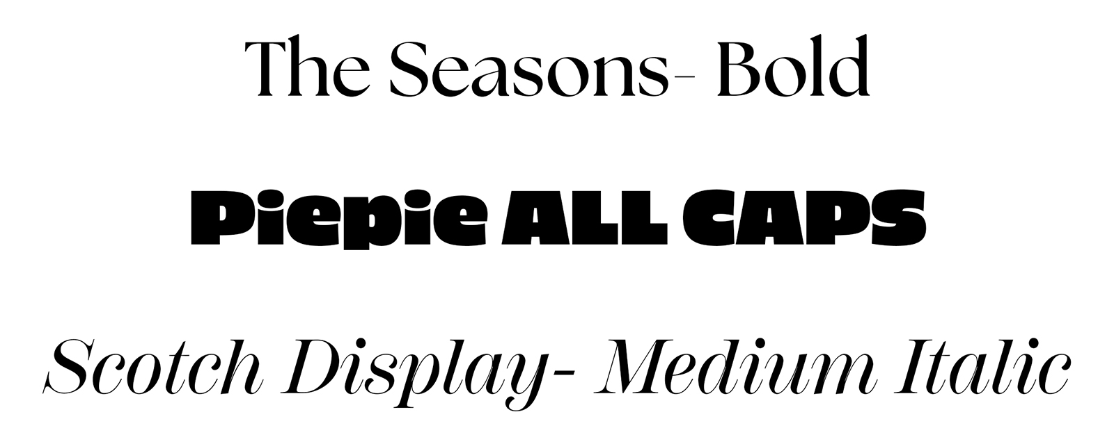
Typeface Selection
The Seasons – Bold brings a stylish, slightly retro sophistication to the main name, aligning with the pin-up aesthetic.
Piepie All Caps delivers thick, punchy lettering for the tagline, making it highly readable on apparel and from afar.
Scotch Display – Medium Italic adds a smooth, expressive accent that echoes the flow of coffee and softens the heavier type, completing a balanced and versatile typographic system.
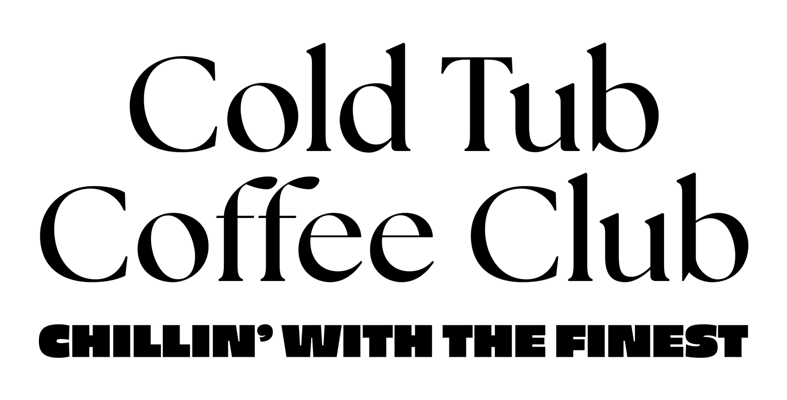
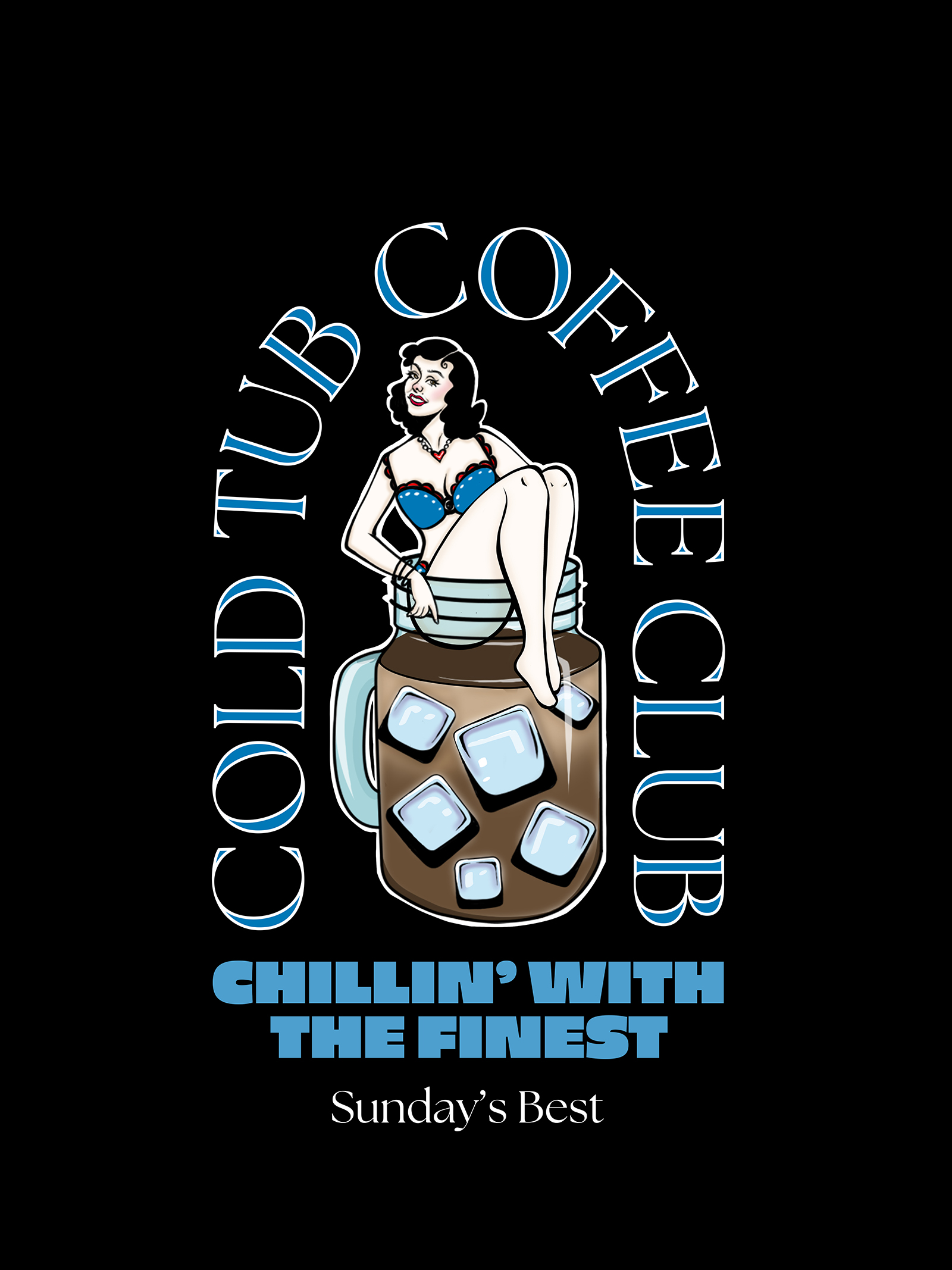
Wordmark Exploration & Hierarchy
Multiple typographic lockups were tested to find the right balance between elegance and impact. Pairing a refined serif for the club name with a bold, blocky all-caps tagline created a clear hierarchy that stays legible across shirts, signage, and small stickers.
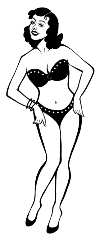
Character Development & Illustration Process
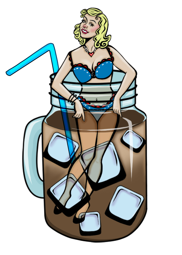
Early sketches explored different poses, hairstyles, and styling before landing on the final confident, seated pose inside the glass mug. Refining linework, proportions, and color built a mascot that feels vintage, flirty, and fun without overpowering the brand name.
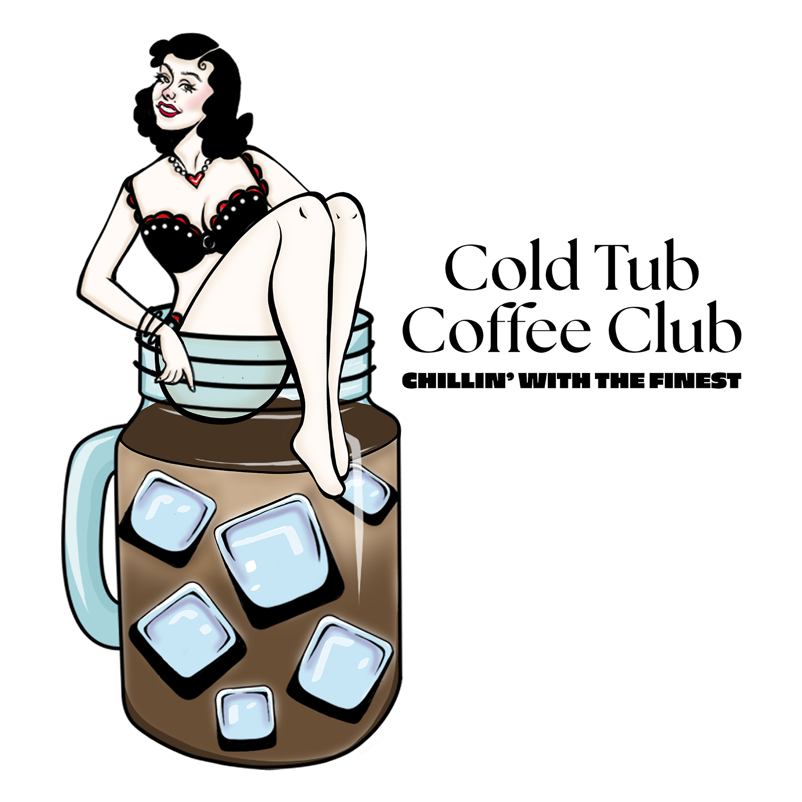
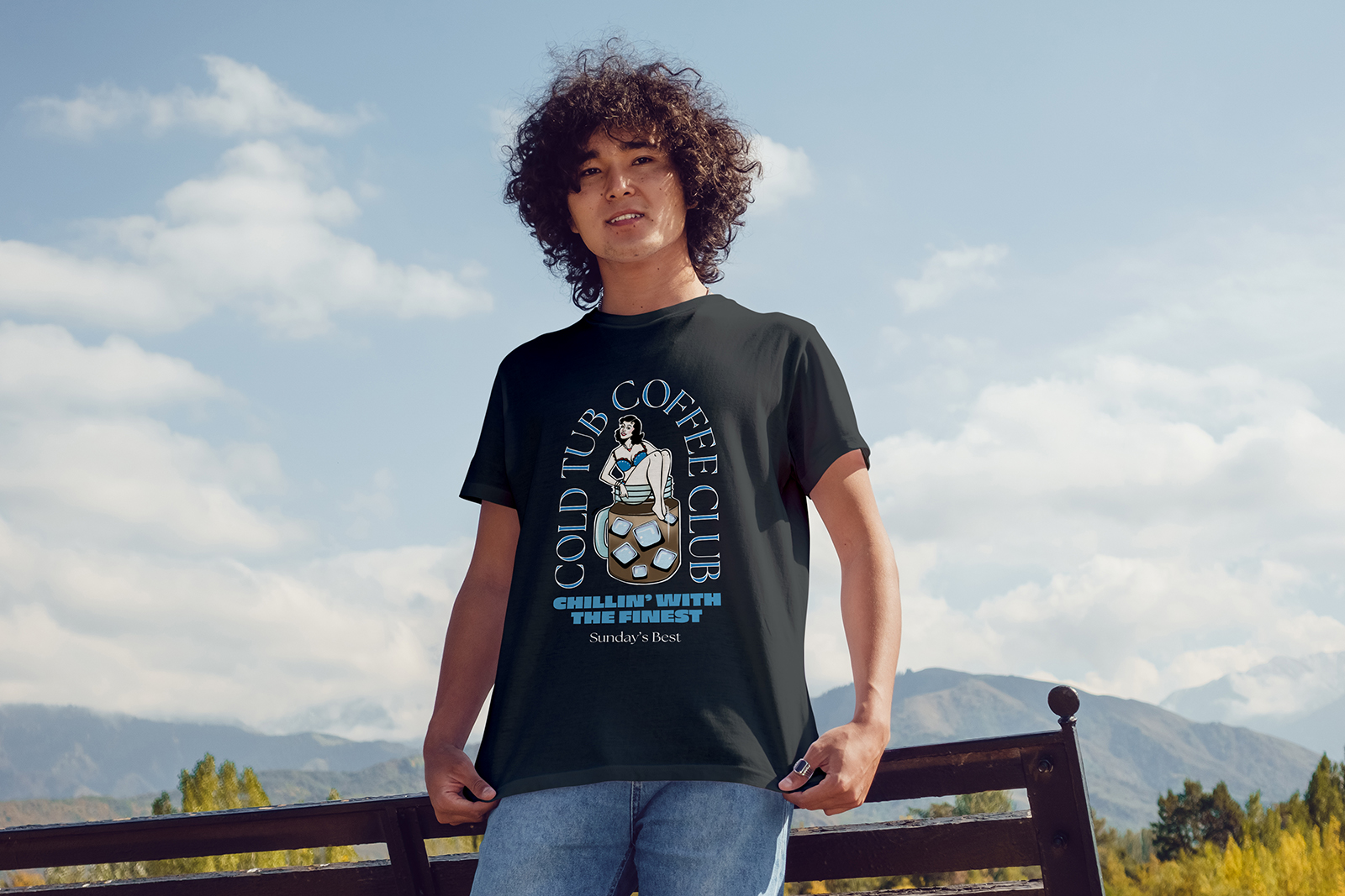
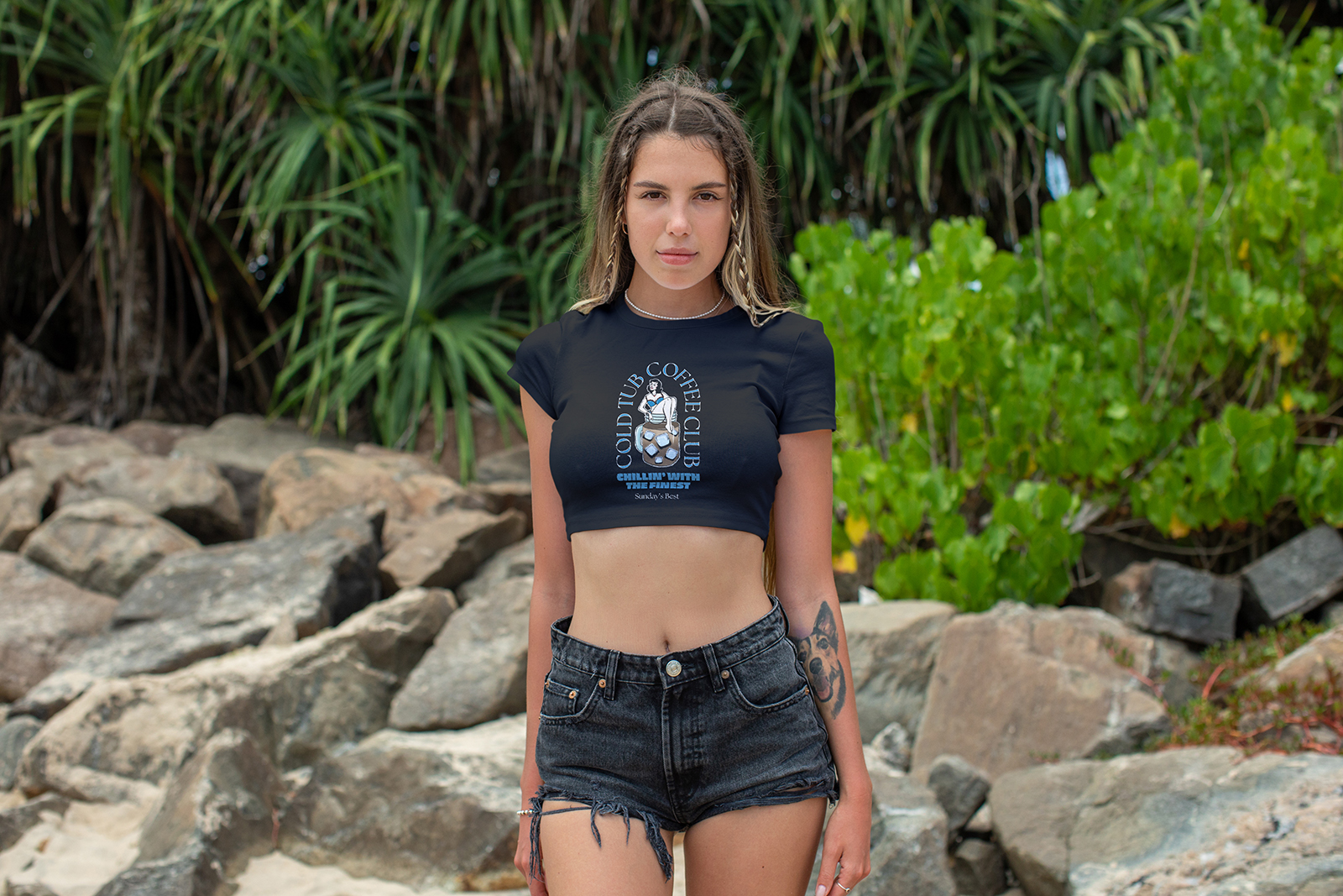
Signature Tee & Sticker Design
The core graphic centers on a retro pin-up figure relaxing in an iced coffee mug, merging warmth and chill in a single playful image. Designed for screen printing and sticker use, the circular badge layout ensures the artwork reads clearly from a distance while still rewarding close-up detail.
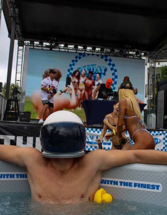
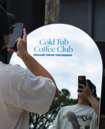
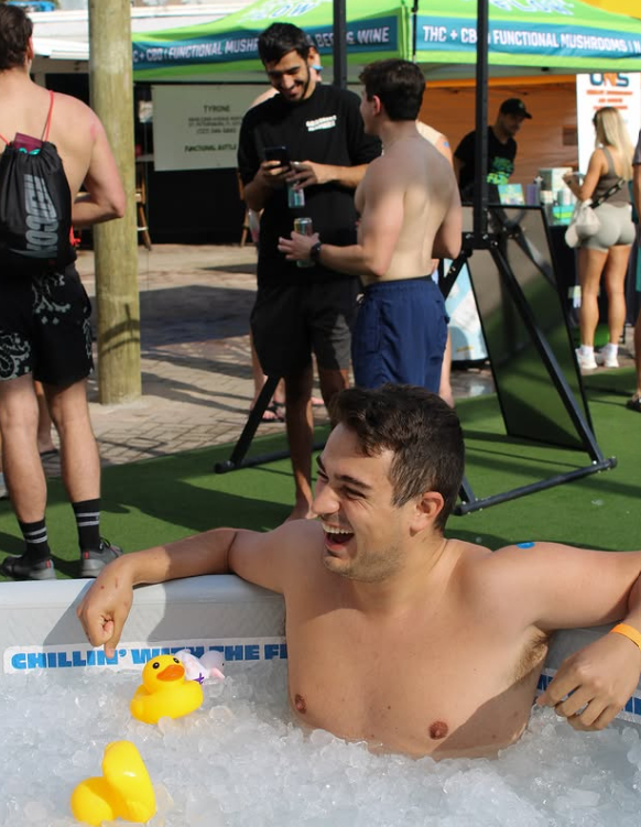
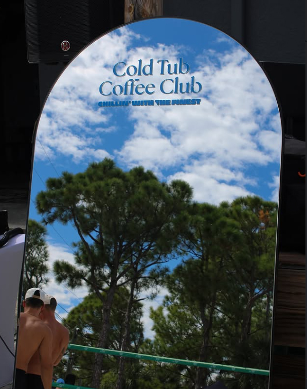
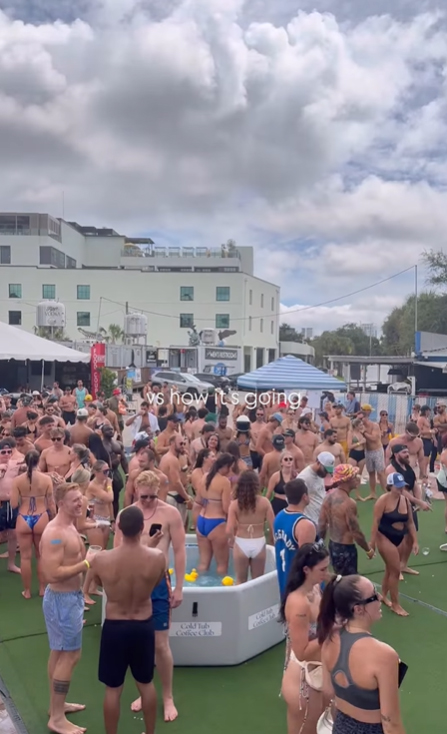
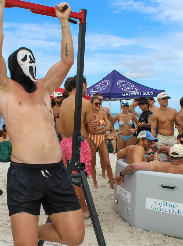
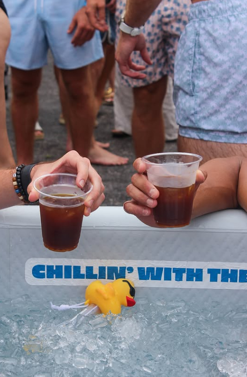
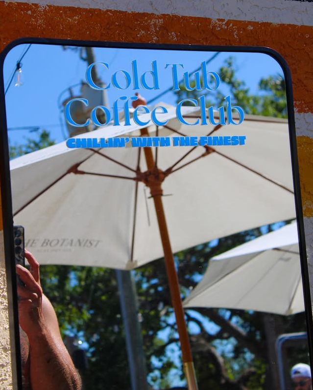
Event Energy And Brand In Action
These photos capture the real Cold Tub Coffee Club experience: crowded beach meetups, ice baths, coffee in hand, and strangers quickly becoming friends. The branding appears naturally in the environment, from tub decals to mirrors and signage, showing how the identity lives within candid, high-energy moments rather than staged advertising.
Conclusion
This project blends playful illustration, bold typography, and real-world community moments into a cohesive, wearable identity. The designs capture the contrast of cold plunges and warm coffee while staying versatile across apparel, stickers, and event branding.
Final Thoughts
By pairing retro-inspired visuals with modern social energy, the work creates something both nostalgic and fresh. It turns a simple meetup into a recognizable culture that people can wear, share, and rally around.
