Fiery Fairy
Fiery Fairy is a conceptual band identity built from hand-drawn lettering turned digital and combined with original photography of flowers on fire. The visual style extends across album art, merch, posters, stage visuals, and streaming graphics.
Unique Product Designs
Hours to Complete
T-Shirt Designs
13
20+
5
Overview
Completed
May 2022
My Role
Graphic Designer
Scope
Handmade lettering, digital typography, album cover design, record sleeve, CD design, gig poster, merchandise design, apparel graphics, stickers, patches, pins, tote bags, temporary tattoos, stage visuals, and streaming platform graphics.
Tools
Photoshop, Illustrator, Lightroom, Camera
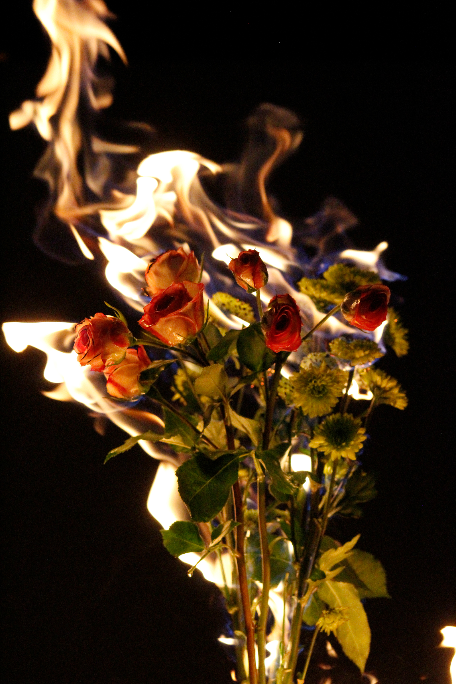
Created for a typography course at USF, Fiery Fairy is a fully realized conceptual band identity that begins with expressive, handmade lettering, later refined digitally to preserve its raw, organic energy. The typography is paired with original photography of flowers on fire, creating a striking contrast between delicate natural forms and destructive heat, which becomes the core visual metaphor of the project. This language is translated consistently across a wide range of physical and digital touchpoints, from vinyl and CD packaging to apparel, gig posters, and collectible merchandise like pins, patches, stickers, and temporary tattoos. Larger applications such as stage visuals and streaming platform displays adapt the same fiery floral textures and custom lettering at scale, ensuring the identity remains recognizable whether experienced on a phone screen or from the back of a venue. Together, these elements form a cohesive, high-impact system that demonstrates how experimental typography can drive an entire music brand and its surrounding culture.
The Challenge
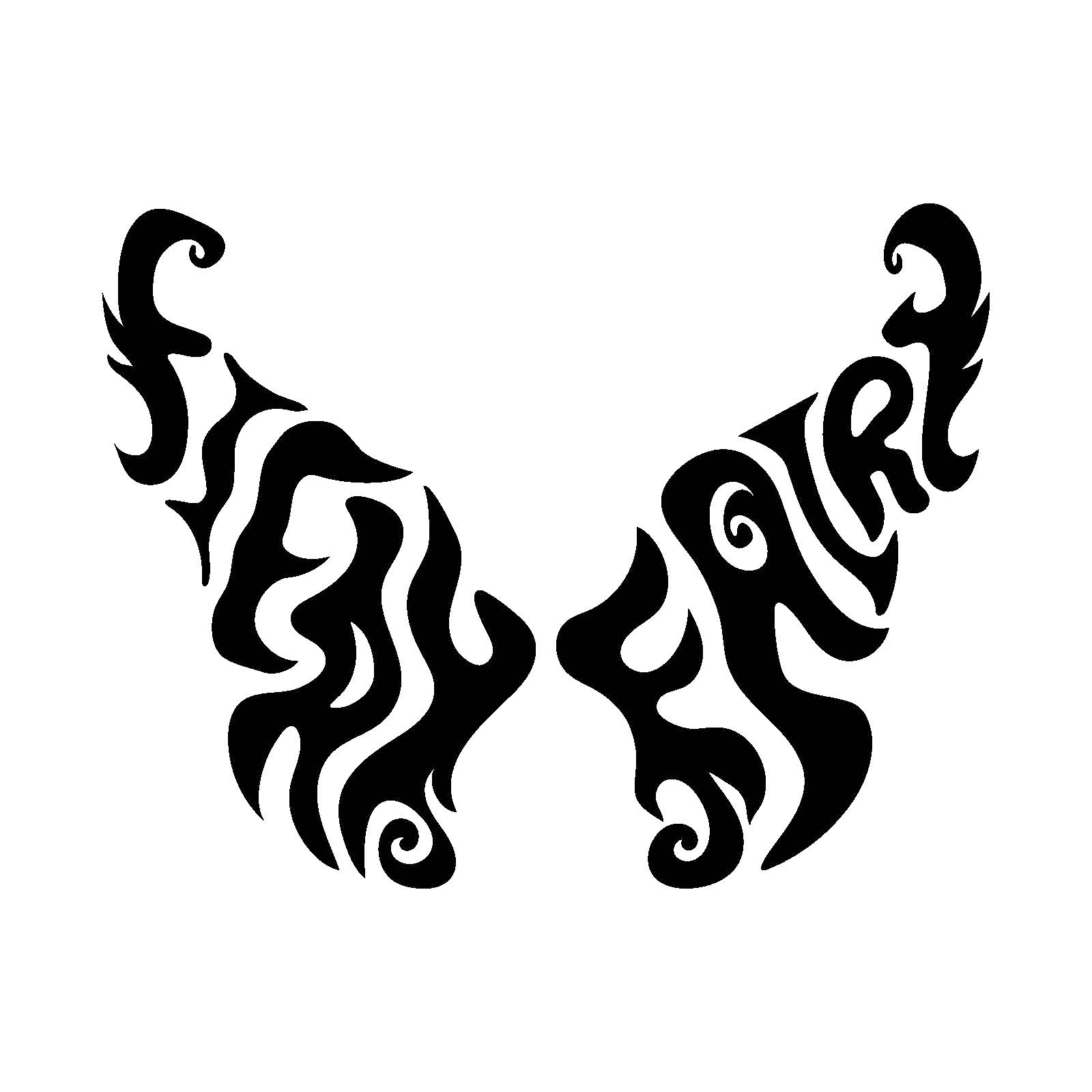
The name “Fiery Fairy” carries an inherent irony: fairies are typically soft, whimsical, and delicate, while fire represents intensity and destruction. Capturing both qualities in one cohesive identity was difficult without letting one overpower the other, especially while shaping the words into a perfect butterfly form that needed to read clearly and feel magical rather than chaotic.
The Solution
Custom hand-drawn lettering was arranged to form a symmetrical butterfly silhouette, blending flowing, fairy-like curves with sharp, flame-like motion. A bold palette of orange, black, and pink reinforces this duality, where fiery tones convey heat and energy while the pink adds softness and fantasy. Combined with imagery of burning flowers, the result is a visual language where delicacy and danger coexist, creating a unique, striking vibe true to the name.
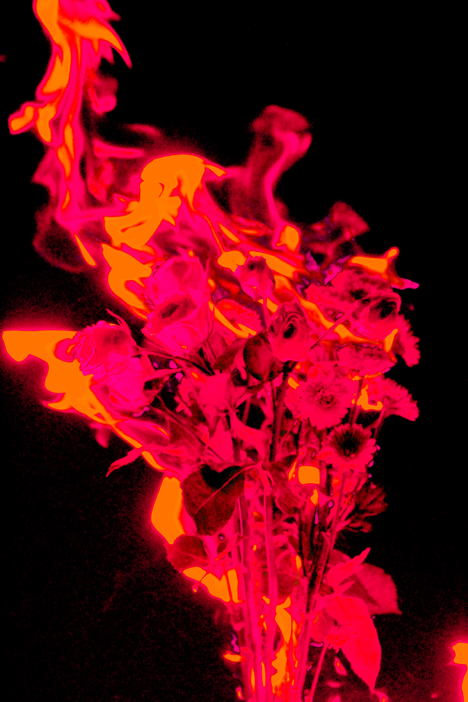
From Raw Elements to Visual Identity
The foundation of the Fiery Fairy aesthetic begins with two untouched sources: real flowers captured mid-burn and expressive hand-drawn lettering in pure black and white. The photograph introduces the project’s core tension between beauty and destruction, while the raw lettering establishes an organic, imperfect voice that feels personal and alive. Applying a gradient map in the brand’s orange, pink, and black palette unifies these elements into a single visual language, transforming documentation into identity and setting the tone for every application that follows.
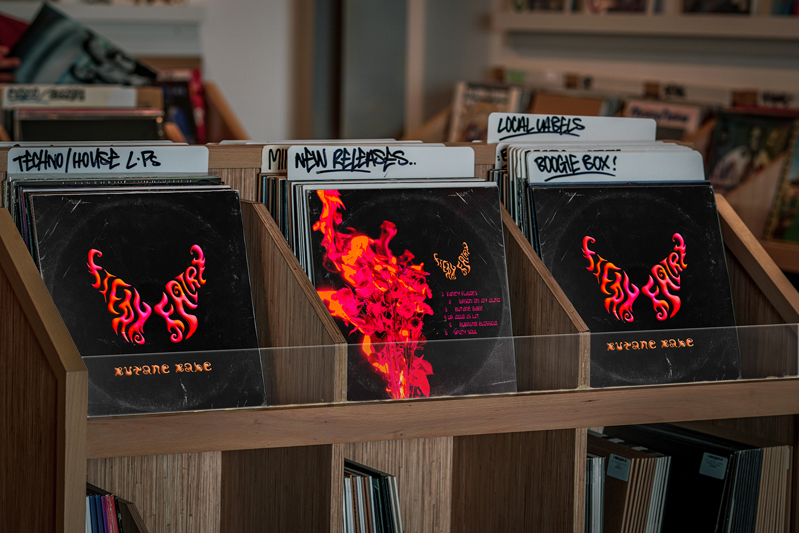
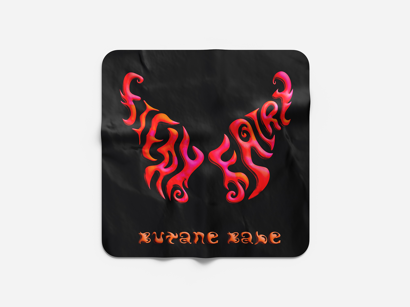
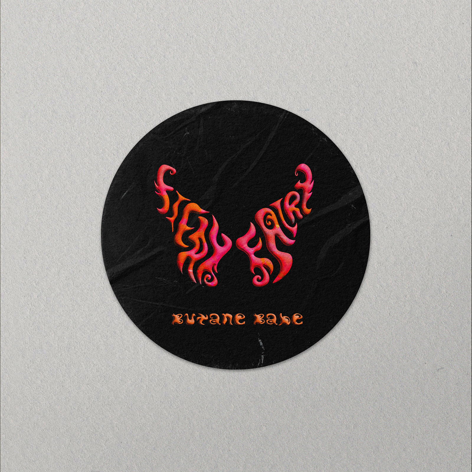
Album Artwork
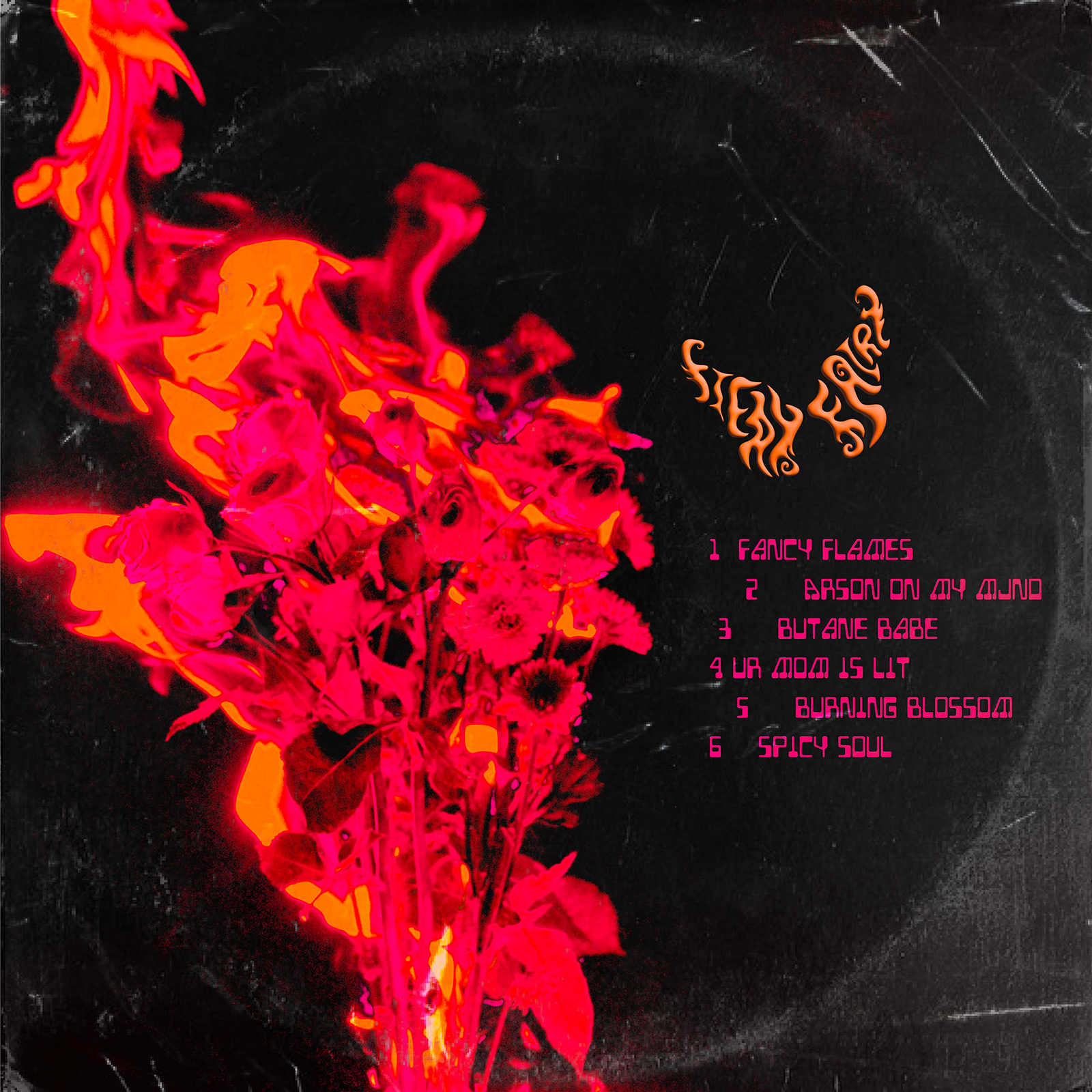
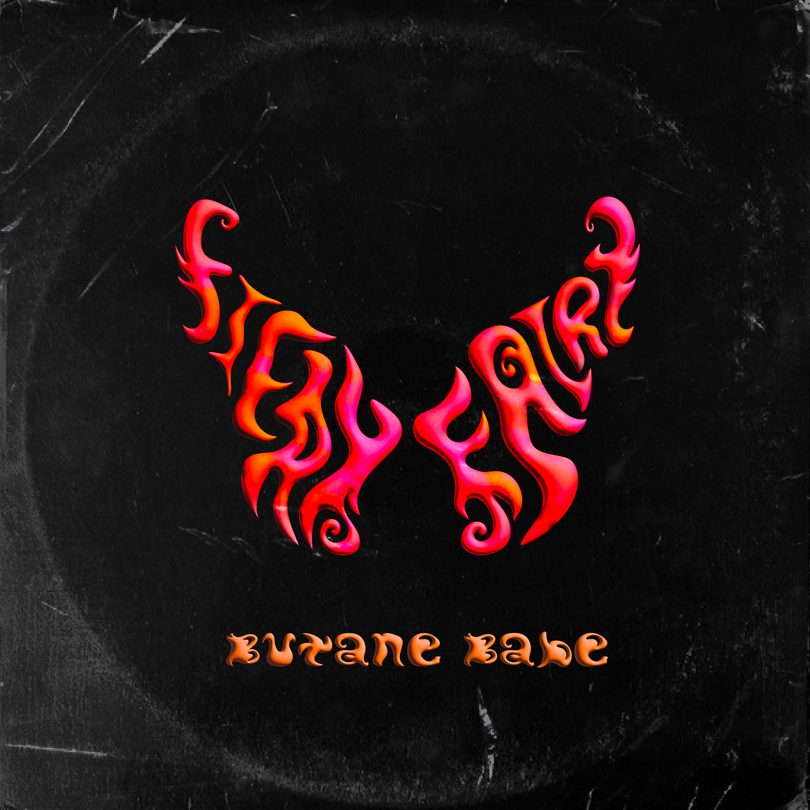
The record cover brings the identity together by placing the butterfly-shaped Fiery Fairy logo over the burning floral imagery against a deep black backdrop. Handwritten lettering spelling Butane Babe anchors the bottom, reinforcing the raw, handcrafted tone of the project. On the back, the flowers reappear to one side while the tracklist sits opposite, with a small butterfly logo drifting toward the flames as if drawn back into the fire.
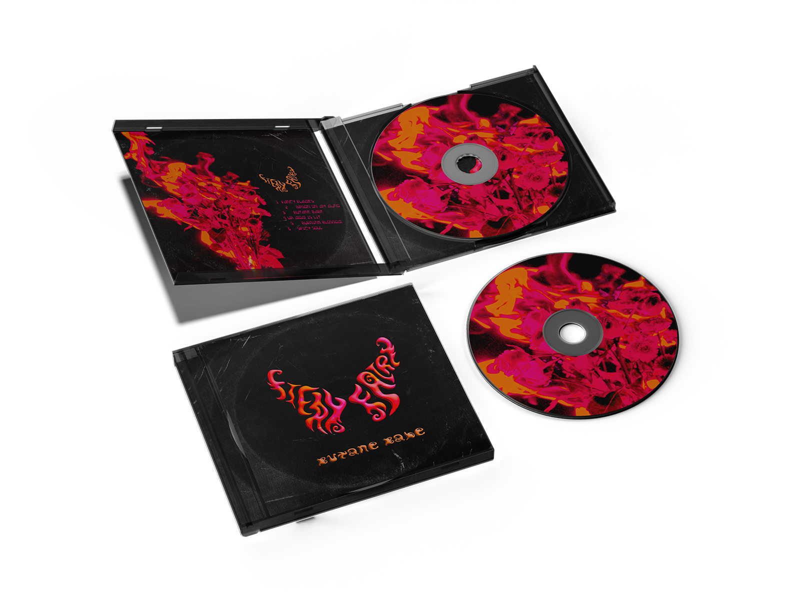
Album Mockups
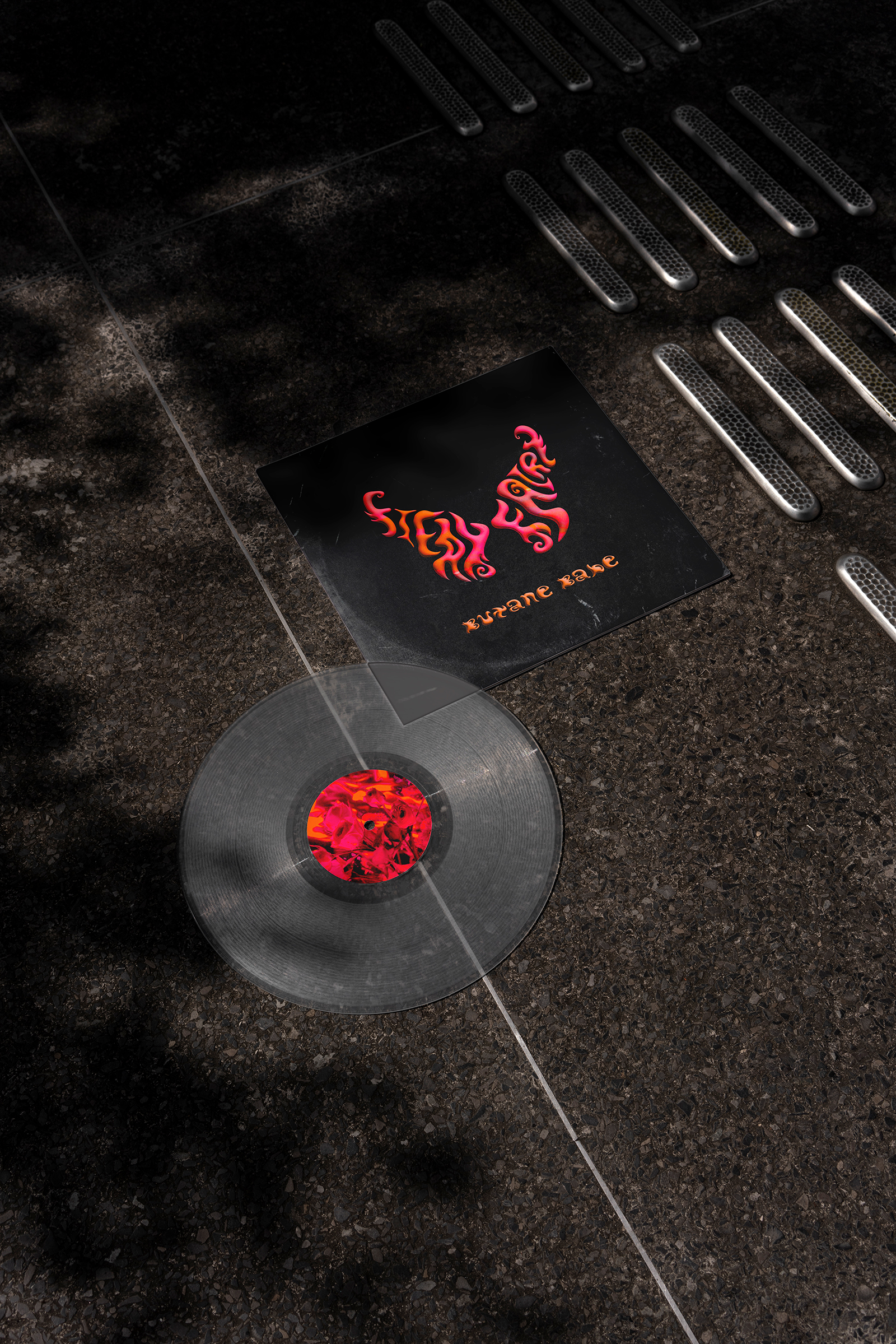
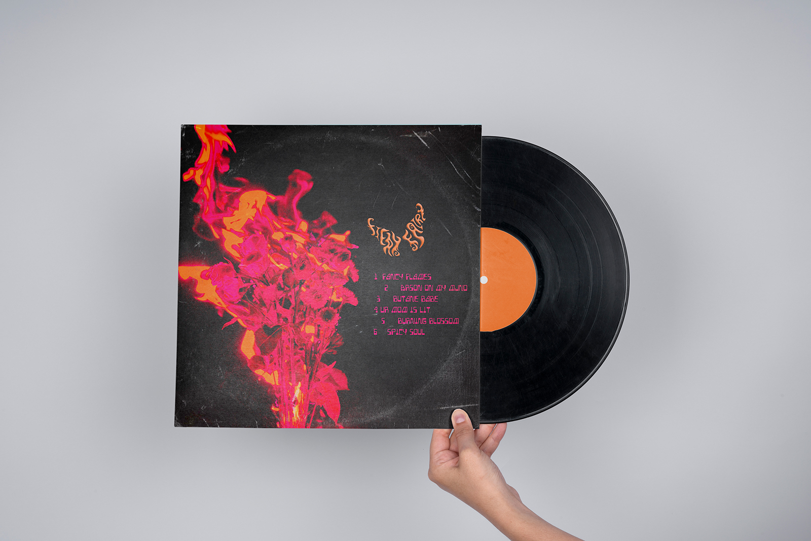
Real-world mockups show the album existing beyond the screen, held in hand and placed within everyday environments to test scale, texture, and impact. Seeing the fiery florals and butterfly logo on both vinyl and CD formats confirms that the identity remains striking and legible across sizes and materials. These previews validate how the artwork translates from digital concept to tangible object, reinforcing the tactile, collectible nature of the release.
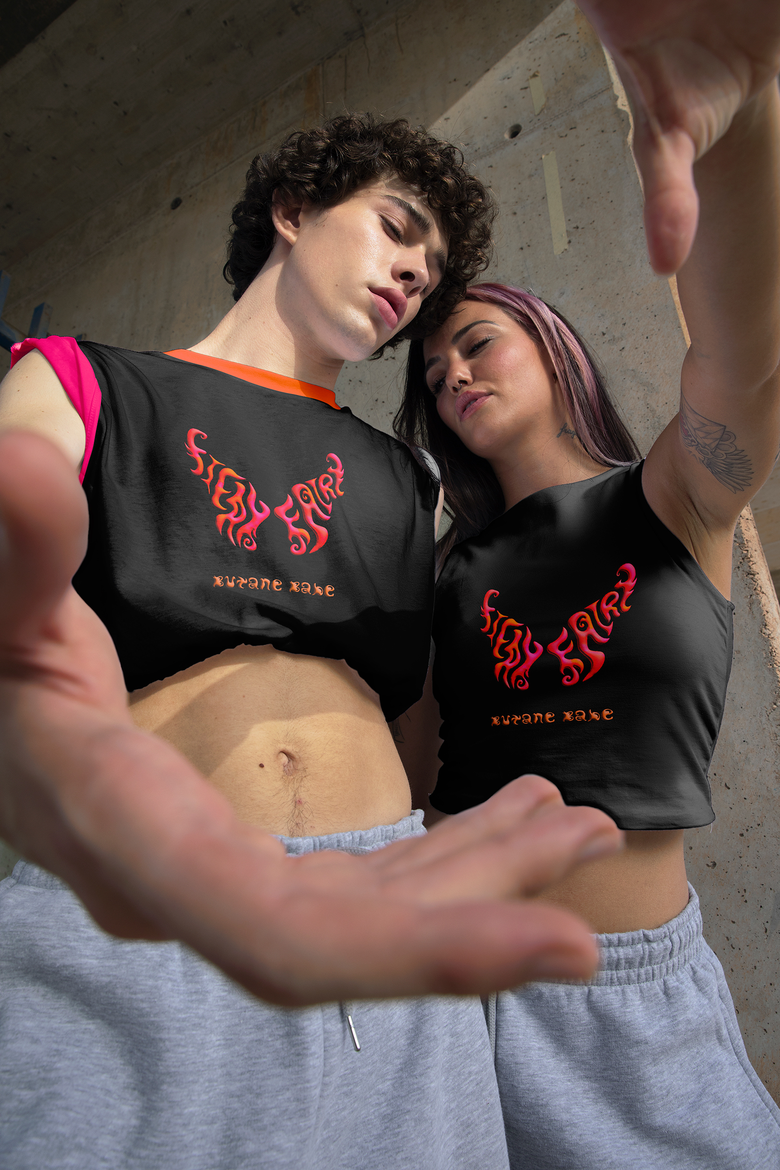
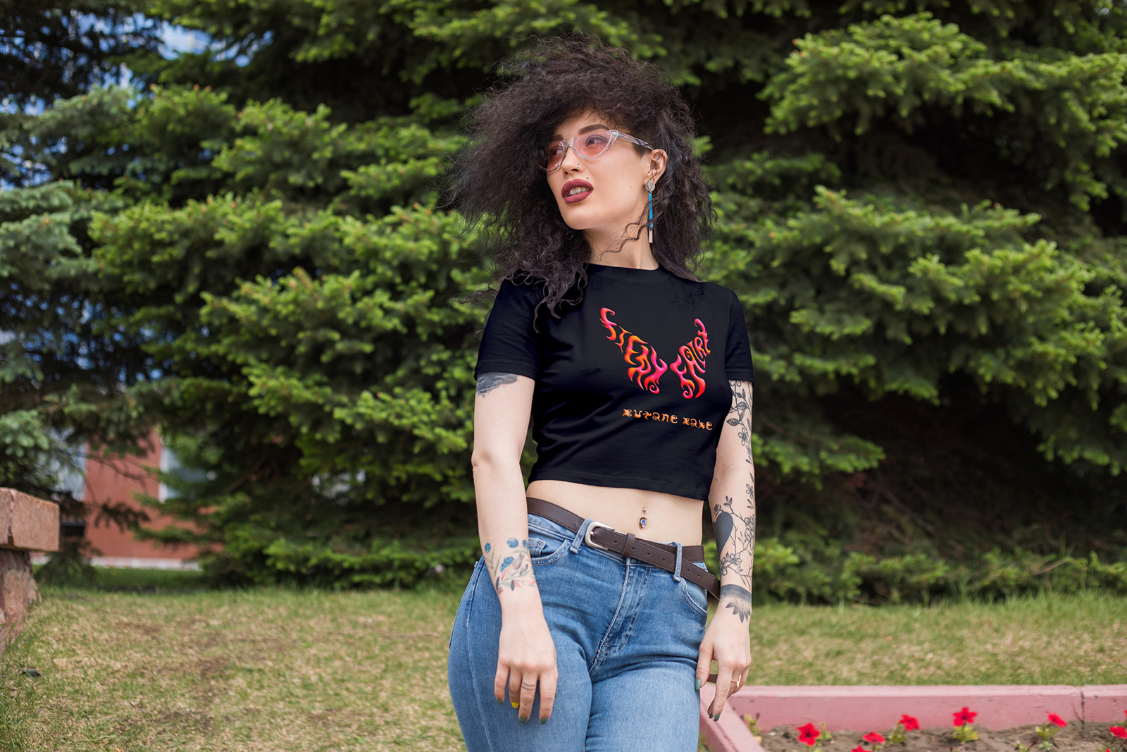
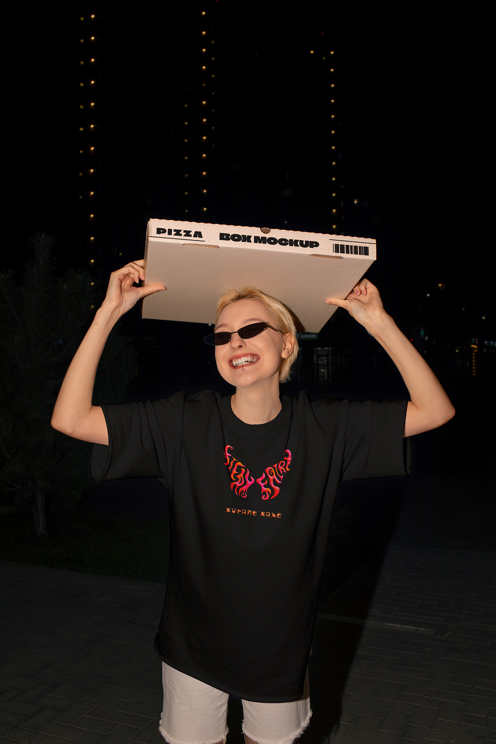
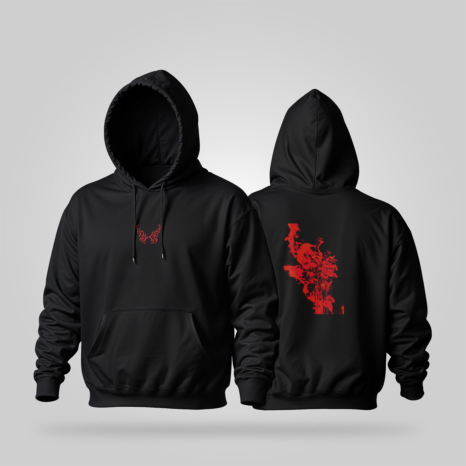
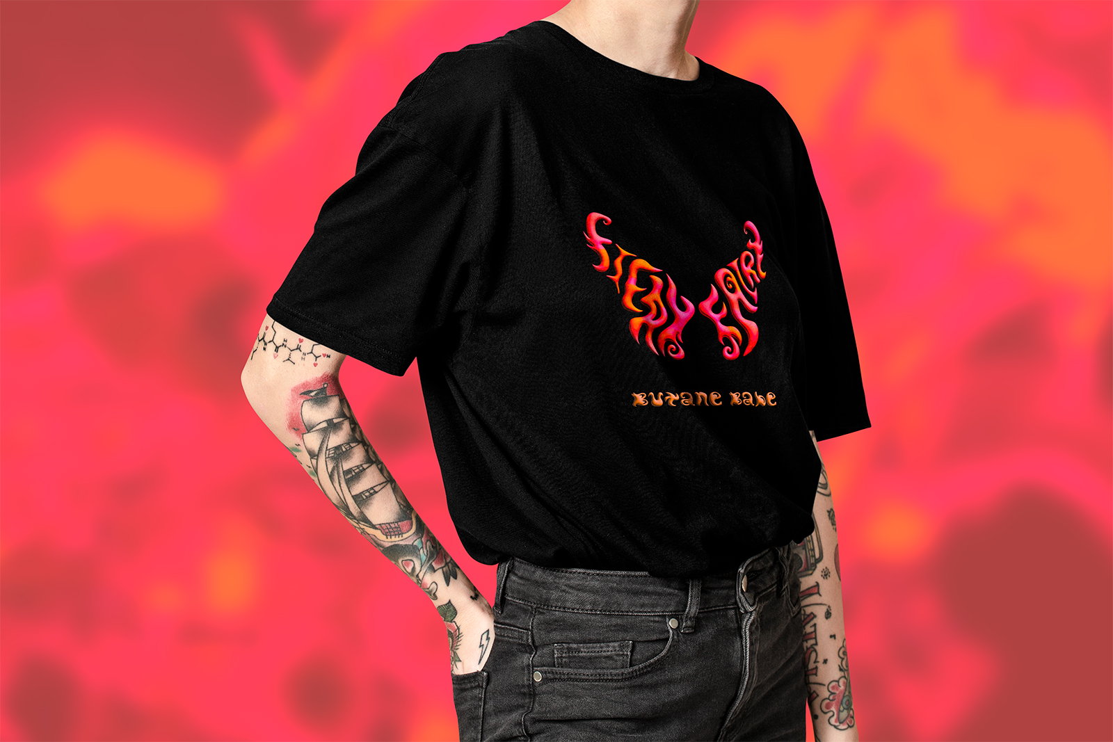
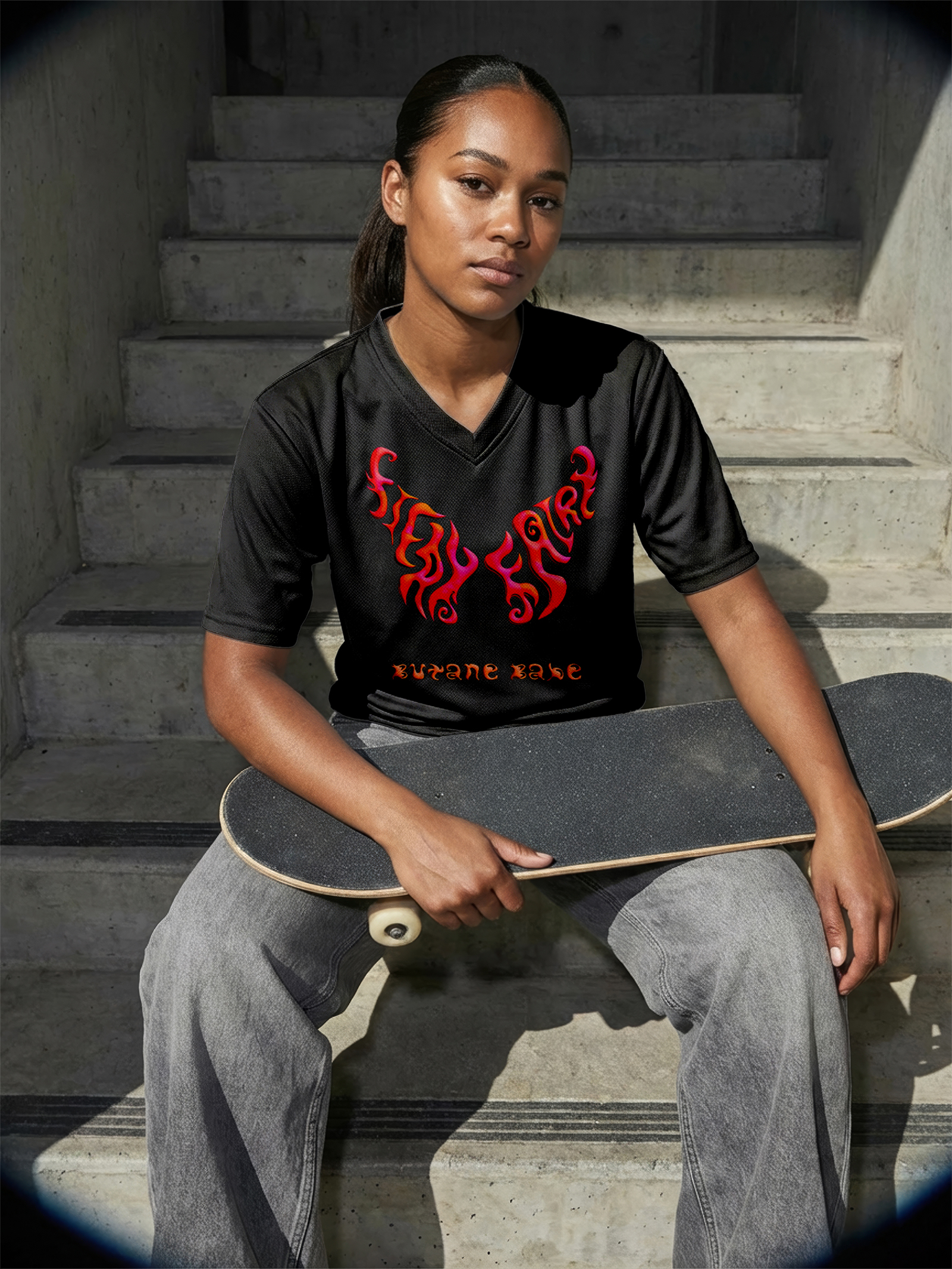
Apparel Designs
The apparel translates the album artwork into wearable statements, placing the fiery floral imagery and butterfly logo prominently on T-shirts, hoodies, and crop tops. High-contrast prints on dark fabric preserve the intensity of the orange, pink, and black palette while letting the hand-drawn lettering remain the focal point. Each piece feels like merch pulled directly from the record cover, turning fans into moving extensions of the band’s visual world.
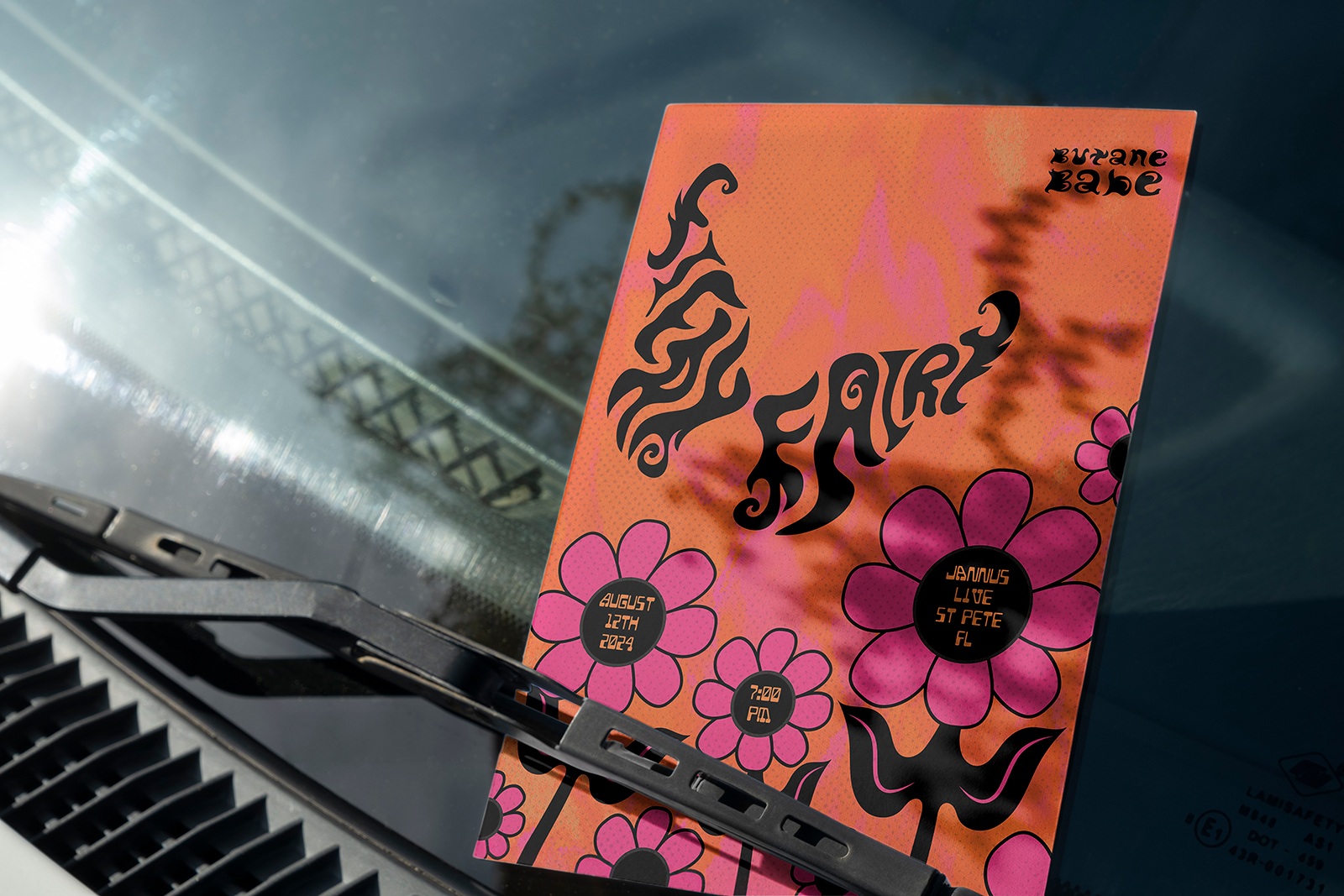
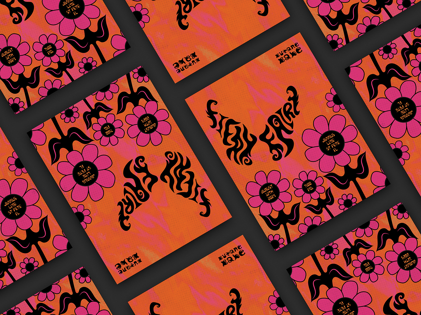
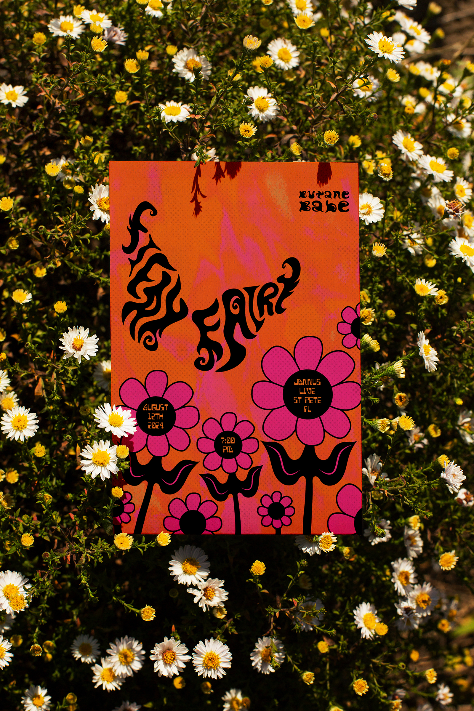
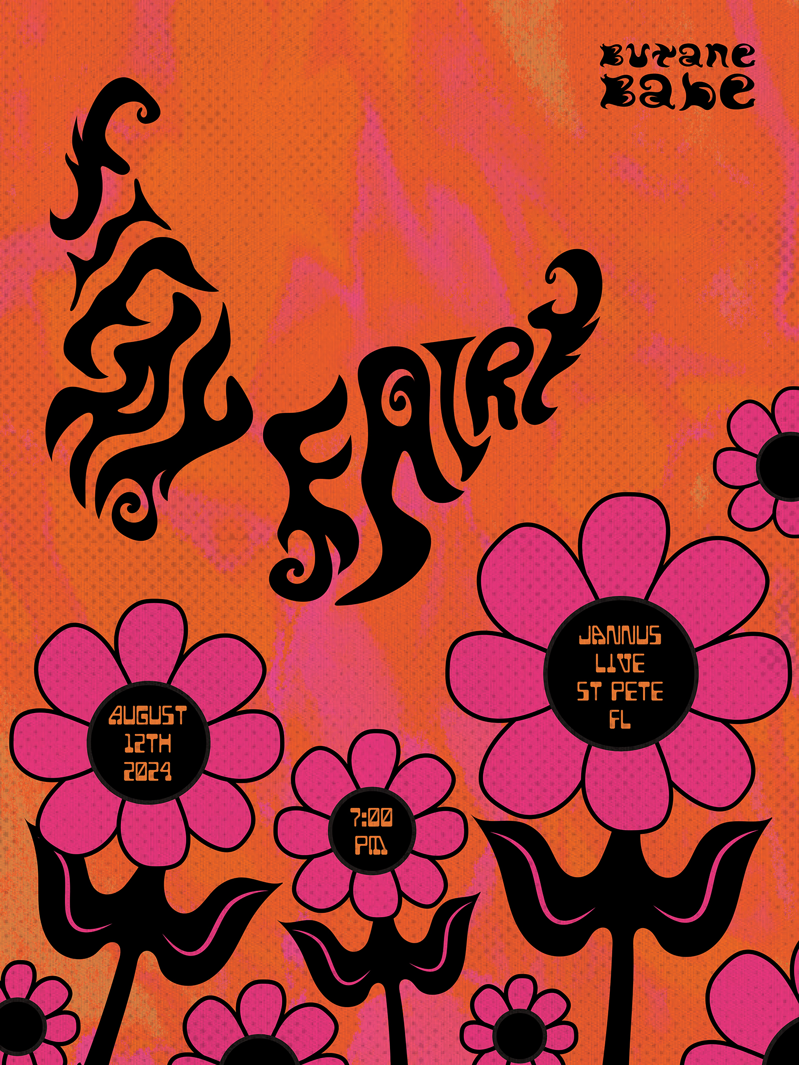
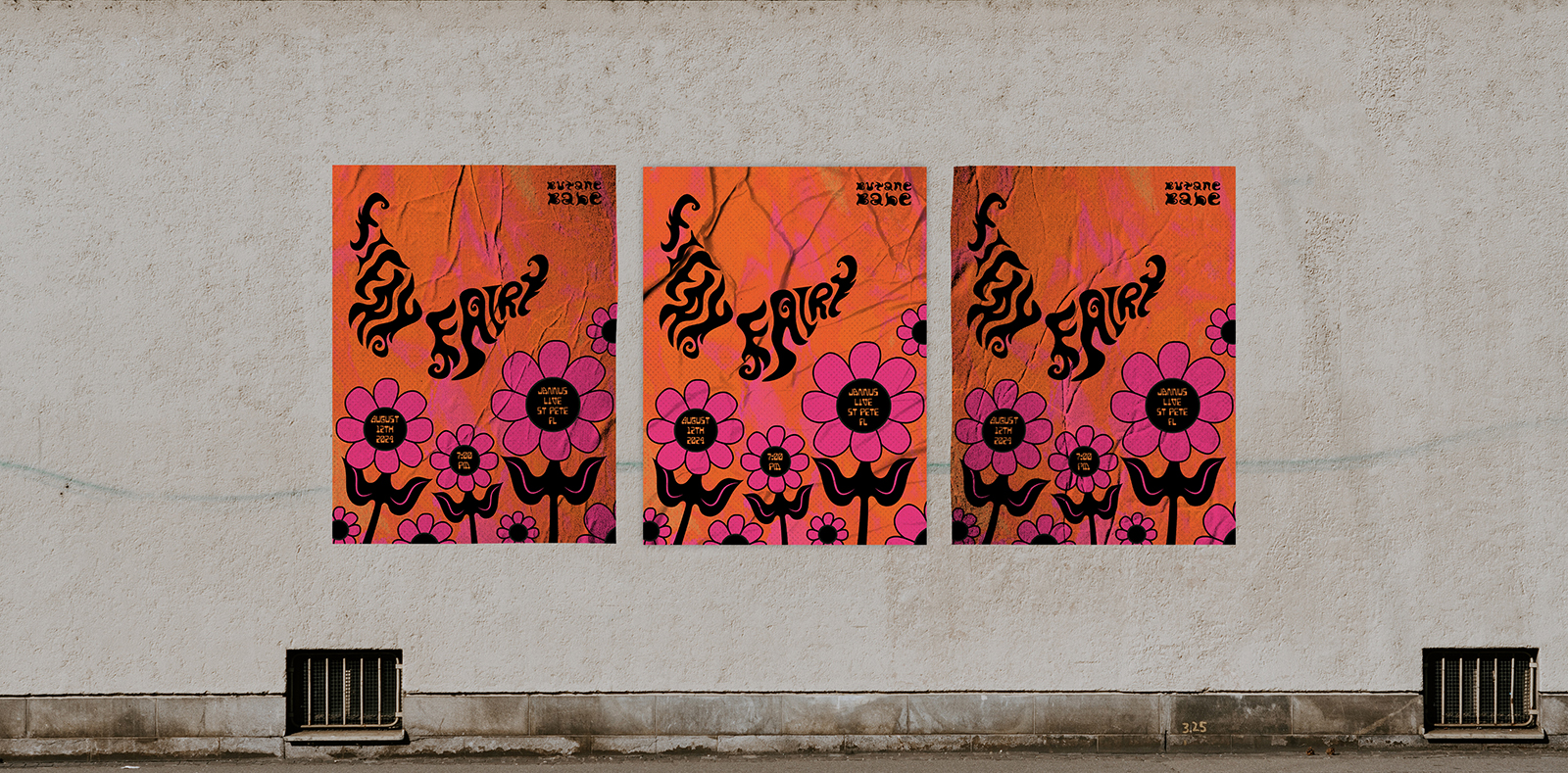
Gig Poster
The gig flyer reimagines the burning florals as a dreamy, blurred backdrop, with the butterfly logo gliding across the scene as if flying over a glowing field of flowers. Illustrated blooms float in the foreground, each containing key details like the date, location, and event info at their centers. This layered composition turns practical information into part of the artwork, creating a poster that feels both atmospheric and instantly informative.
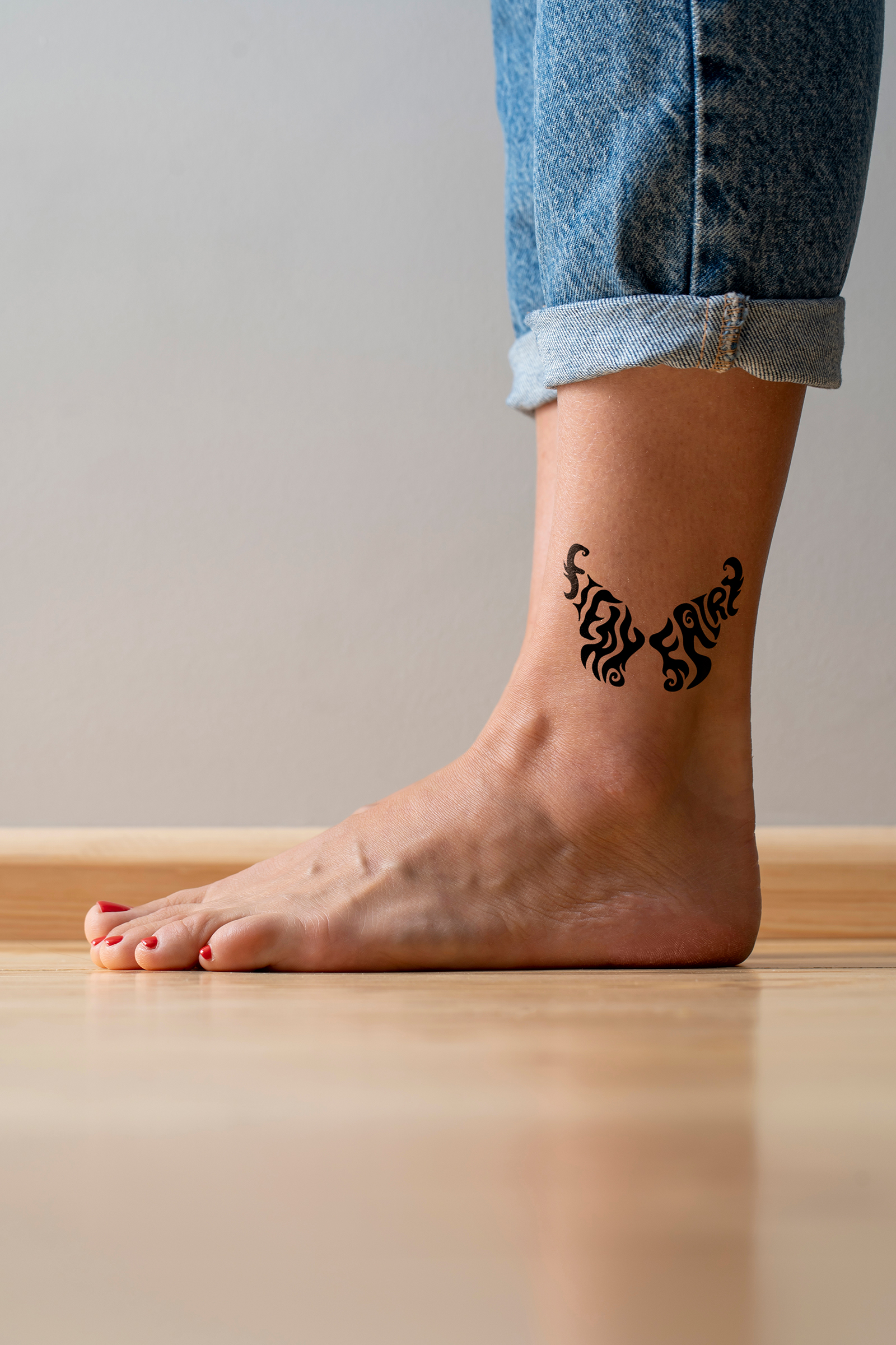
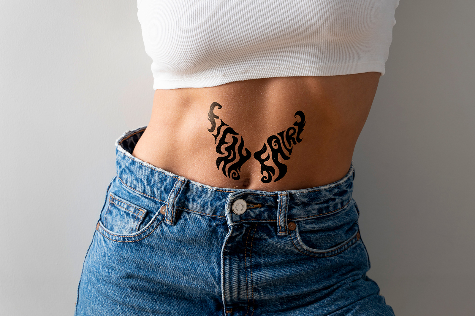
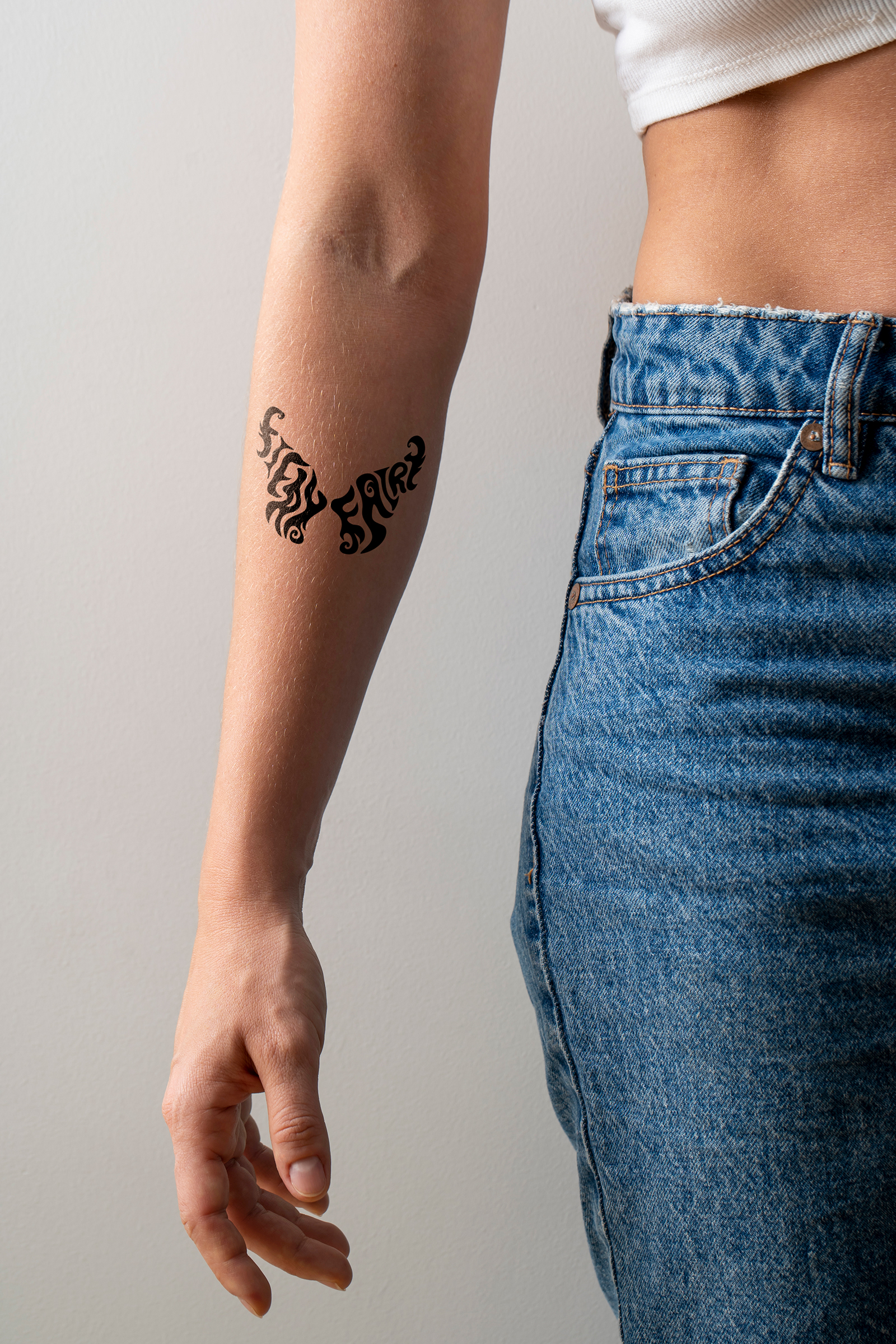
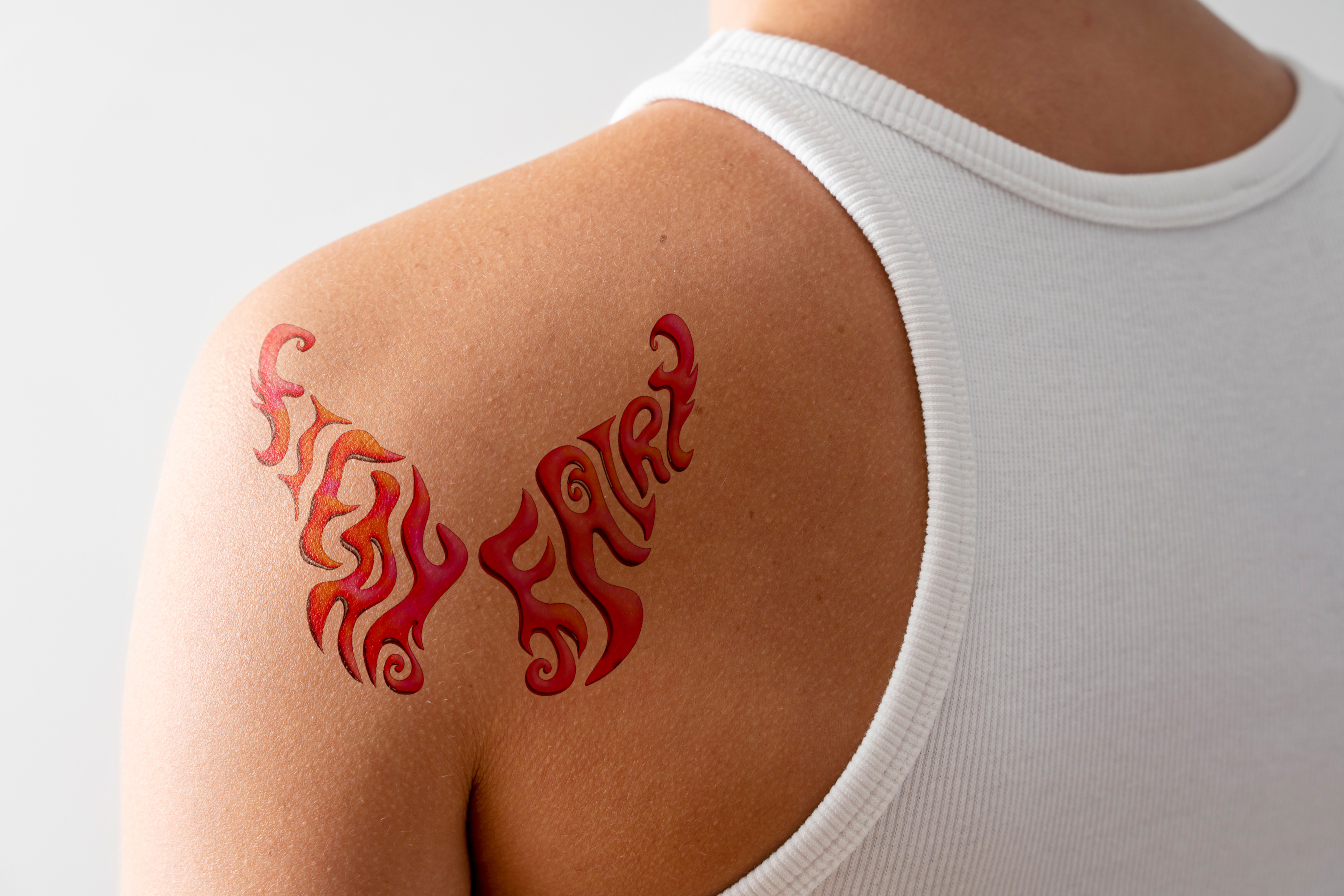
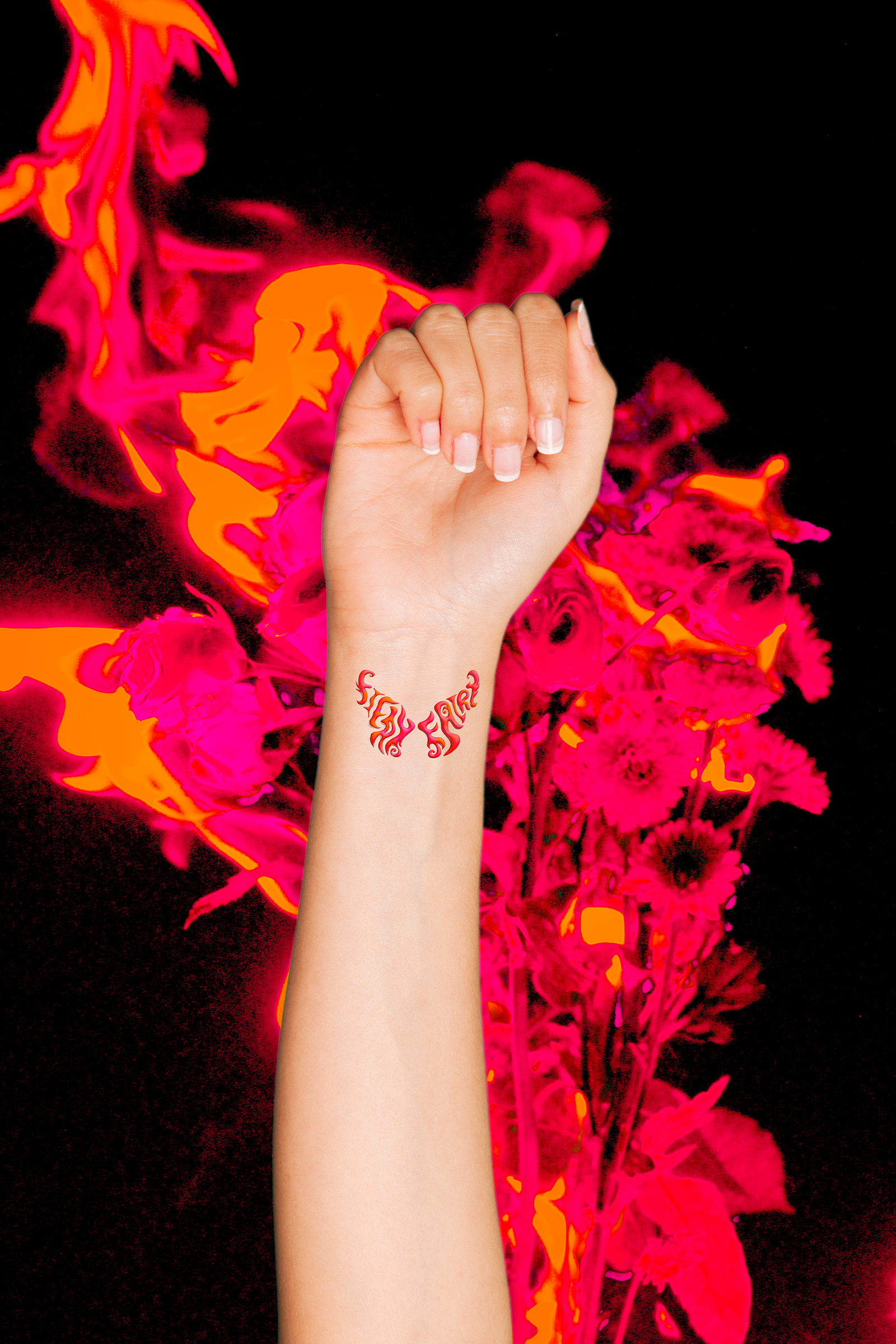
Temporary Tattoos
The temporary tattoo designs showcase both full-color and solid black versions of the butterfly logo applied to different areas of the body, including the shoulder blade, ankle, wrist, sternum, and forearm. These mockups demonstrate how the symmetrical lettering reads clearly at various sizes while adapting naturally to the curves of the body. Whether subtle and monochrome or bold and fiery, the mark works as a striking, wearable emblem of the band’s identity.
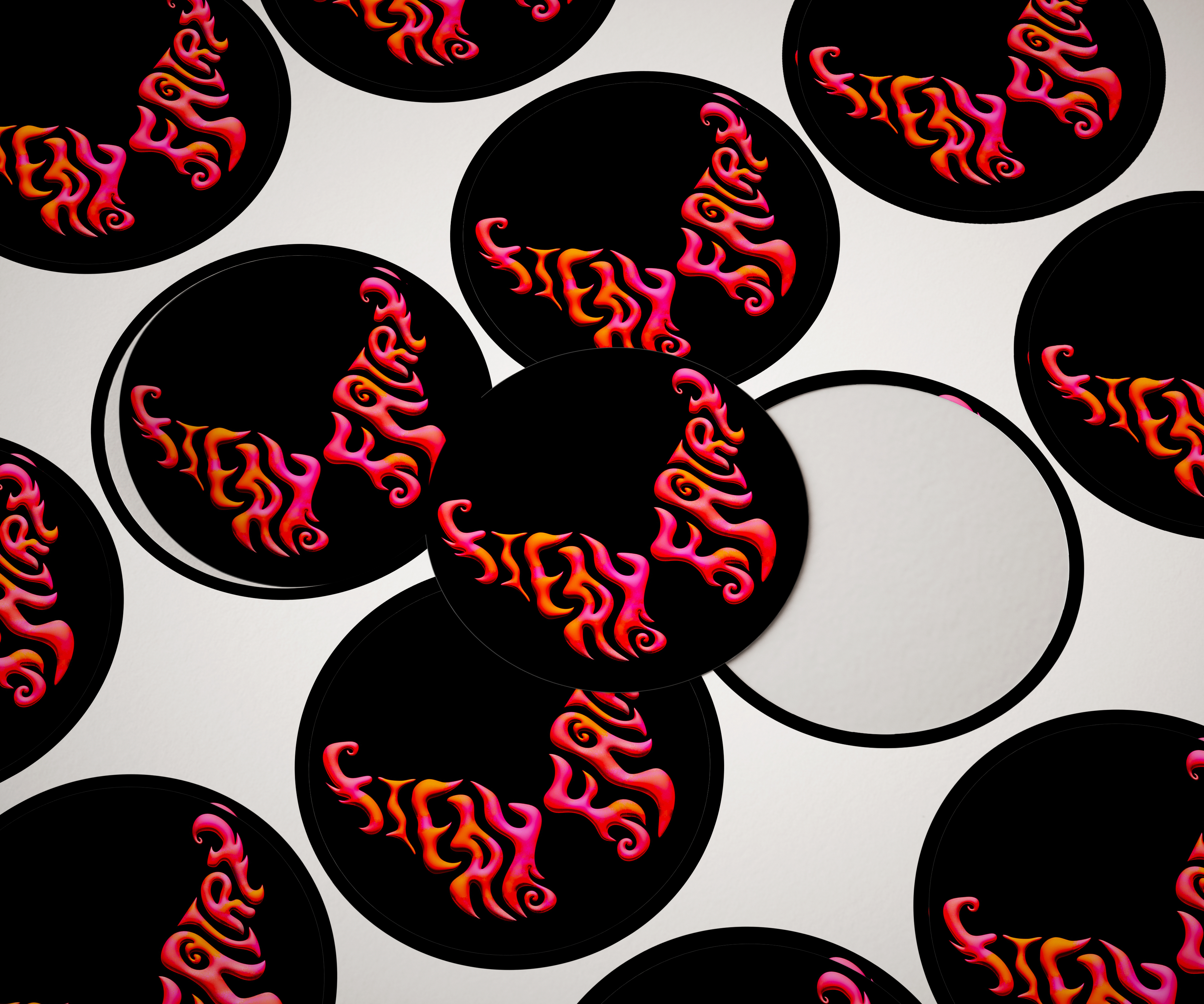
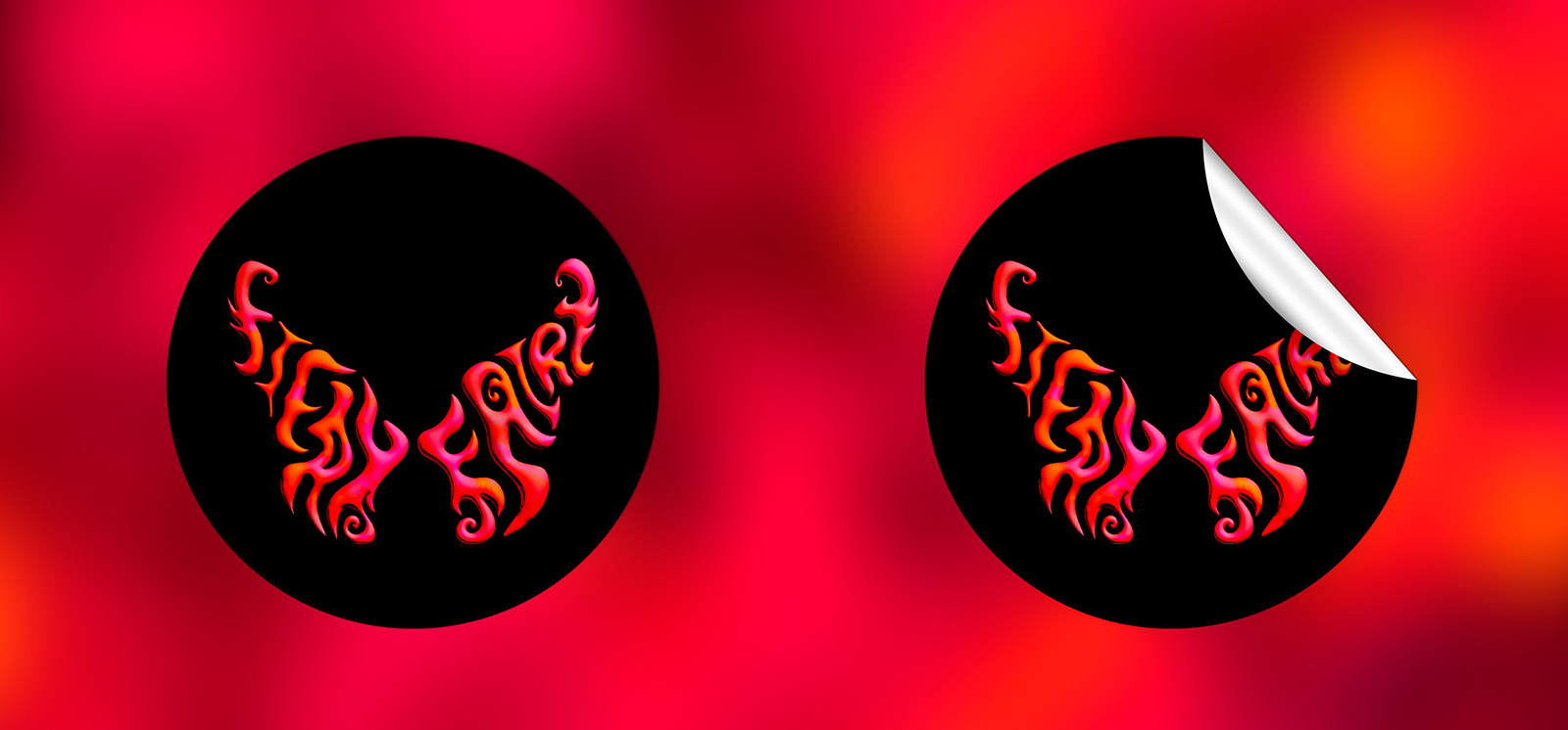
Sticker Variations
Round and square sticker formats adapt the fiery floral artwork and butterfly logo into bold, collectible graphics. The simplified shapes make the design highly versatile, working seamlessly on laptops, water bottles, instrument cases, and street-style surfaces. Across multiple mockups, the stickers maintain strong contrast and legibility, proving the identity holds its impact even at small, repeatable scales.
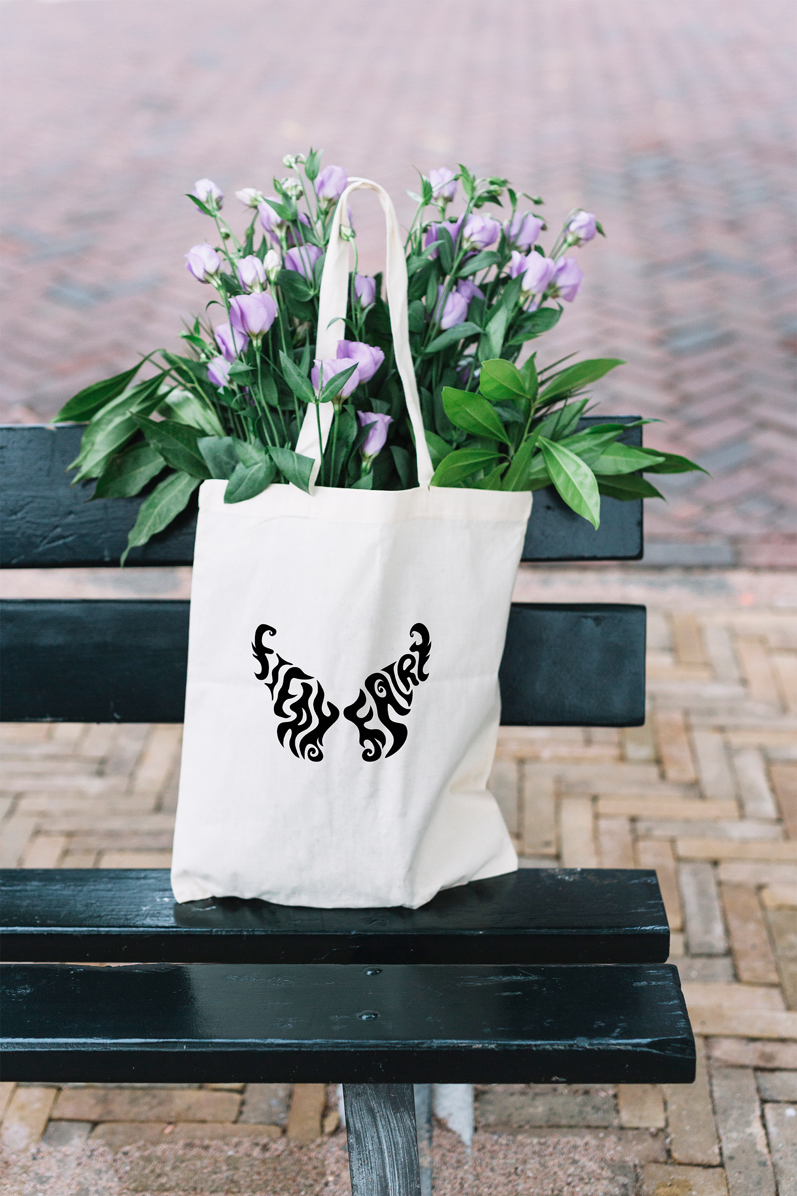
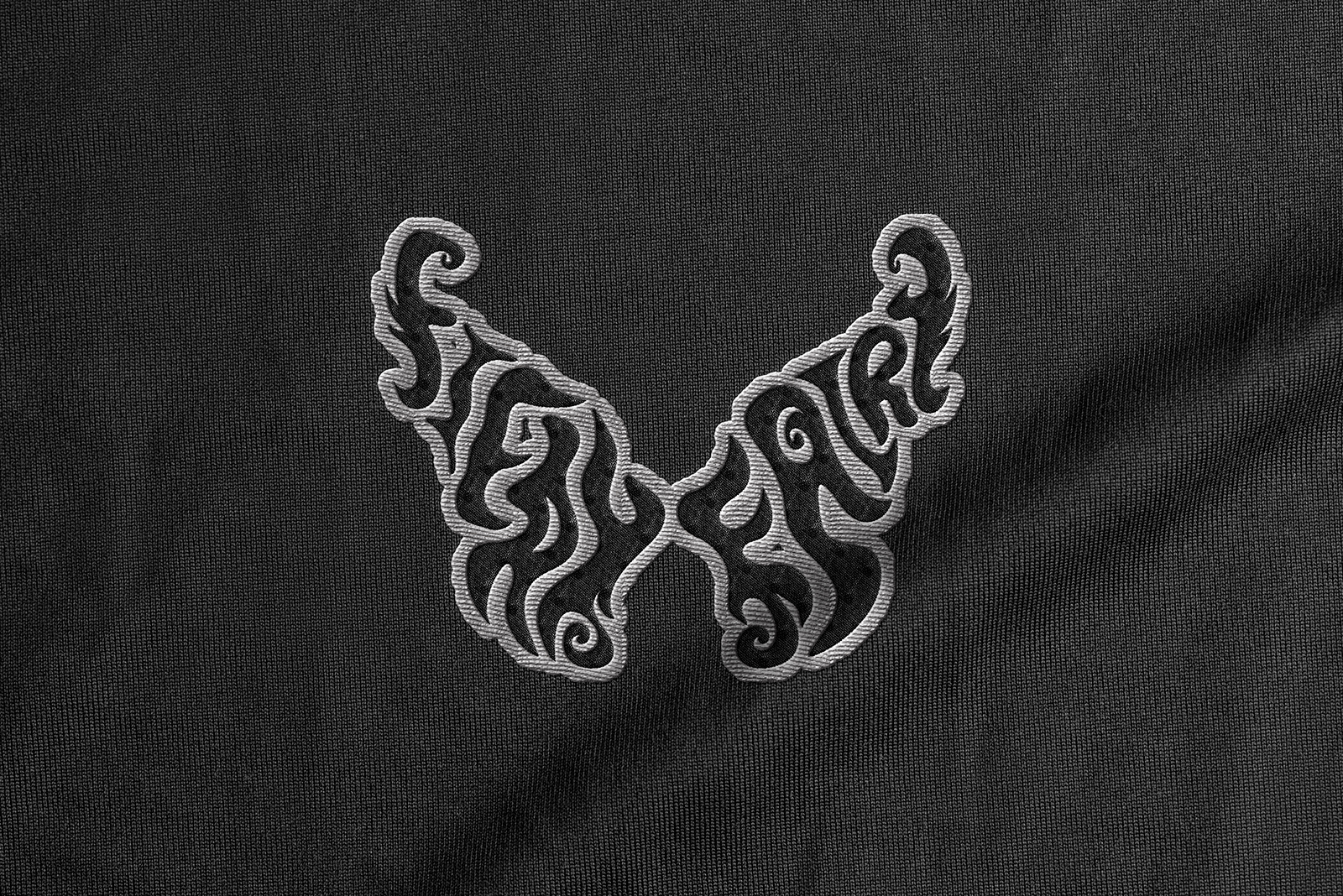
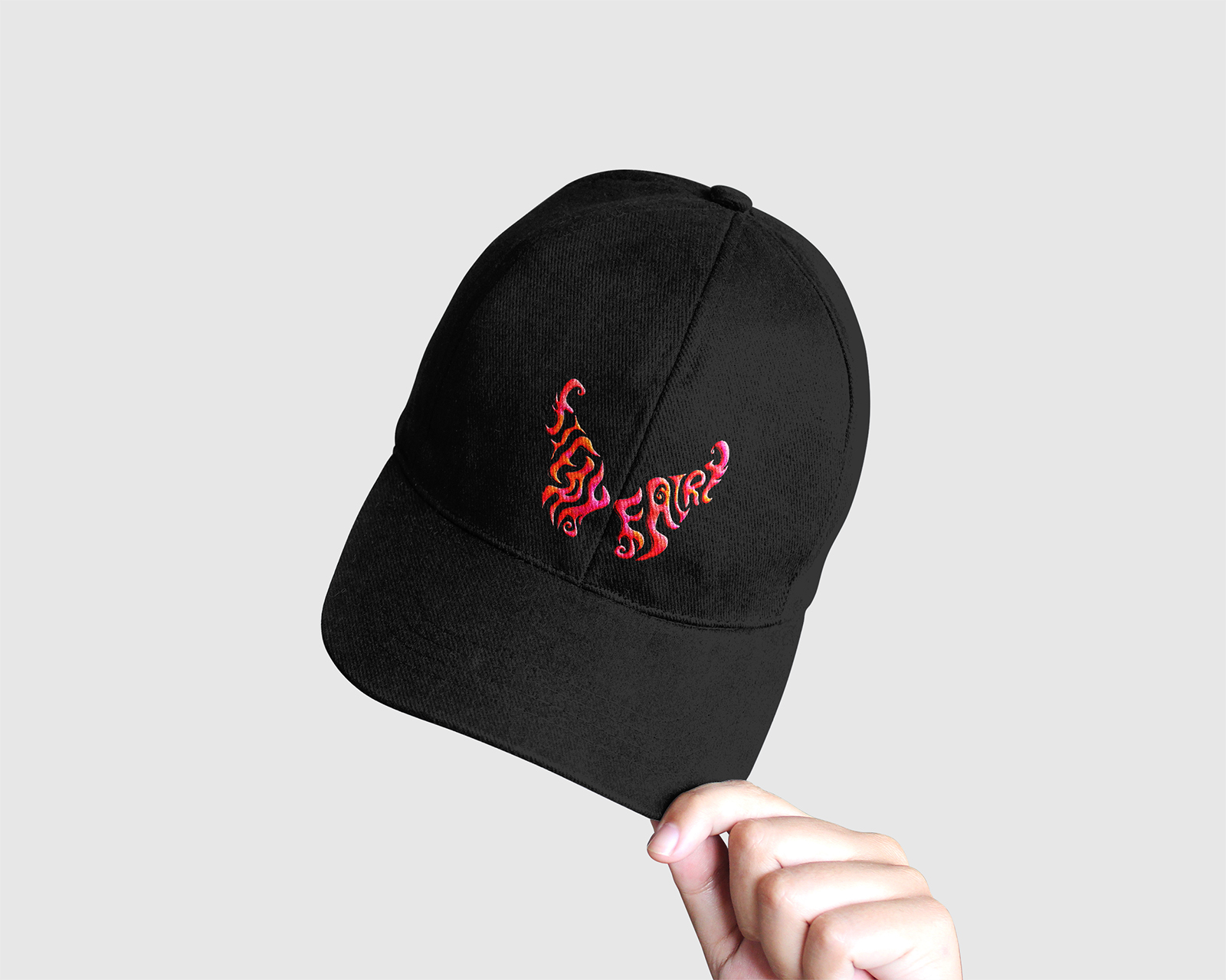
Accessories & Wearables
The accessory set extends the fiery floral language into everyday items, featuring a tote bag filled with burning blooms alongside a matching pin, embroidered patch, and branded hat. Each piece distills the butterfly logo and flame-touched florals into formats suited for fabric, stitching, and metal, while keeping the orange, pink, and black palette intact. Together, these items function as subtle yet striking merch that carries the band’s identity into daily life.
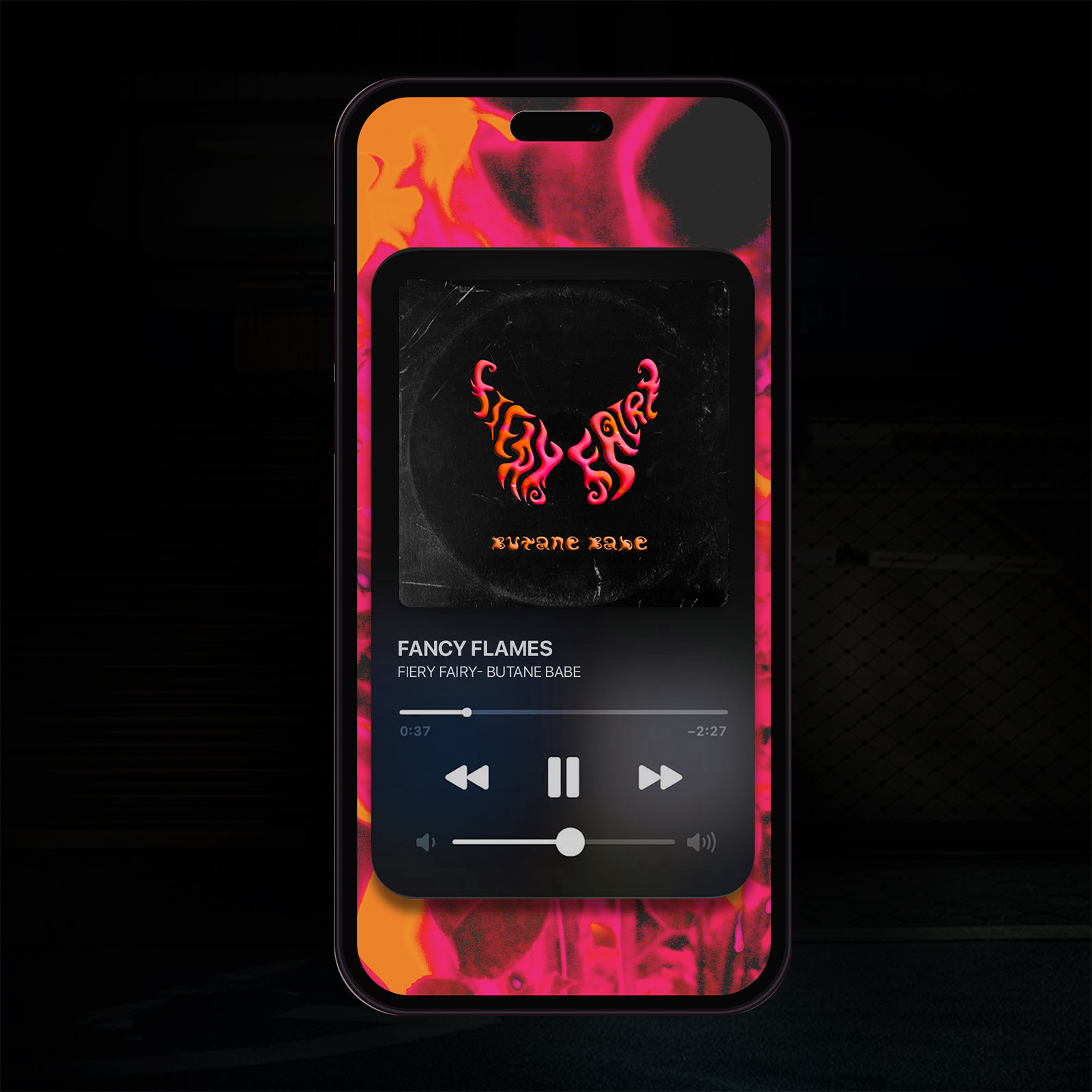
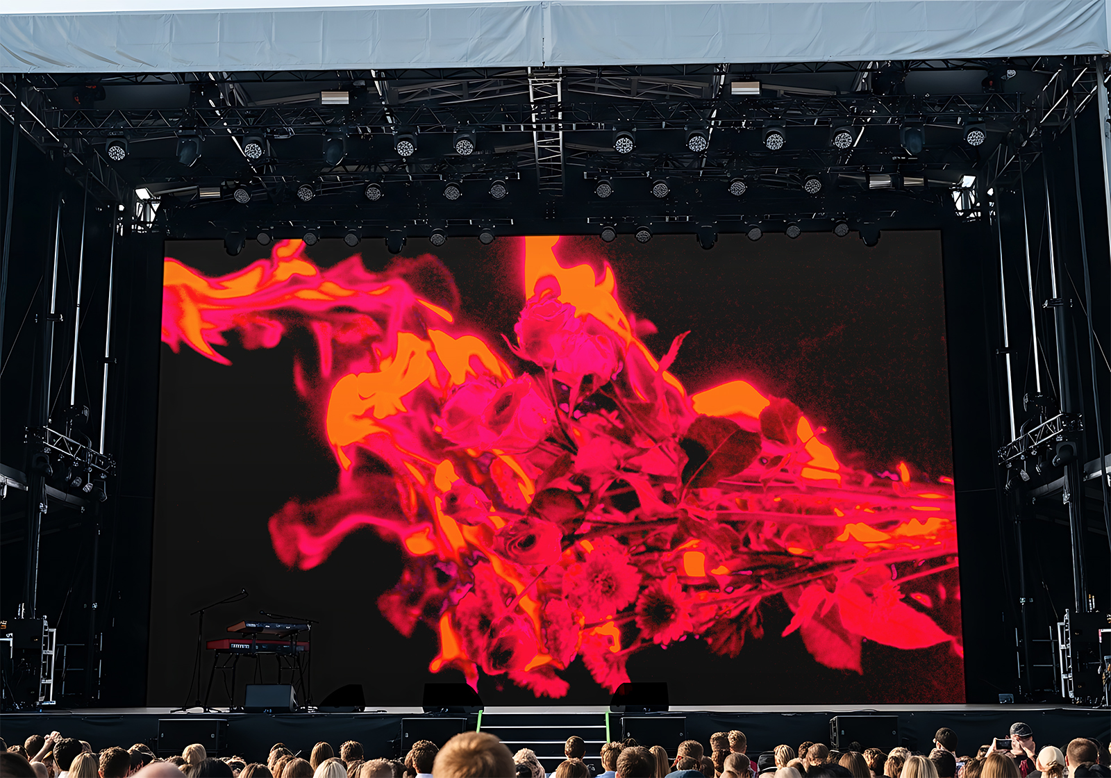
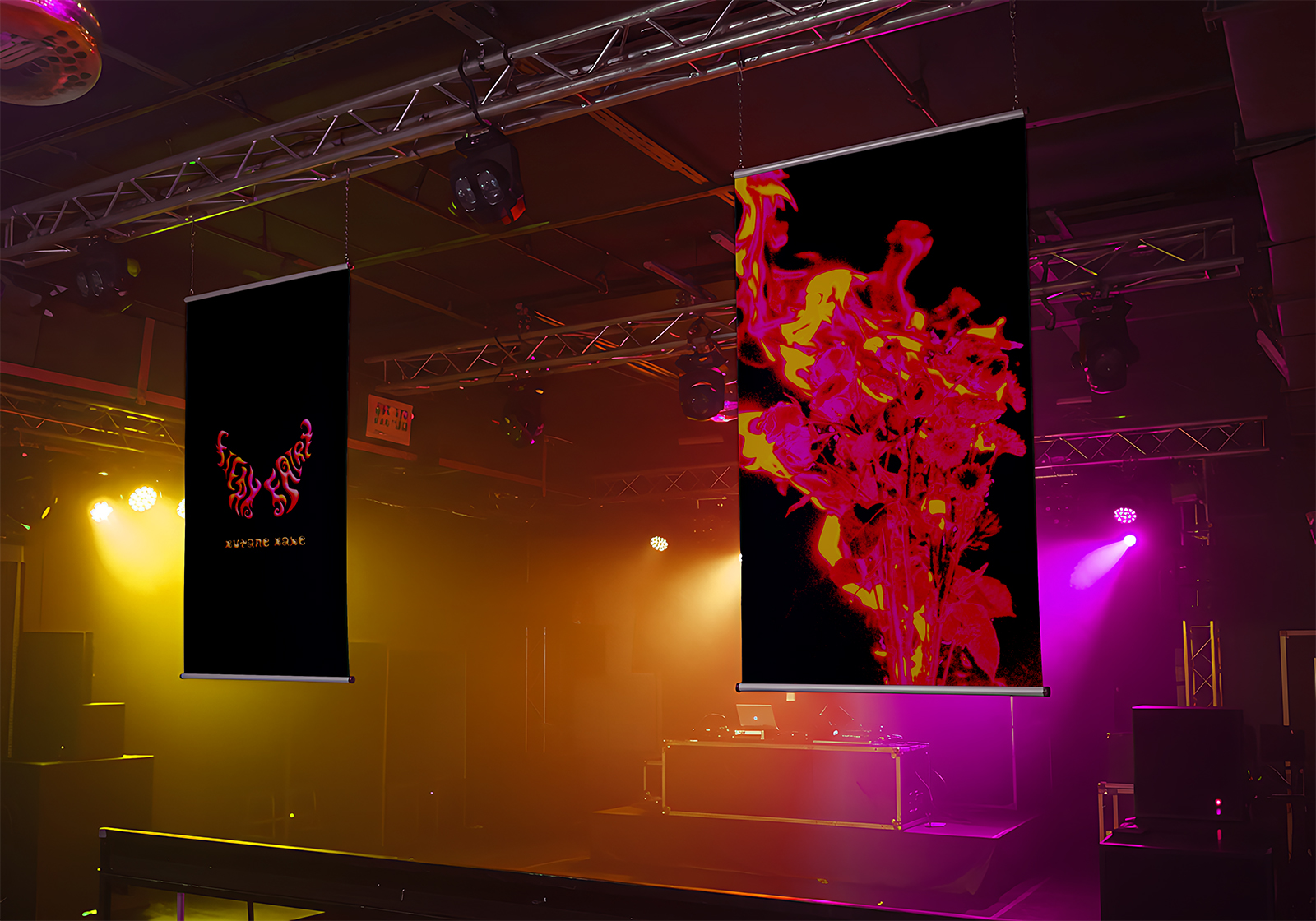
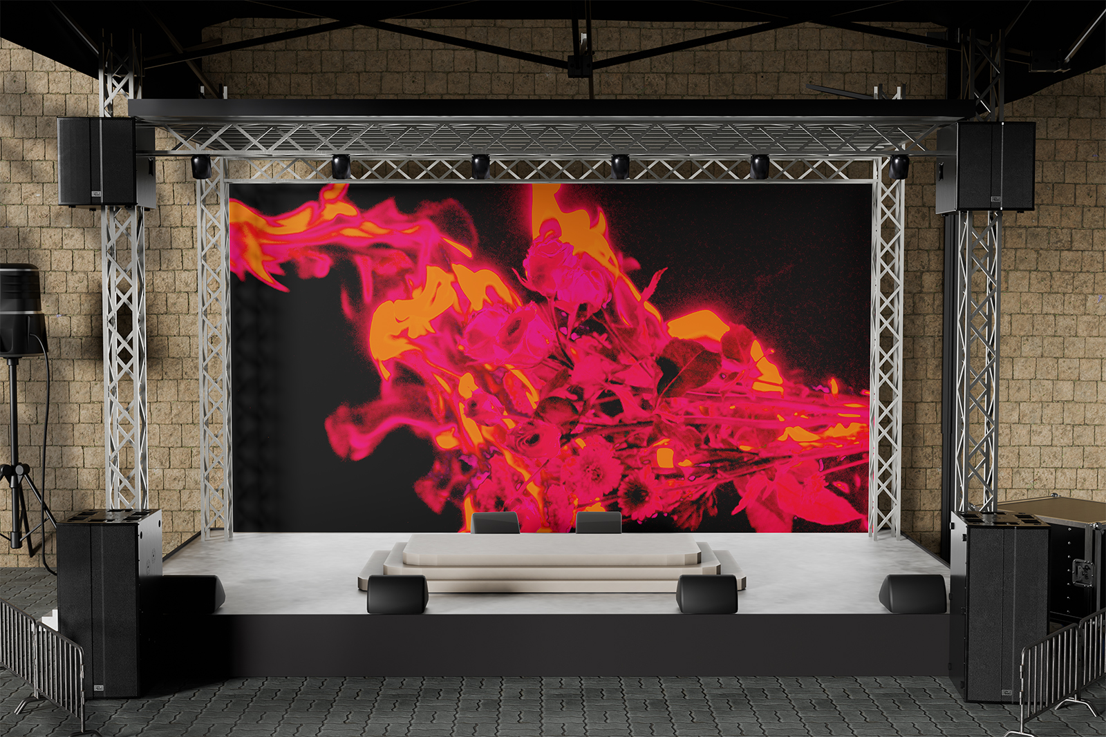
Digital Streaming & Stage Presence
A mobile mockup shows the album live on Apple Music, cleanly translating the fiery florals and butterfly logo onto a small, glowing screen and confirming the artwork’s impact in a digital listening context. The same visual language scales up into stage design, from an intimate venue backdrop to a massive festival jumbo screen where the butterfly mark and burning flowers become a bold, immersive focal point. In a more underground setting, hanging banners and colored lights in orange, pink, and black surround the performers, turning the entire stage into a living extension of the album art.
Conclusion
Fiery Fairy demonstrates how experimental typography and original photography can grow into a fully realized band universe. By turning hand-drawn lettering into a butterfly mark and pairing it with burning florals, the project builds a striking identity that translates seamlessly across music formats, merch, and live experiences.
Final Thoughts
The contrast of softness and fire, whimsy and intensity, creates a visual world that feels unique and memorable at every scale. From a small pin to a festival stage, the consistent orange, pink, and black palette and custom lettering ensure the band’s presence is instantly recognizable and emotionally charged.
