Florida State Fairgrounds Cattlemen Exhibit
In collaboration with a team at Creative Arts Unlimited, the Florida State Fairgrounds Cattlemen Museum was redesigned into an immersive, visually cohesive exhibit. The space guides visitors through 500 years of Florida’s cattle-ranching history through environmental graphics, photography, and artifacts.
Walls Designed
Brand Colors
Artifacts
17
7
50+
Overview
Completed
September 2025
My Role
Graphic Designer
Scope
Brand design, large-scale environmental graphic design, typography, real-world mockups, and artifact integration.
Tools
Adobe Illustrator, Photoshop, and InDesign
A full-scale exhibit redesign transformed the Florida State Fairgrounds Cattlemen Museum into a cohesive visual journey through five centuries of ranching history. Rich, earthy color palettes, heritage-inspired typography, and layered interpretive panels unify archival photography, contemporary imagery, and physical artifacts into a clear chronological narrative. The result is an immersive educational environment that honors the cultural, economic, and environmental impact of Florida’s cattle industry.
The Challenge
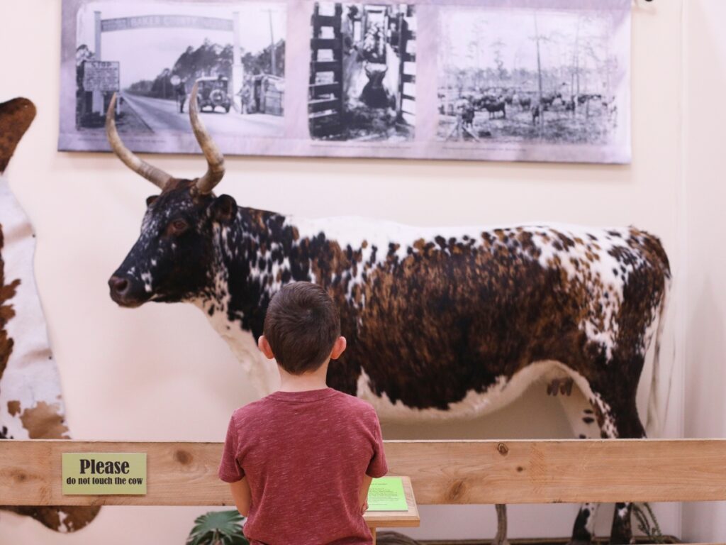
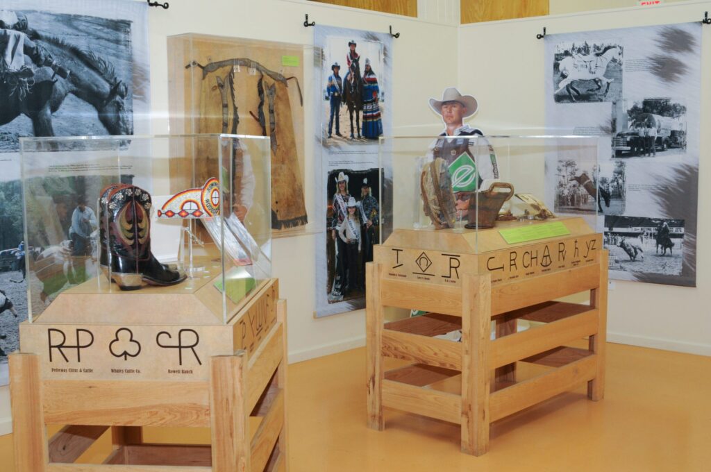
The existing exhibit lacked a clear visual hierarchy and followed no strong chronological flow, making it difficult for visitors to understand the progression of Florida’s cattle industry. Busy layouts, low-contrast typography, and overly bright, mismatched colors reduced readability, especially from a distance during the crowded, fast-paced environment of the Florida State Fair. Artifacts were loosely arranged and easily accessible to passing foot traffic, leaving them vulnerable to damage while also making them harder to comfortably view and appreciate.
The Solution
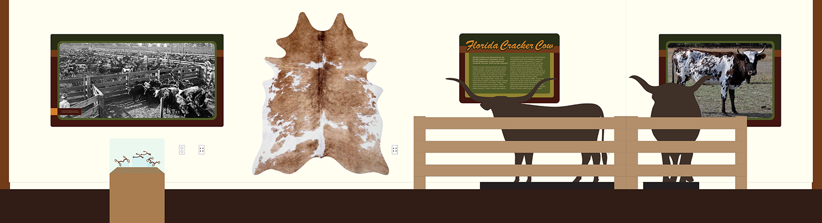
The redesign introduced a structured, timeline-based layout with bold, legible headings and a consistent typographic system that could be read from across the hall. A refined, heritage-inspired color palette created visual cohesion while improving contrast and clarity for both close and long-range viewing. Custom-built display cases elevated and protected artifacts, organizing them into focused groupings that improved sightlines, durability, and the overall storytelling experience.
Understanding the Existing Space
Before any redesign began, the museum needed to be evaluated as visitors actually experienced it: crowded, noisy, and fast-moving during the Florida State Fair. The original layout presented valuable stories and artifacts, but inconsistent hierarchy, scattered timelines, and low visibility from a distance made the content easy to overlook. By documenting the space and identifying pain points (from readability and flow to artifact safety and viewing angles), the foundation was set for a clearer, more immersive, and more resilient exhibit design.
Typography and Color Exploration
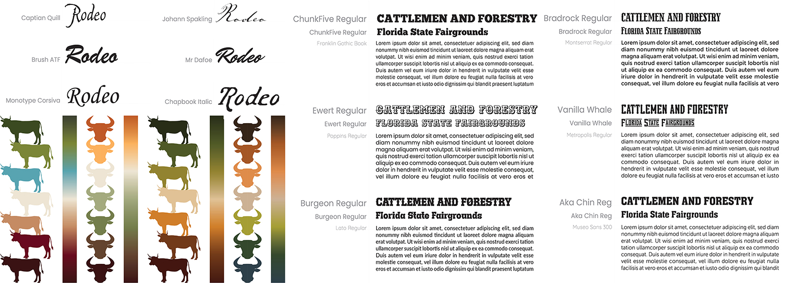
A wide range of typeface directions and color palettes were explored to find the right balance between heritage and clarity. Display type needed to echo the character of old Florida cattlemen through subtle western and hand-crafted influences, while body and supporting text had to remain highly legible from across a crowded exhibit hall. Multiple pairings were tested to ensure headings could feel distinctive and decorative without sacrificing quick readability at a distance.
Color studies focused on a restrained, country-inspired palette of greens, browns, and warm yellows drawn from Florida’s natural landscape. Limiting the number of colors helped control production time and cost while also creating stronger visual consistency throughout the space. High-contrast combinations were prioritized to support layered panels, improve wayfinding, and keep text and imagery clear and comfortable to read in busy fairground lighting conditions.
Finalized Visual Identity
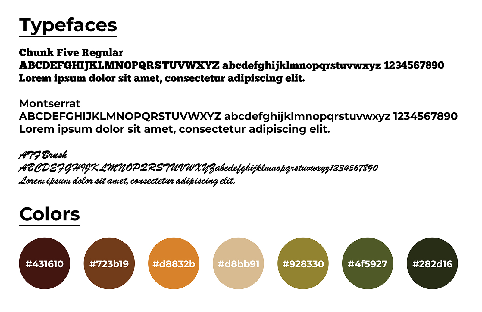
The final typographic system pairs Chunk Five for bold, character-rich headings with Montserrat for clean, highly legible body and supporting text. This combination captures the spirit of old Florida ranch signage while maintaining modern clarity that’s easily read from across the exhibit hall.
The color palette draws from natural Florida landscapes: deep browns, sunbaked oranges, warm sand tones, and layered greens to create an earthy, authentic atmosphere. A limited, high-contrast set of colors keeps production efficient while supporting strong hierarchy, layered graphics, and comfortable readability from both near and far.
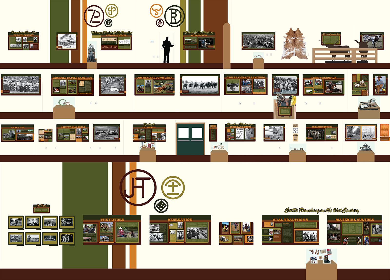
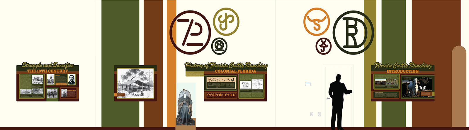
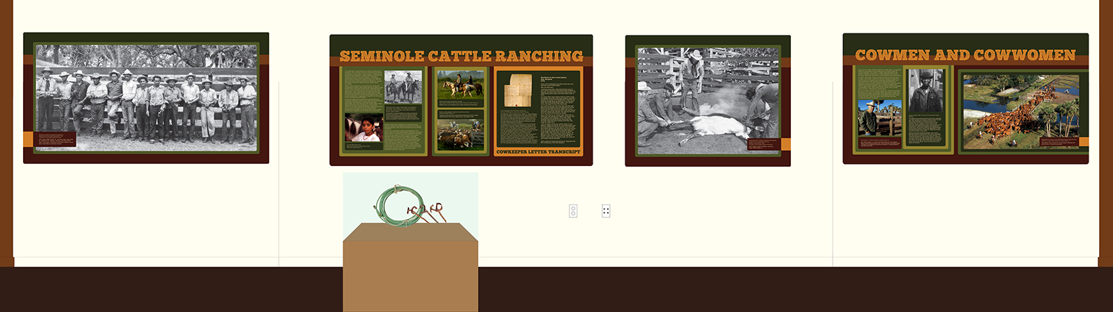
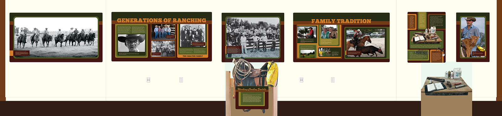
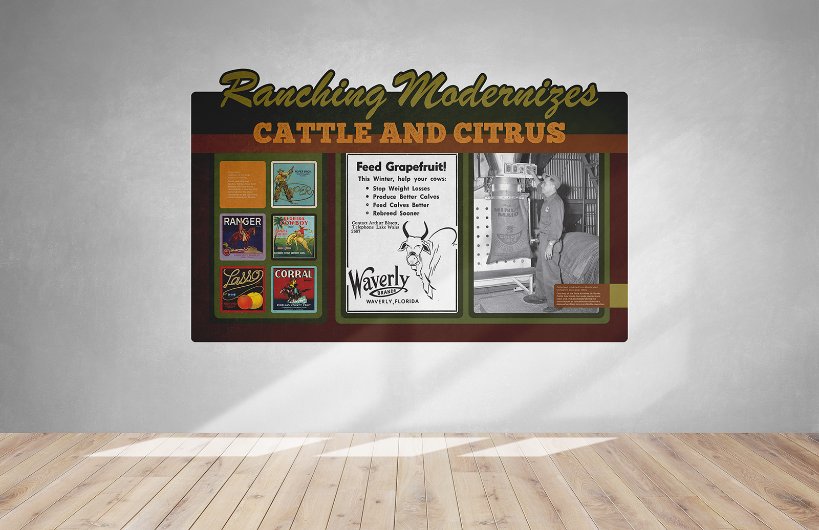
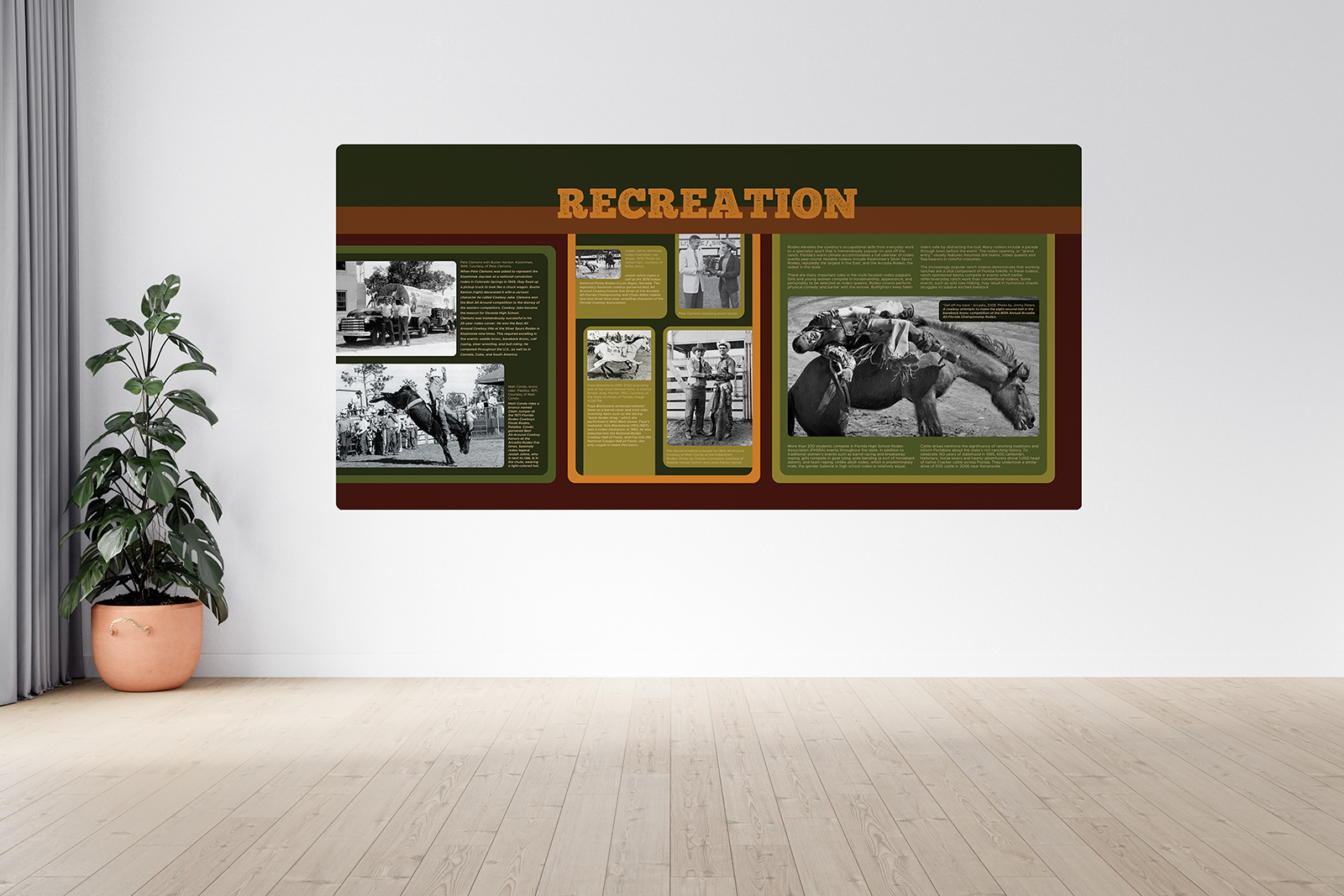
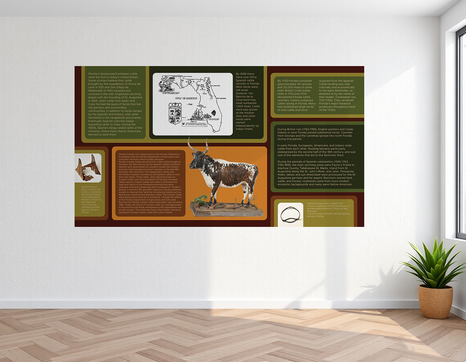
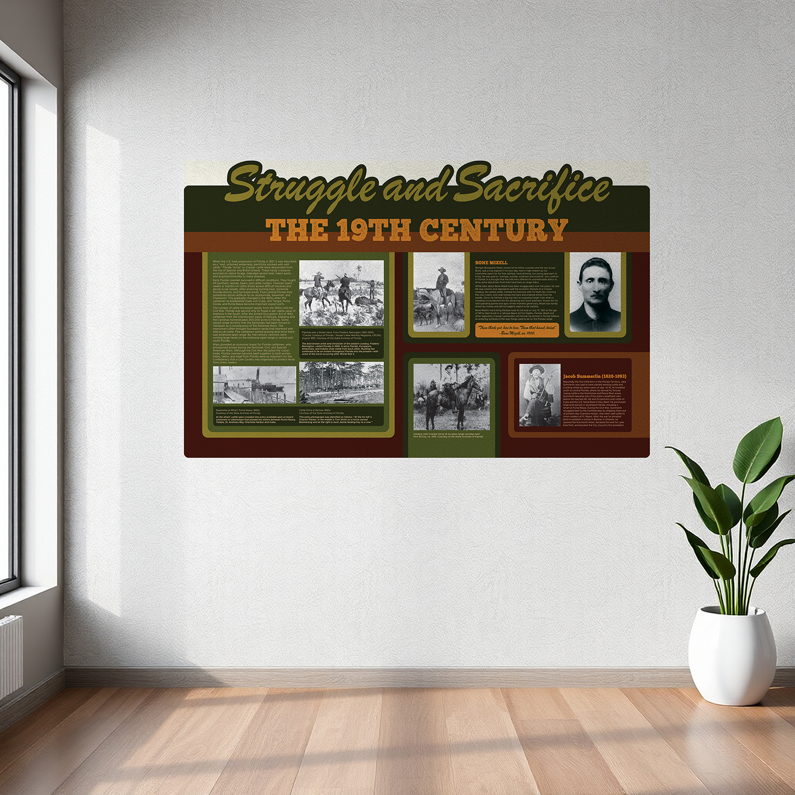
Final Wall System
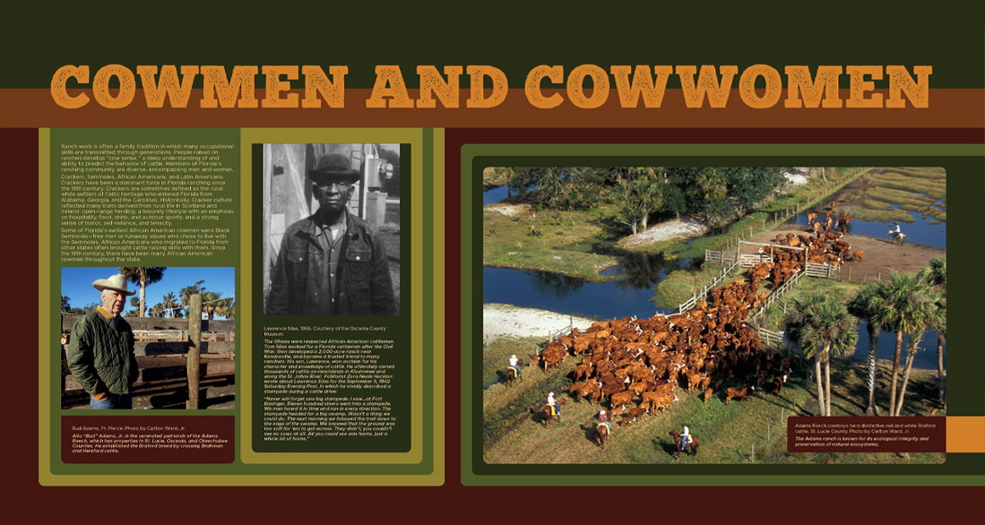
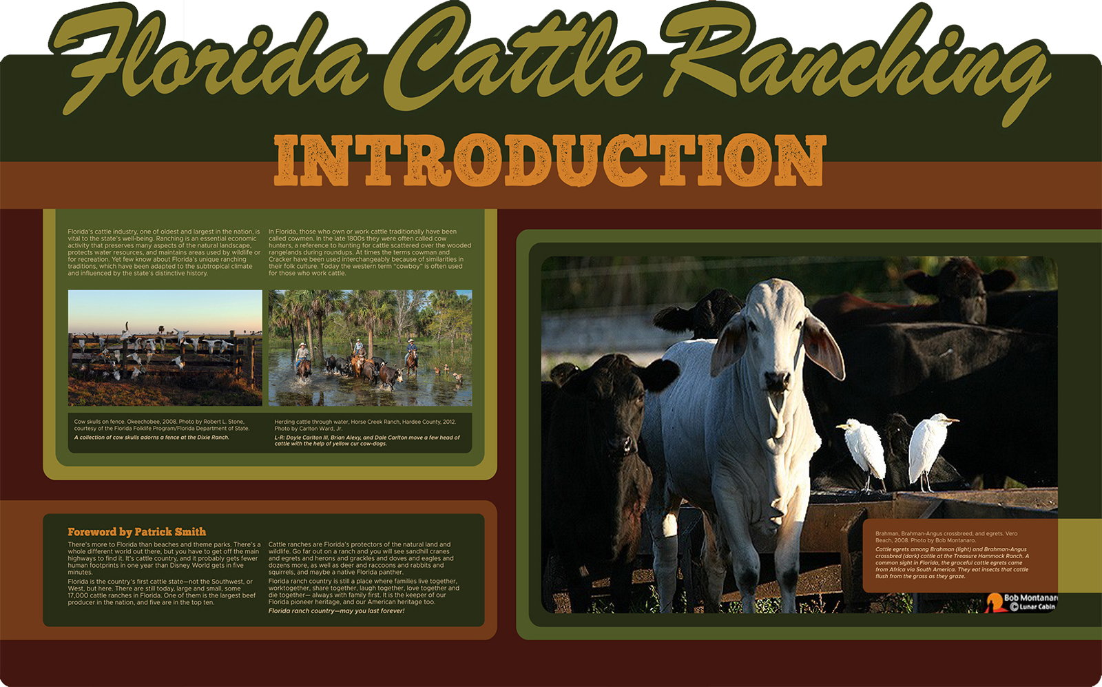
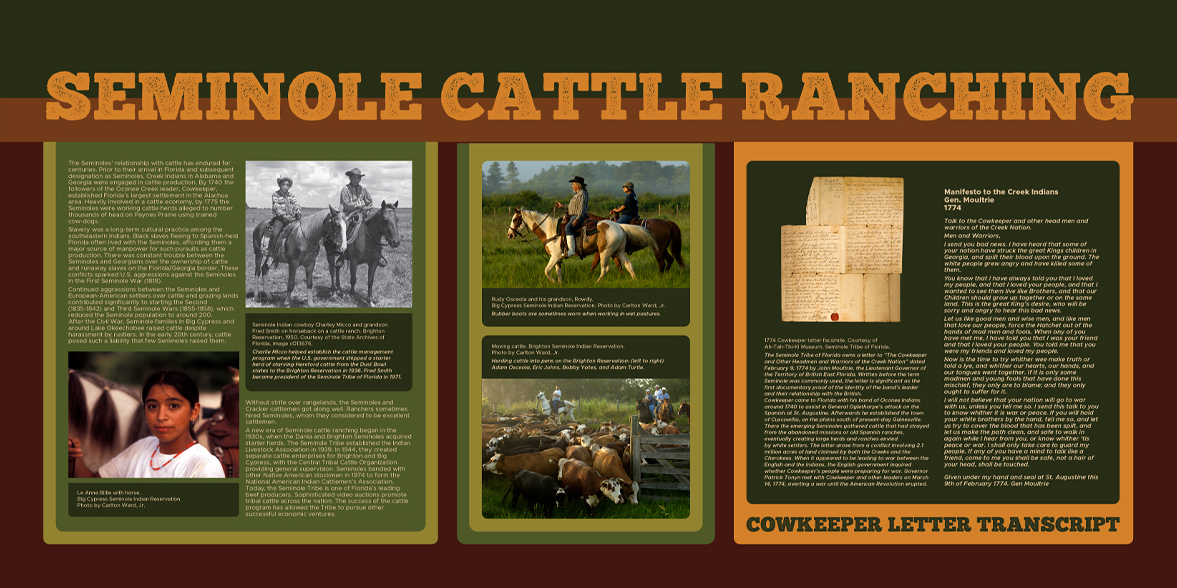
Thirty-six interpretive panels spread across sixteen walls create a continuous, chronological journey through Florida’s cattle ranching history. Each panel acts as a focused story moment, combining bold headers, archival and contemporary imagery, and concise interpretive text that can be quickly understood from a distance or explored up close.
Together, the panels form a cohesive visual system that guides visitors smoothly through the space using consistent hierarchy, color coding, and typography. Large-scale graphics establish strong visual impact in the busy fair environment, while detailed content and integrated artifacts invite deeper, more personal engagement.
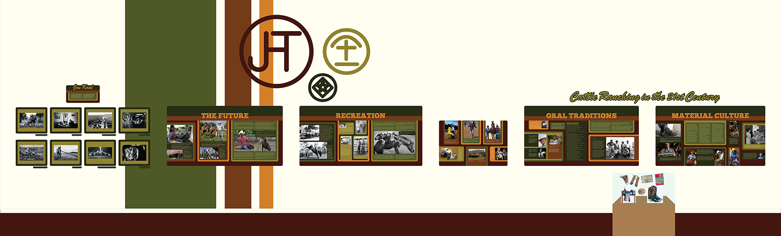
Panel System Details
A closer look at individual panels reveals a highly structured design system that keeps the entire exhibit cohesive while allowing each story to feel unique. No two layouts are identical, yet every panel follows the same underlying rules for type scale, spacing, margins, and alignment, creating a subtle visual rhythm that visitors intuitively understand as they move through the space.
Carefully calibrated typography, kerning, tracking, and leading establish a near-mathematical framework that governs the placement of headlines, imagery, and body text. This coded structure ensures consistency and readability across all 36 panels while flexible layout variations maintain visual interest, hierarchy, and narrative intrigue from one section to the next.
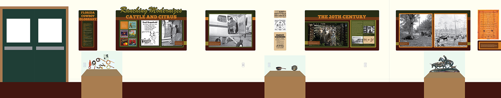
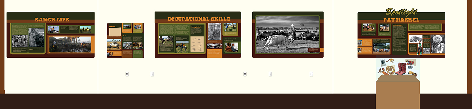
In-Space Visualization
Full-scale mockups demonstrate how the panels perform in a real gallery environment, validating readability, scale, and visual impact before fabrication. Seeing the designs at true size ensures headlines remain legible from across the room while images and text blocks maintain comfortable viewing at close range.
These contextual previews also confirm spacing between panels, alignment along the walls, and the overall rhythm of color and content as visitors move through the exhibit. By testing the system in a realistic setting, the final layouts balance bold presence from afar with inviting detail up close, creating an experience that feels both organized and immersive within the physical space.
Conclusion
The completed exhibit transforms a fragmented and hard-to-navigate space into a cohesive, chronological experience that honors the depth and longevity of Florida’s cattle industry. Through a disciplined visual system, refined typography, and an earthy, high-contrast palette, each of the 36 panels contributes to a unified story that is readable from afar yet rich in detail up close. Custom display solutions and carefully structured layouts protect and elevate artifacts while guiding visitors smoothly through 500 years of history.
Final Thoughts
This project demonstrates how thoughtful environmental graphic design can bring clarity, dignity, and renewed relevance to a long-standing cultural space. By balancing heritage-inspired character with modern legibility and production efficiency, the redesign creates an exhibit that can endure heavy fairground traffic while remaining visually engaging and easy to understand. The result is a flexible, repeatable system that celebrates tradition while setting a strong foundation for future growth and updates.
