Miscellaneous Projects
A range of exploratory and client-based projects that span illustration, branding, apparel, posters, and large-scale environmental graphics. Each piece reflects a hands-on, experimental approach to design, emphasizing versatility, craft, and the ability to translate strong visual concepts across different mediums and real-world spaces.
Overview
Completed
2020-2025
My Role
Graphic Designer, Printmaker
Mediums
Digital illustration, photography, poster design, apparel and merch design, screenprinting, cyanotype printing, linocut relief printing, bitmap image processing, brand identity systems, packaging design, environmental and wall graphics, vinyl wraps, dimensional signage and plaques, and large-scale interior installations.
This collection highlights a range of exploratory and client-based work that pushes beyond traditional branding into tactile, spatial, and highly expressive territory. Across posters, prints, apparel, packaging, and environmental graphics, each project experiments with how illustration, photography, typography, and material processes can shape mood and narrative. From hand-crafted textures and analog techniques to digitally refined layouts and large-scale installations, the work balances playfulness with precision, often blending personal voice with real-world application.
Together, these pieces demonstrate versatility in both concept and execution, moving fluidly between intimate self-initiated art and collaborative public-facing design. Whether translating live music into bold poster compositions, turning natural motifs into prints, or transforming physical spaces through murals and signage, the throughline is a focus on storytelling, atmosphere, and experience. The result is a body of work that treats every surface (paper, fabric, walls, and objects) as an opportunity to build immersive visual worlds.
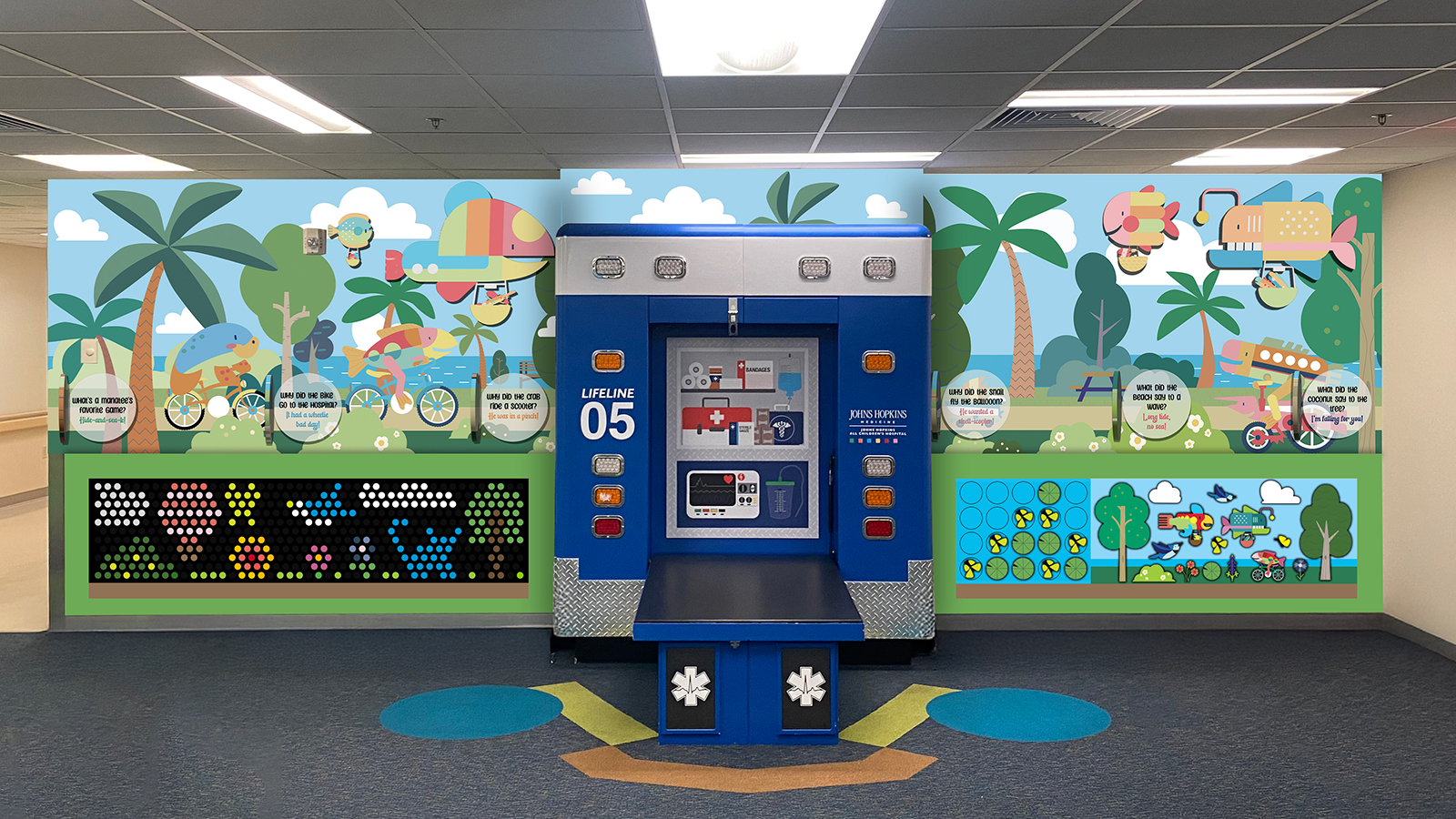
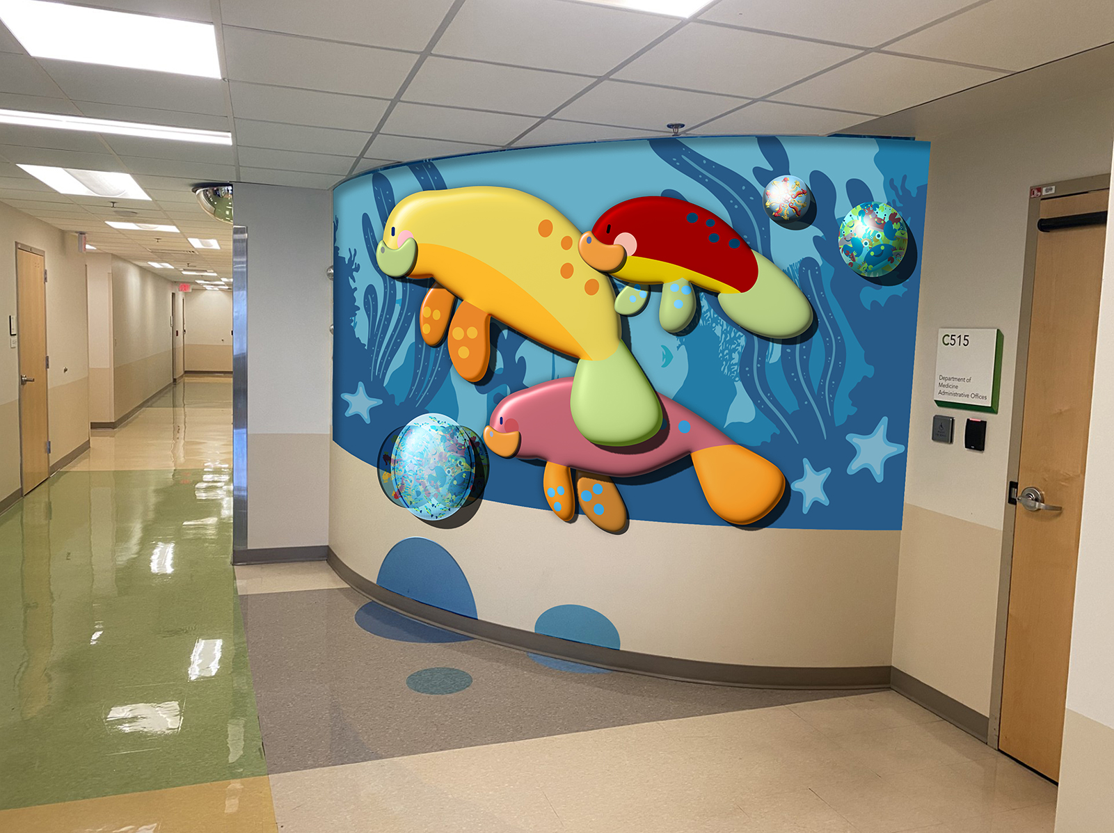
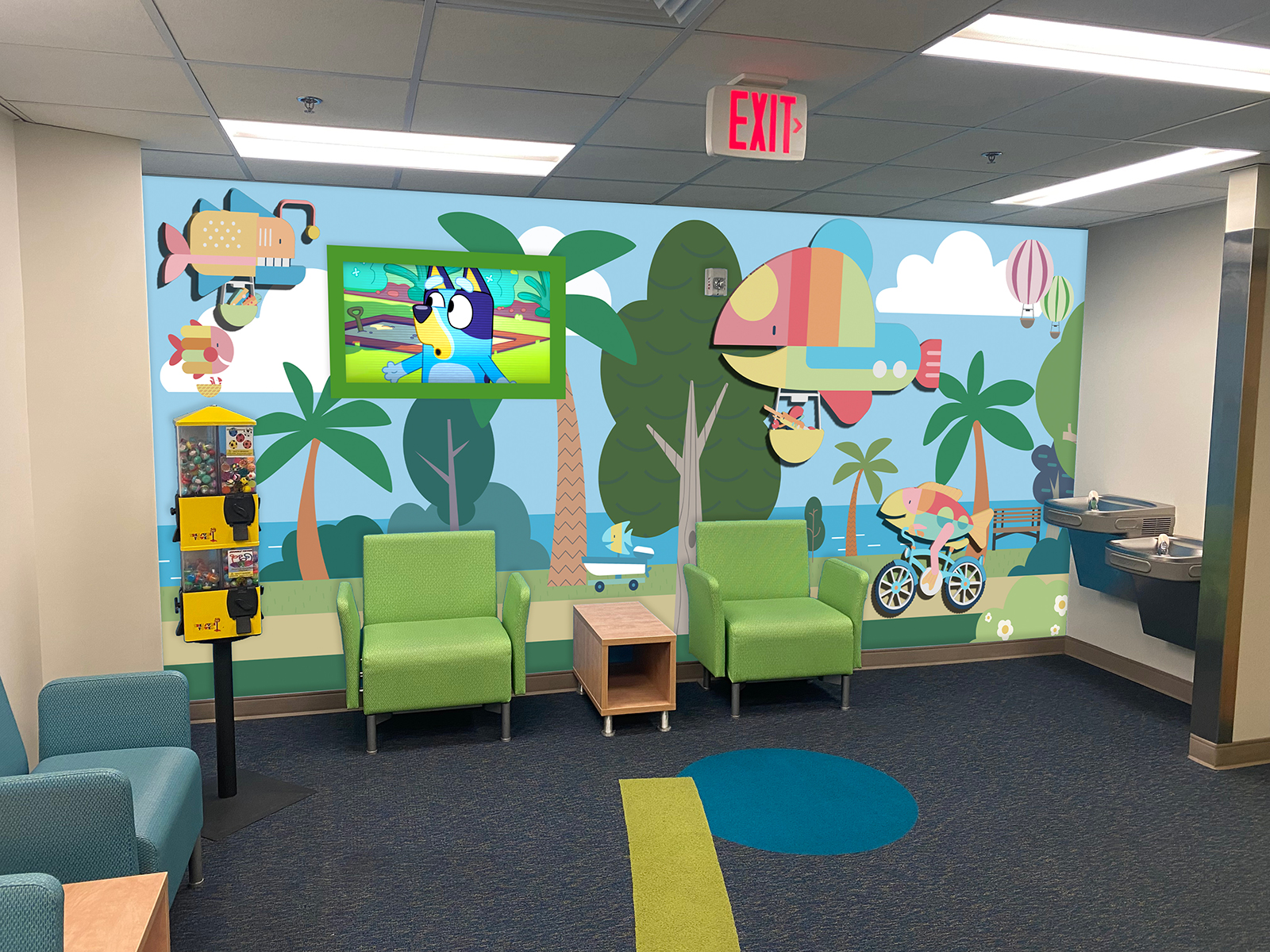
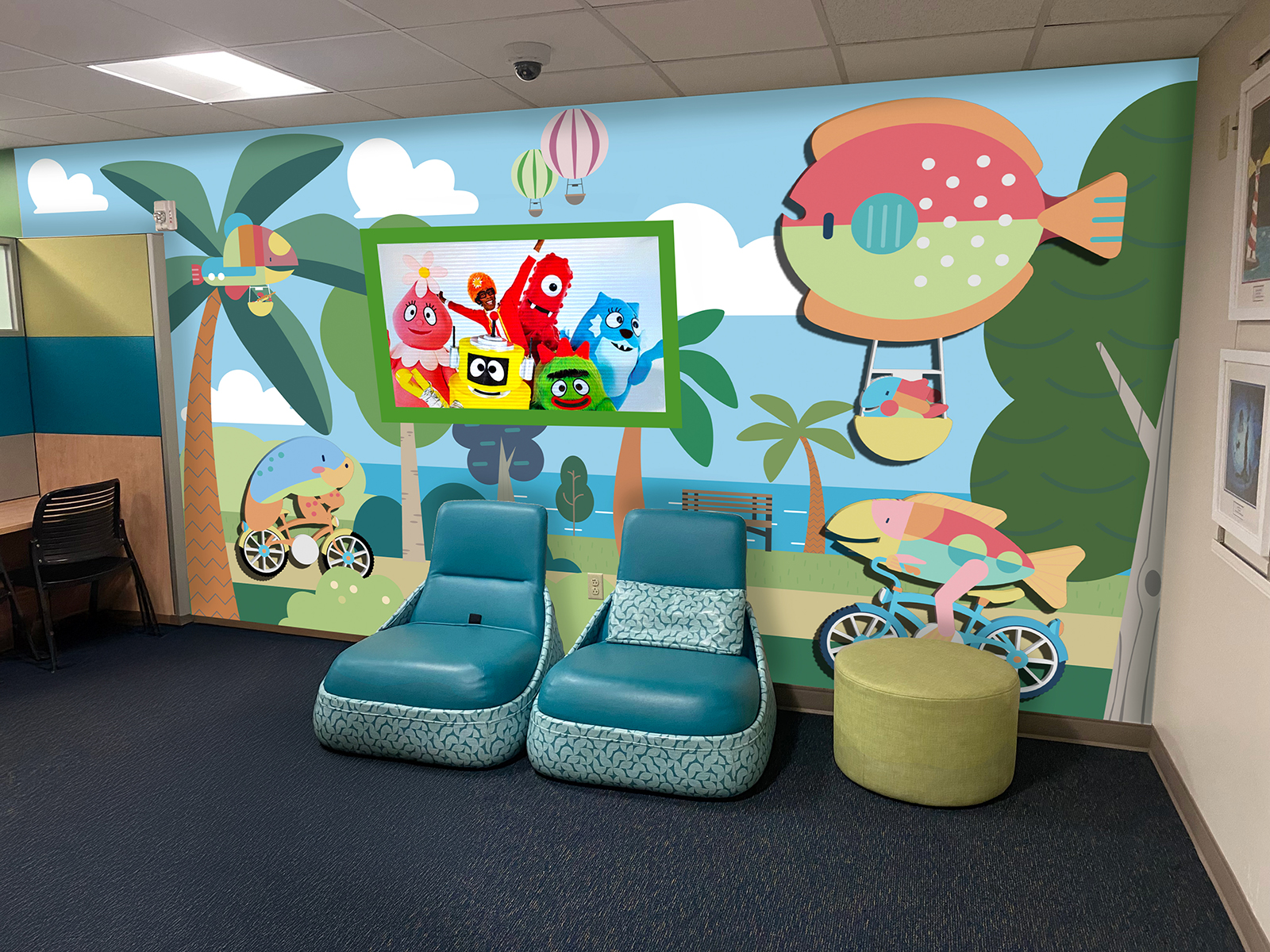
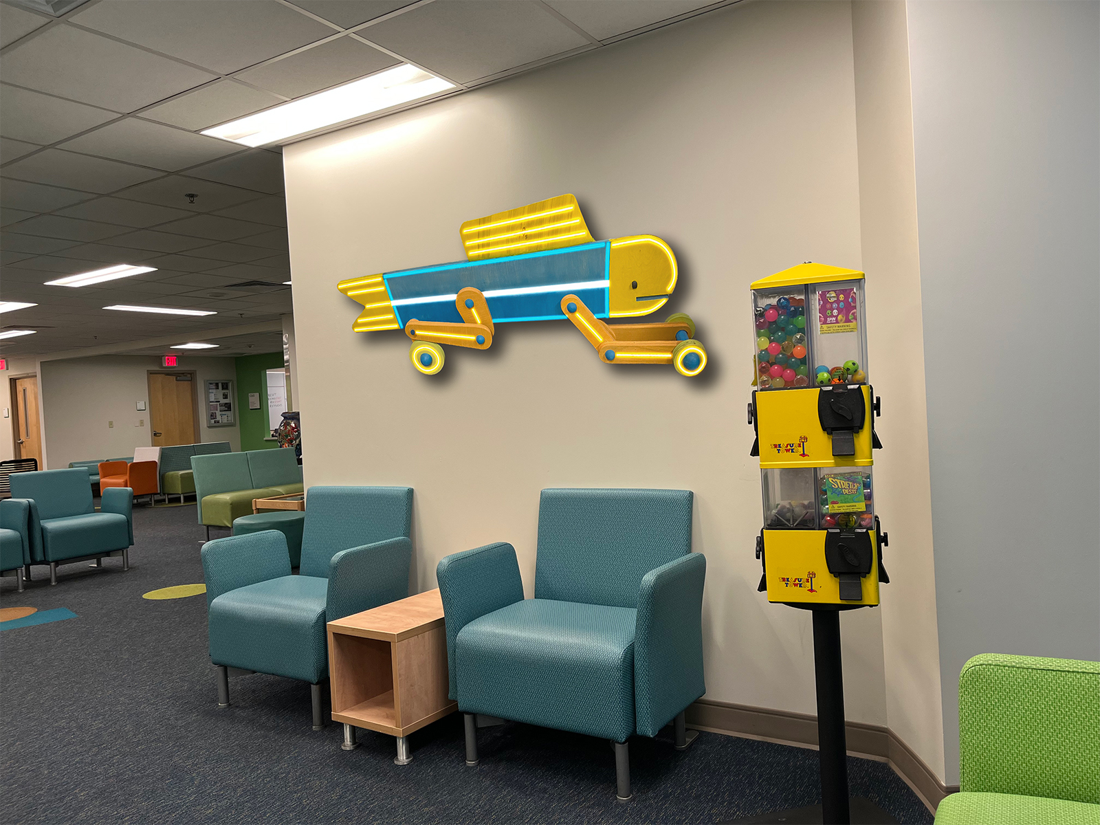
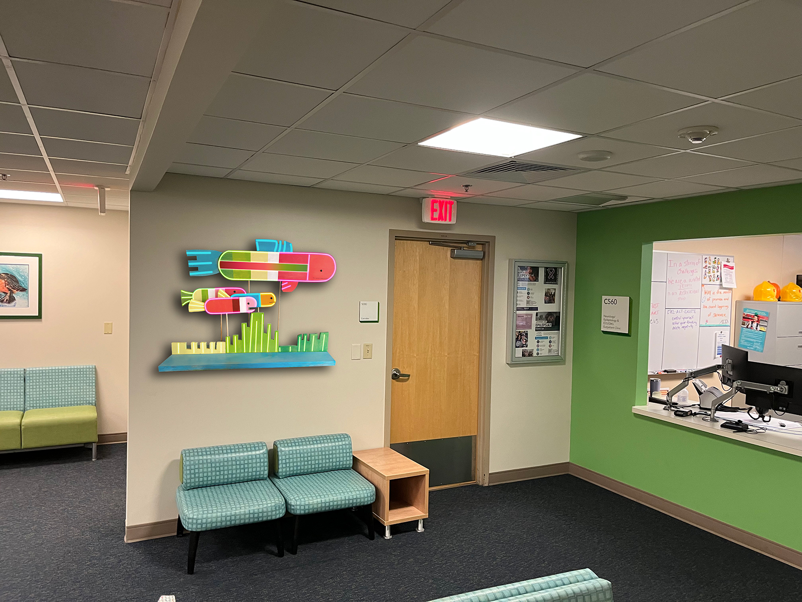
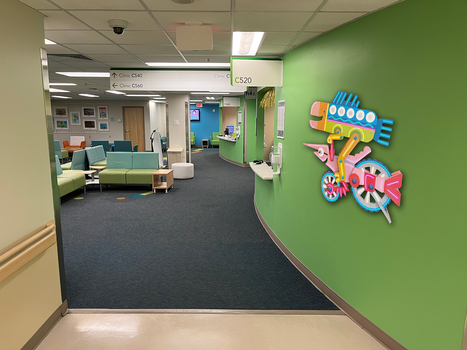
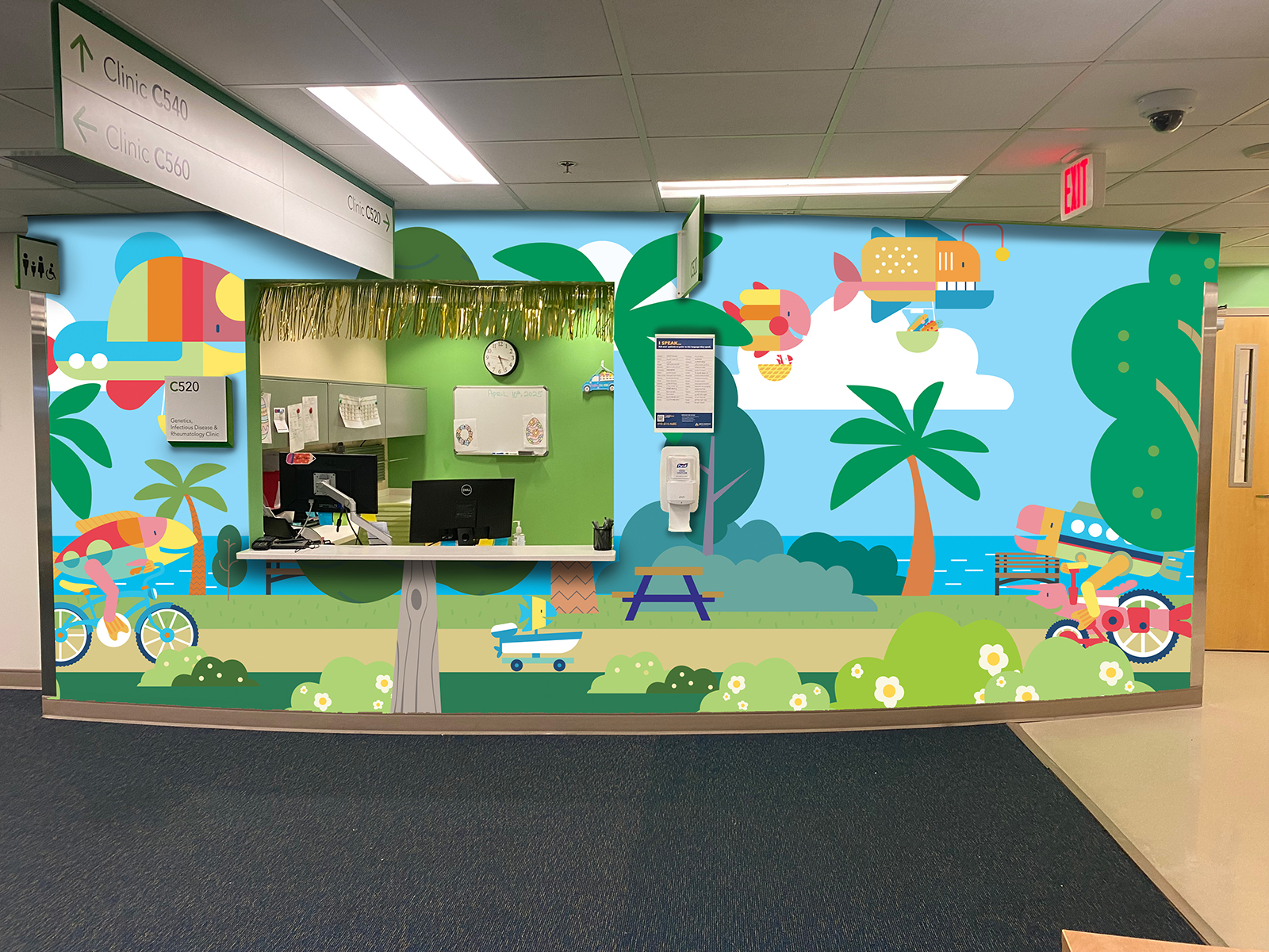
All Children’s Hospital
Created while working at Creative Arts Unlimited, this project transformed a children’s hospital waiting area into an immersive, playful environment designed to reduce stress and spark imagination. The space features large-scale illustrated murals of friendly sea creatures, whimsical flying fish, and outdoor adventure scenes that wrap around curved walls to create a cohesive visual journey. Dimensional elements and custom neon-style fixtures add depth and glow, turning flat graphics into engaging focal points that feel almost animated. Bright, approachable colors and soft organic shapes were chosen to create a calming yet uplifting atmosphere, helping young patients and their families feel more comfortable while they wait.
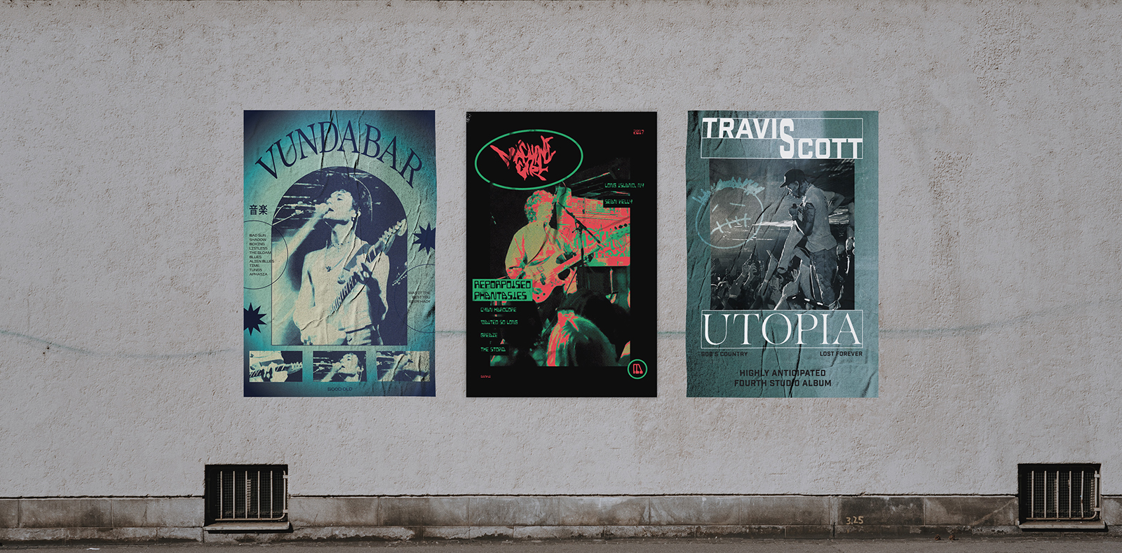
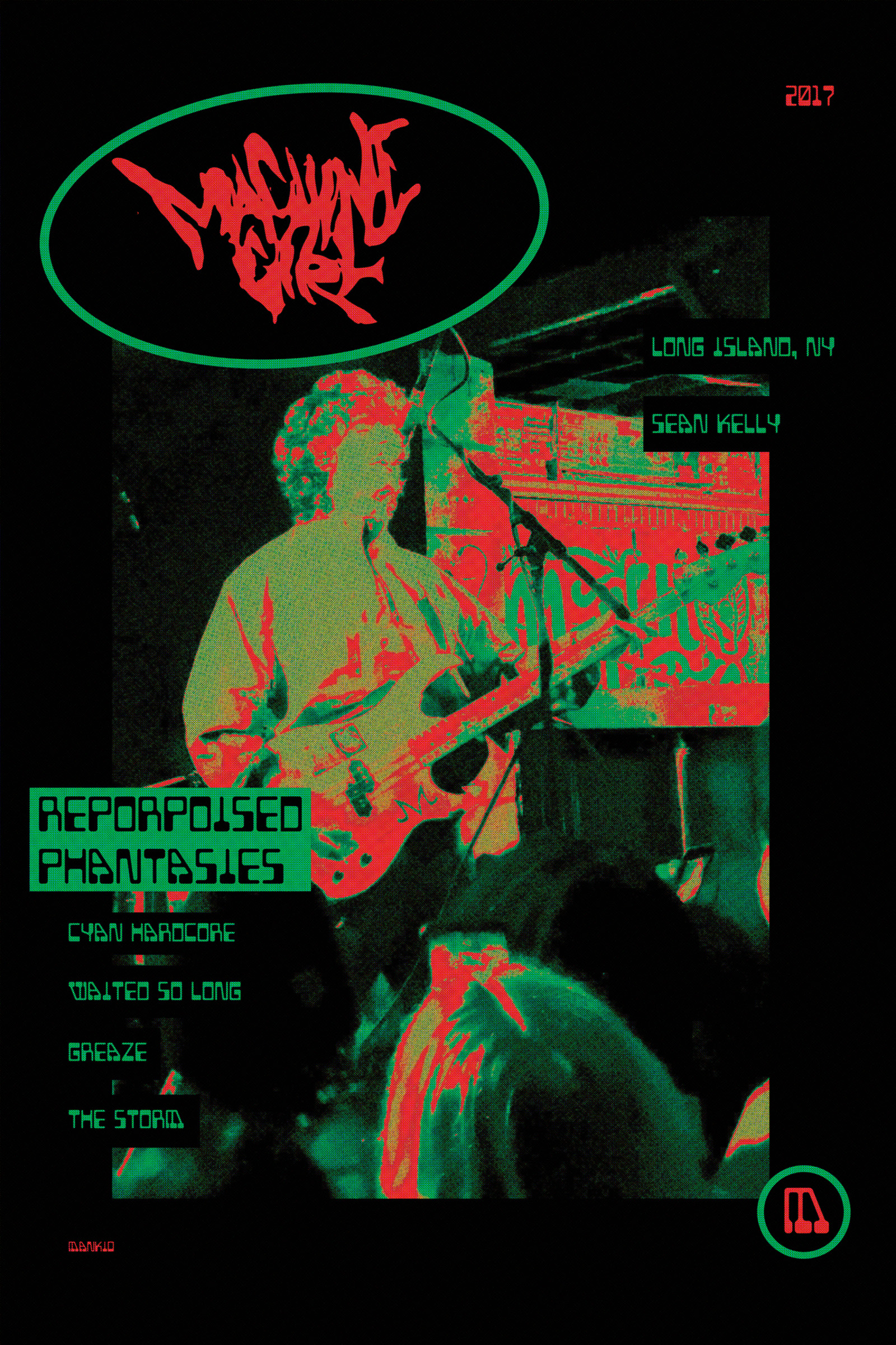
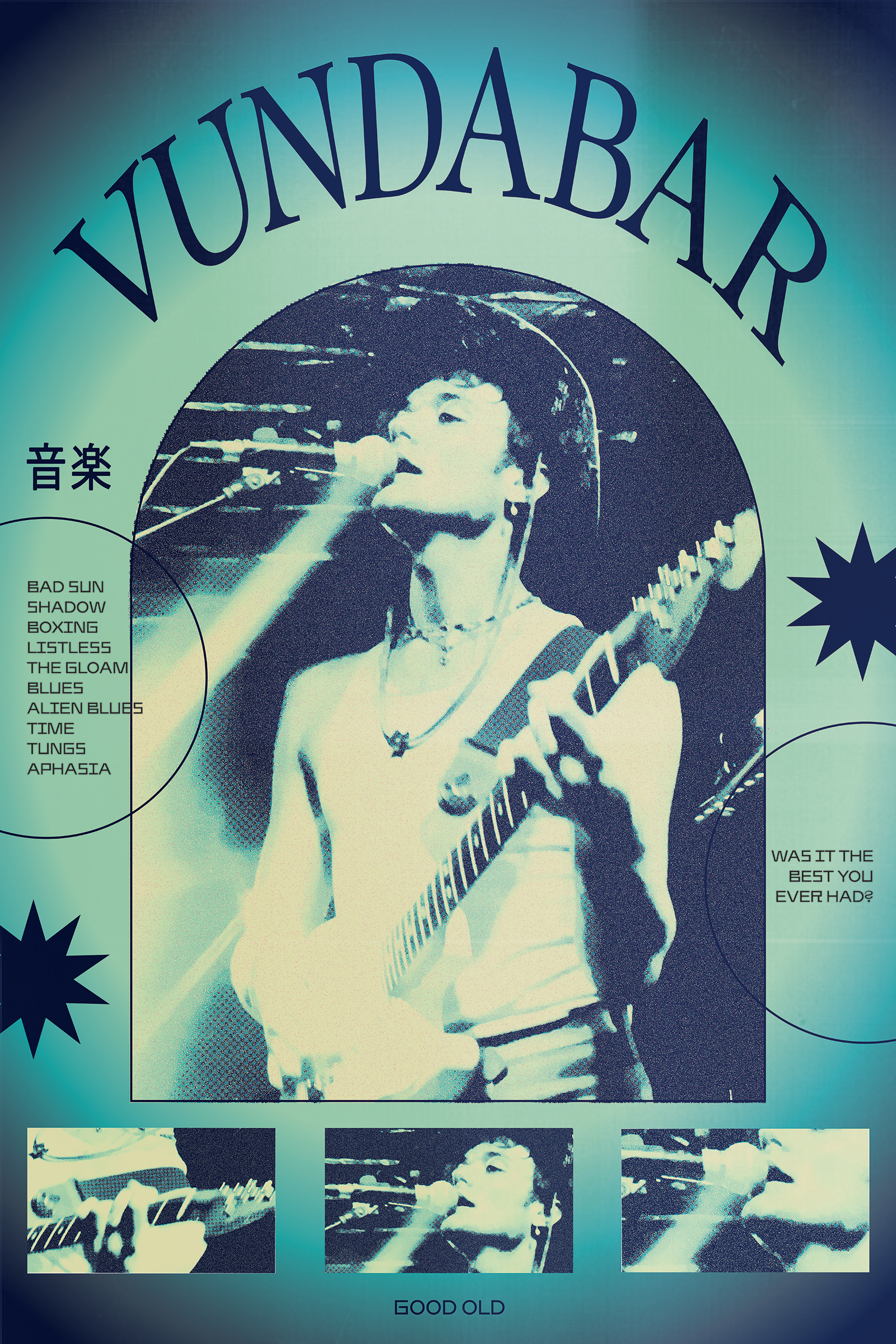
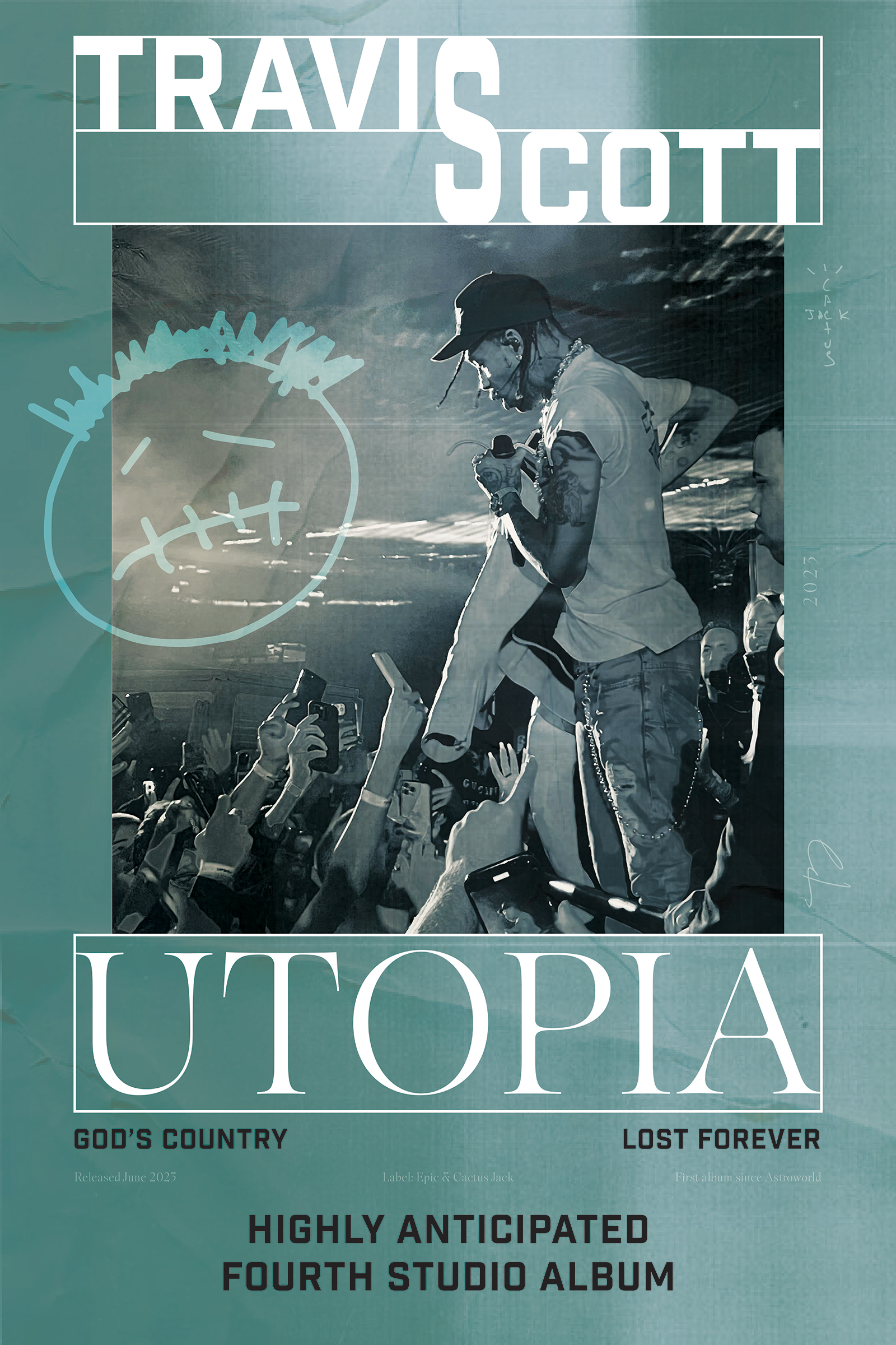
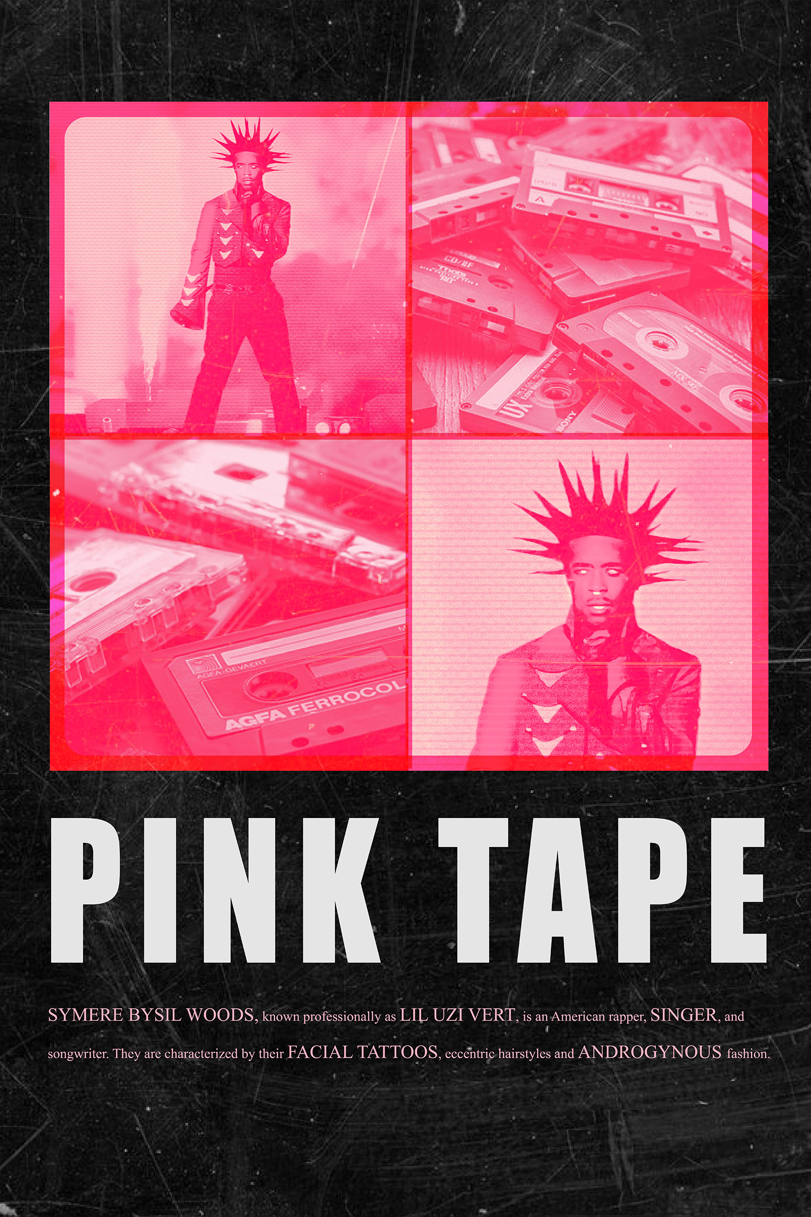
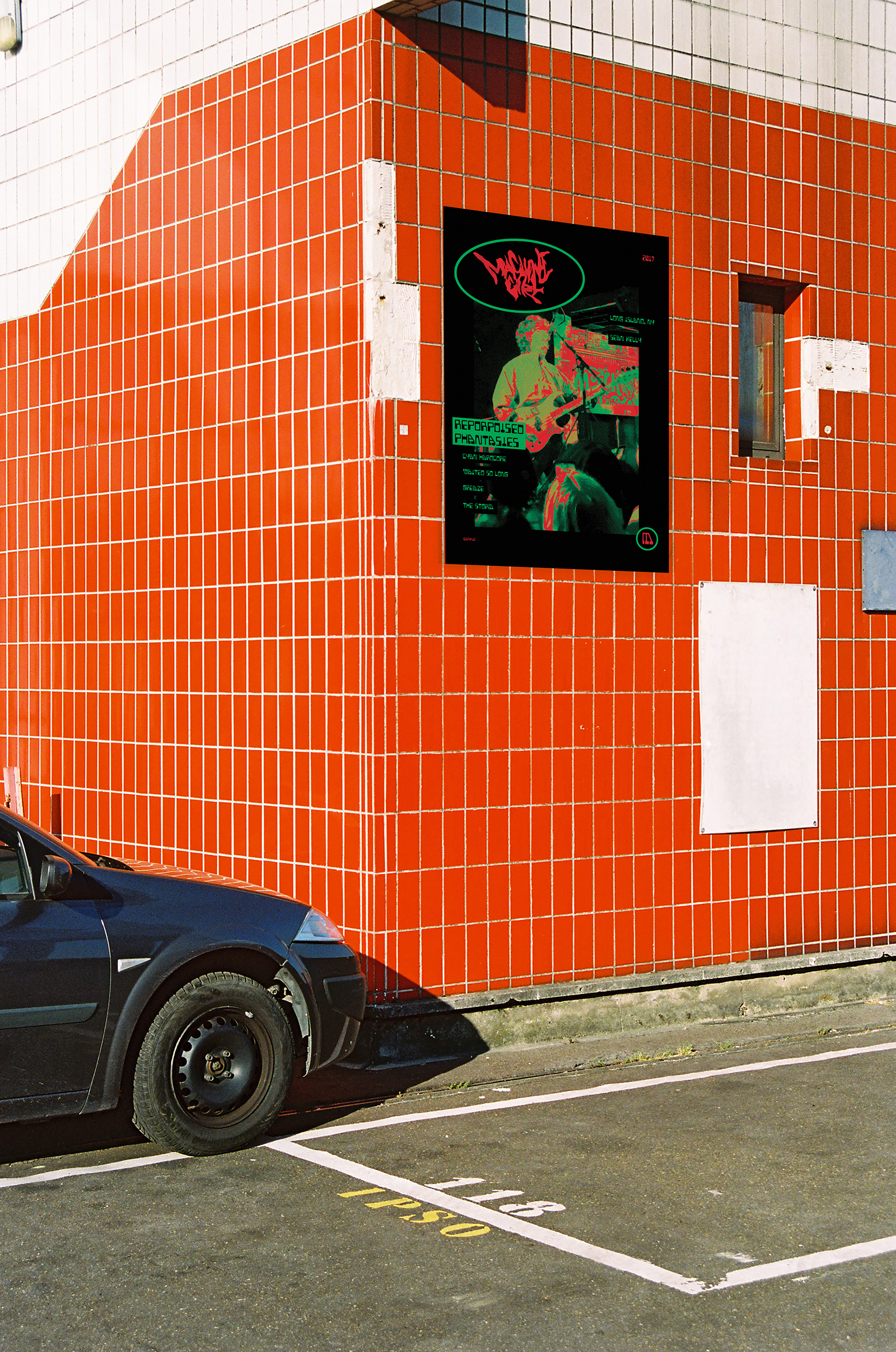
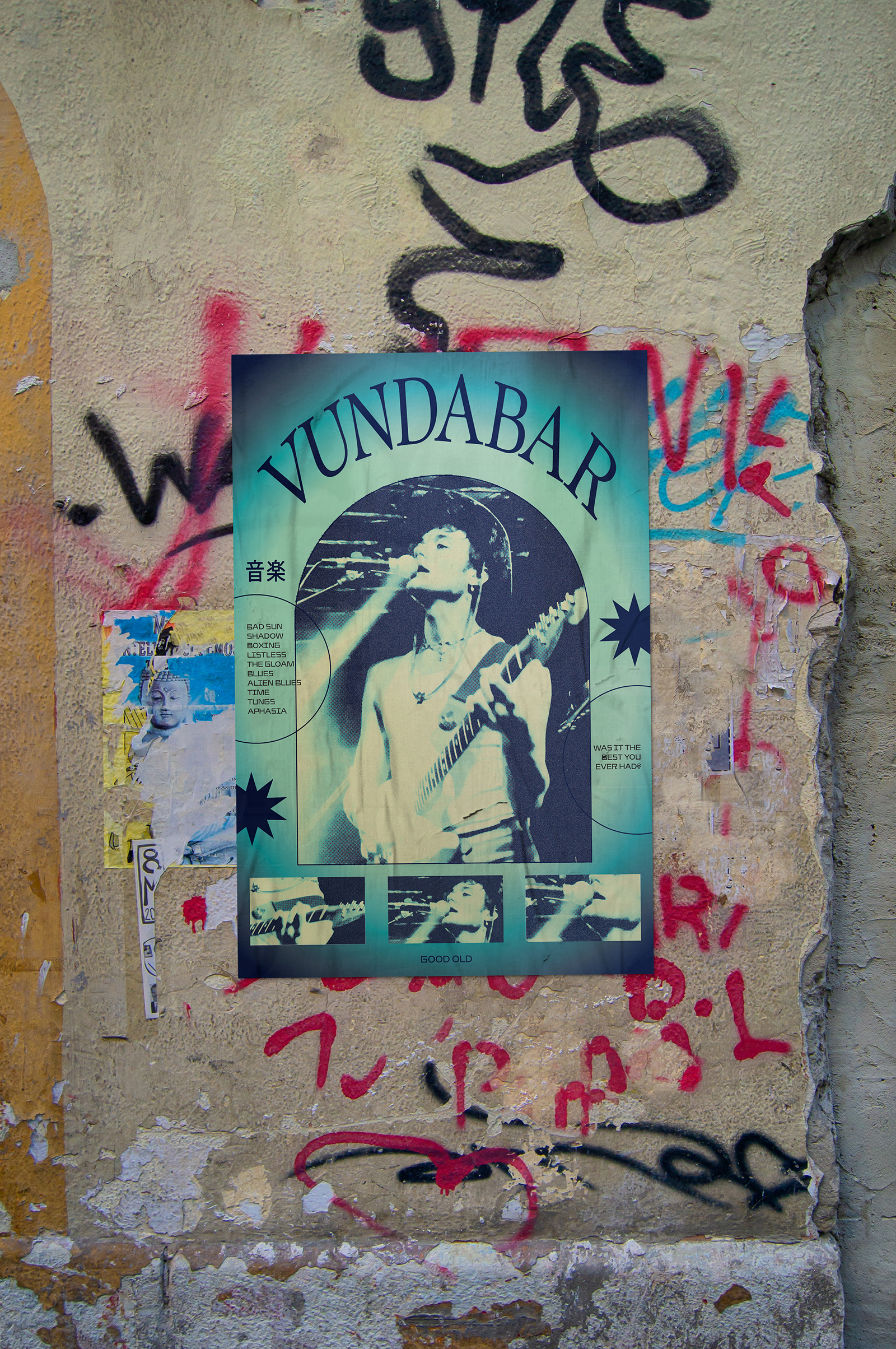
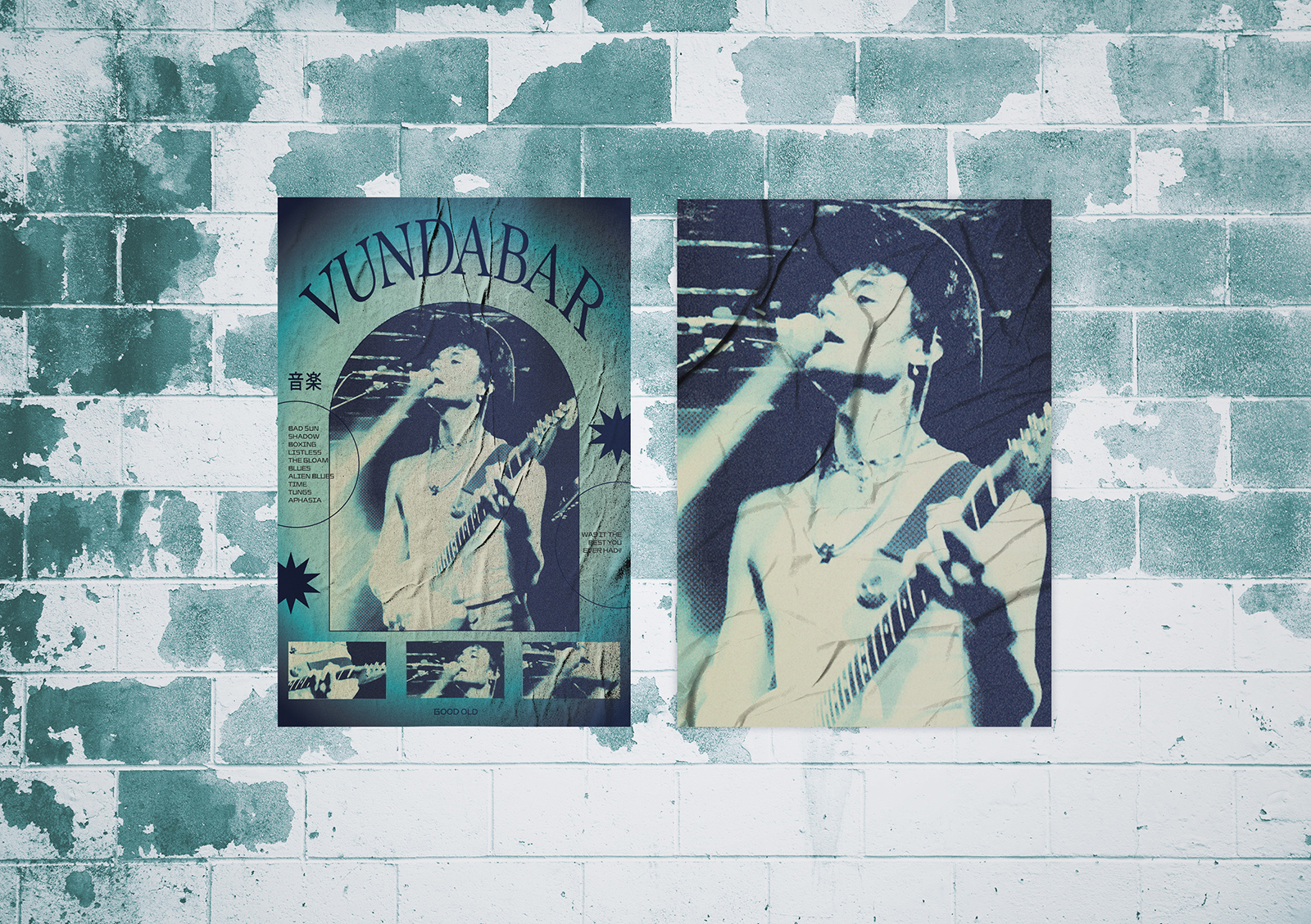
Concert Poster Series
This poster series transforms original concert photography into bold, stylized promotional artwork that captures the raw energy of live performances. Using photos my friend and I shot ourselves at shows, I experimented with high-contrast edits, layered textures, and expressive typography to create unique visuals for different artists and genres. Each poster explores a distinct mood and color palette while maintaining a gritty, music-driven aesthetic that feels authentic to the live experience.
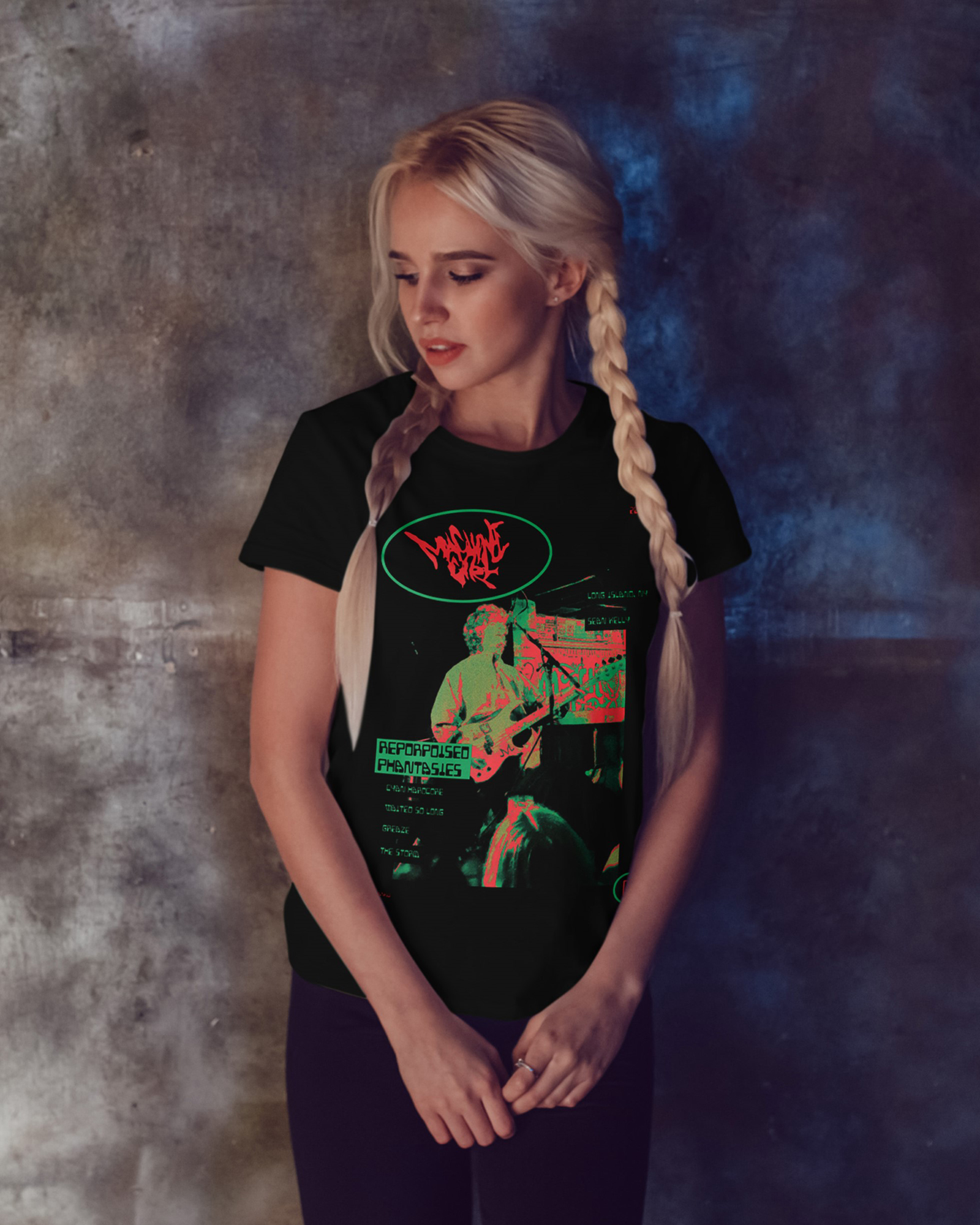
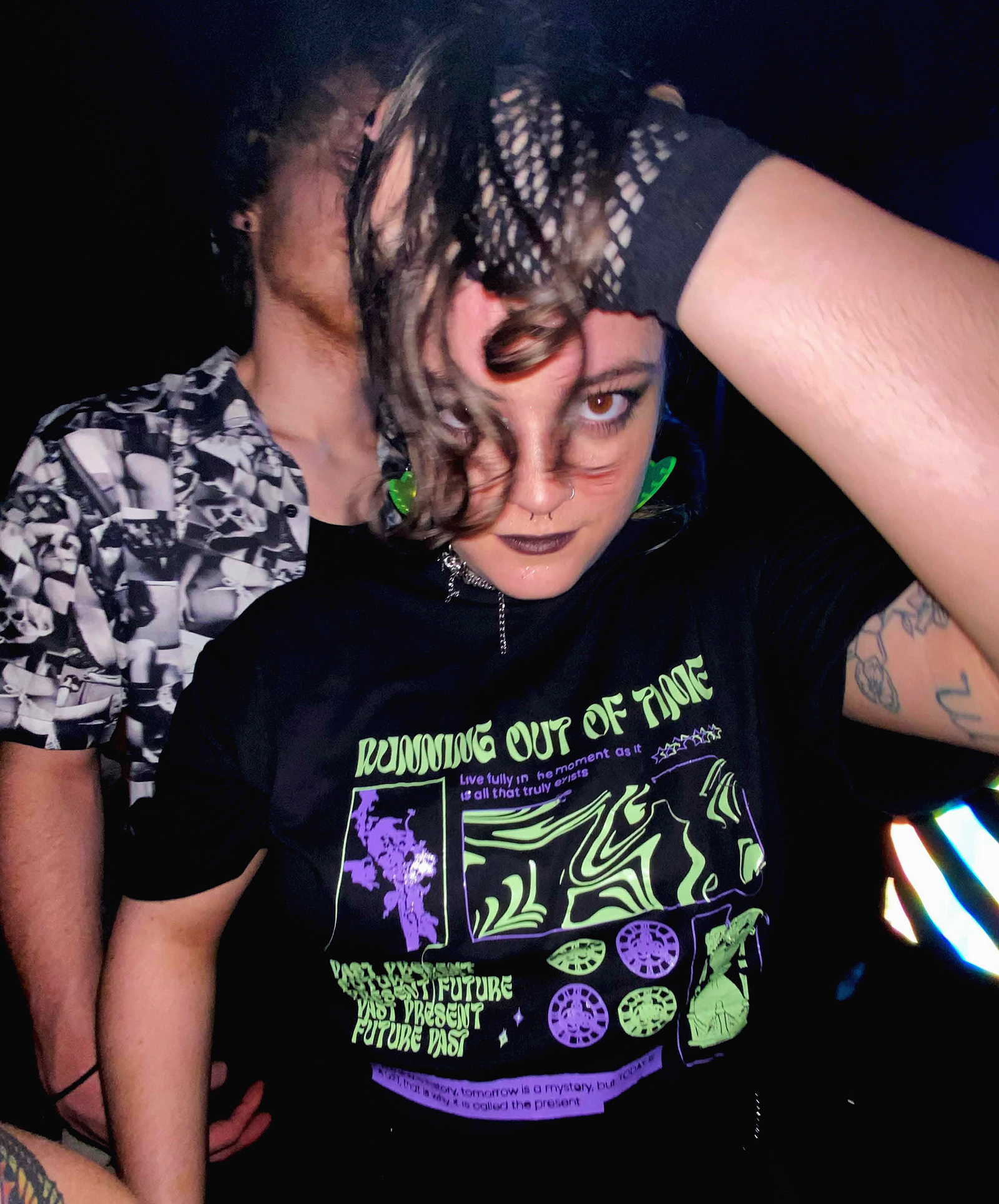
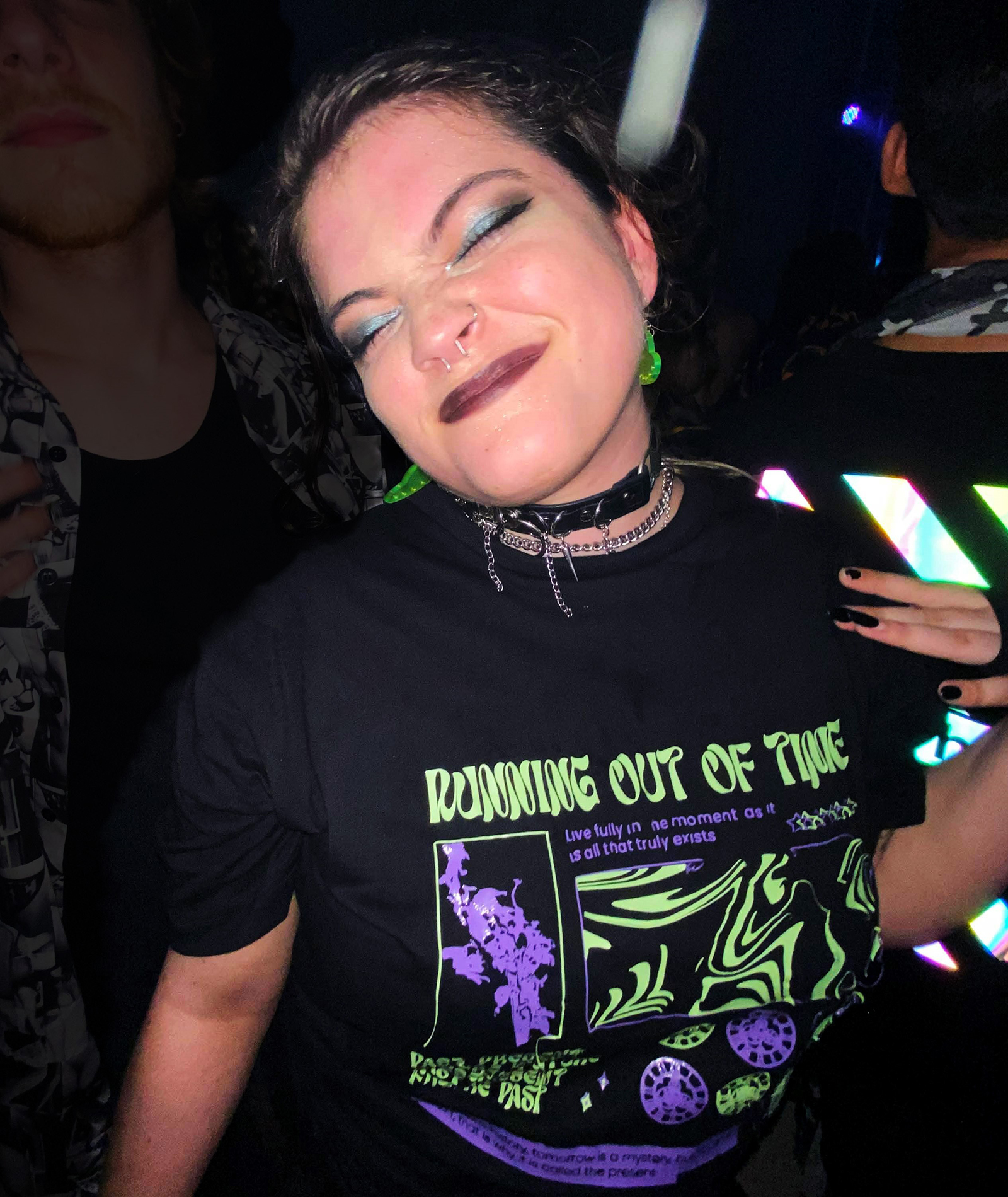
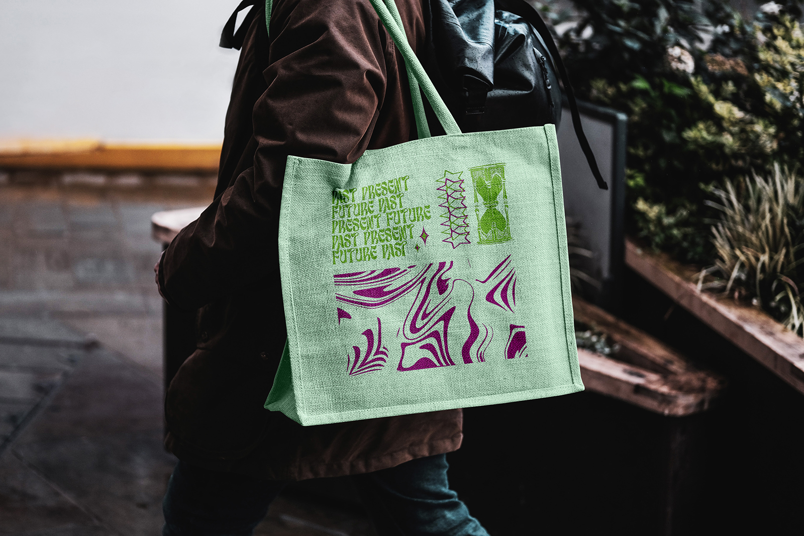
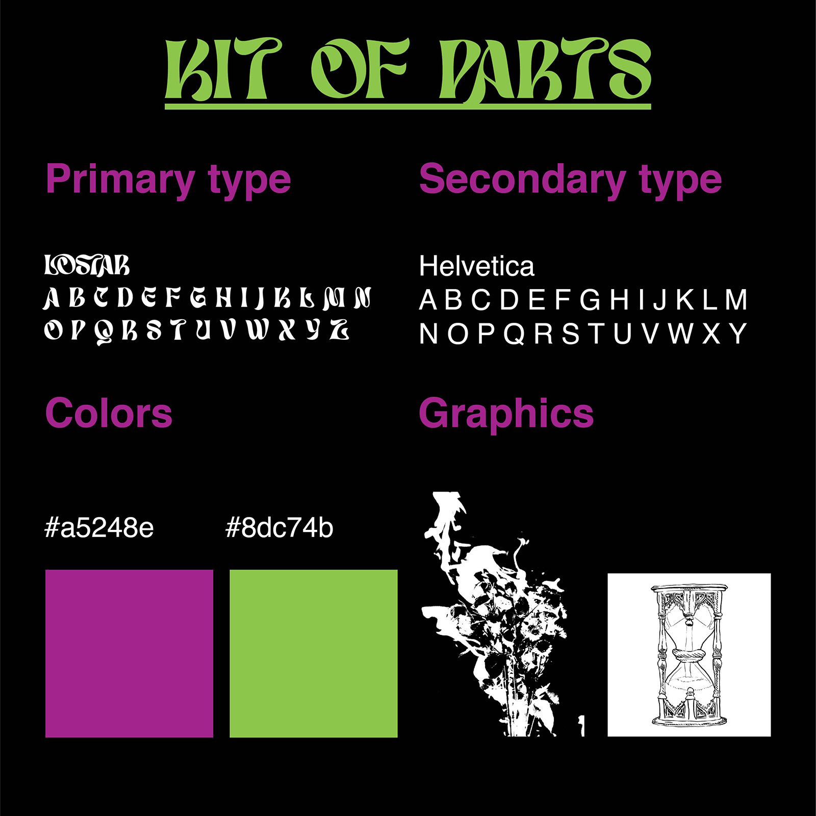
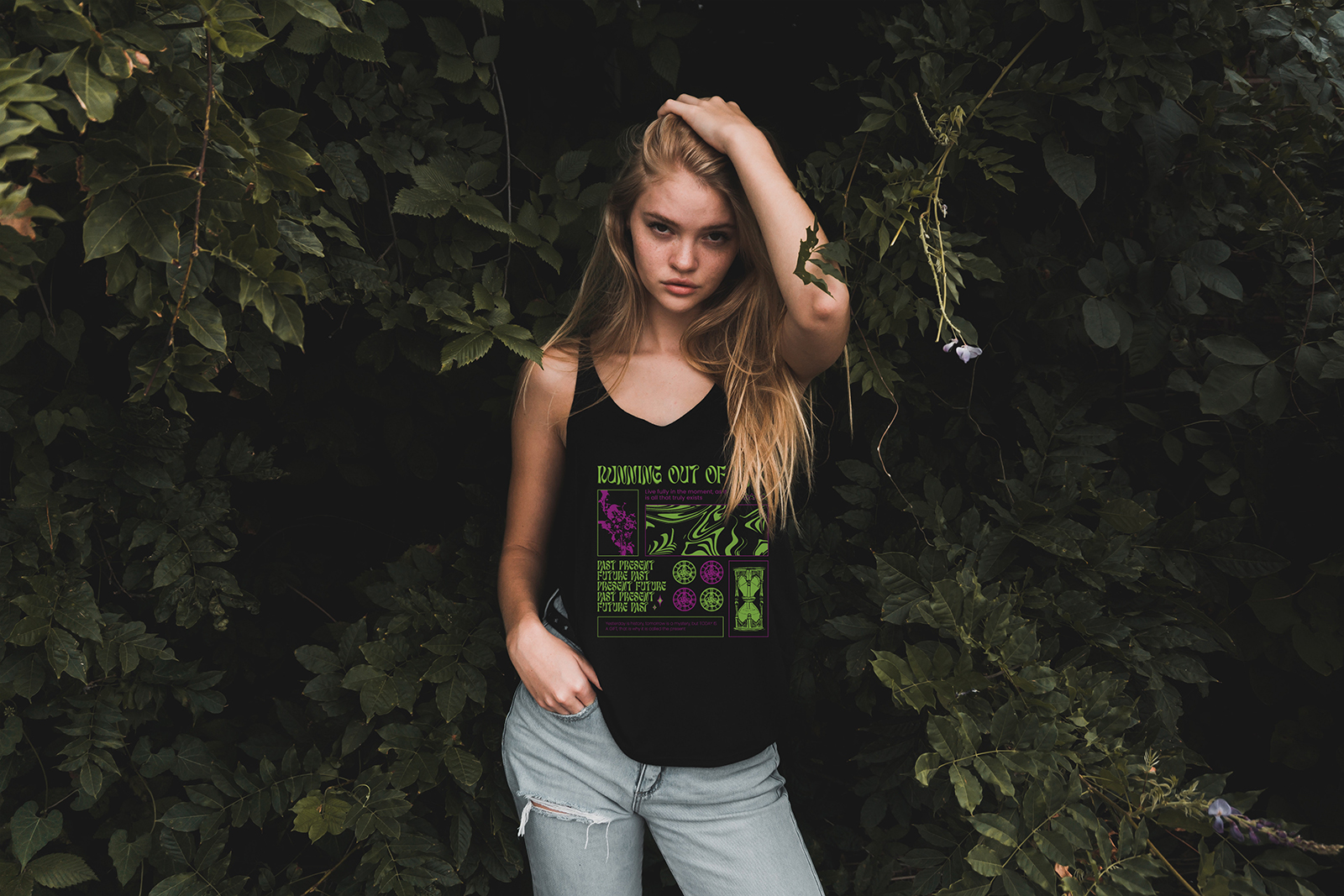
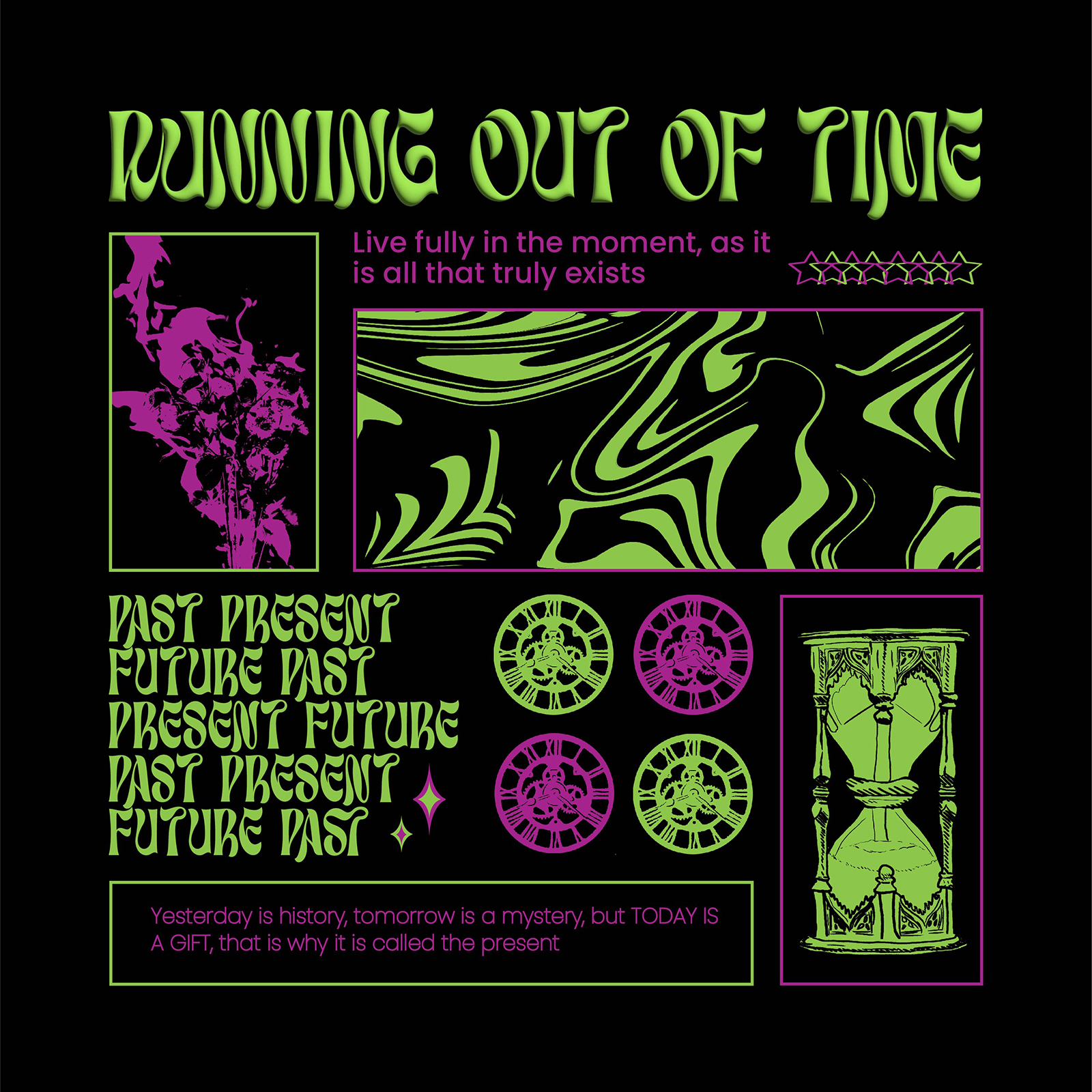
Running Out Of Time
This personal branding project explores a bold, time-bending visual identity applied to apparel and accessories. Centered around a graphic tee and matching tote bag, the design combines distorted typography, psychedelic patterns, and high-contrast neon colors to create a statement look meant for music and nightlife environments. I photographed several of the product shots myself, directing and capturing my friend modeling the shirt at a live concert to showcase how the brand lives and moves in real-world settings.
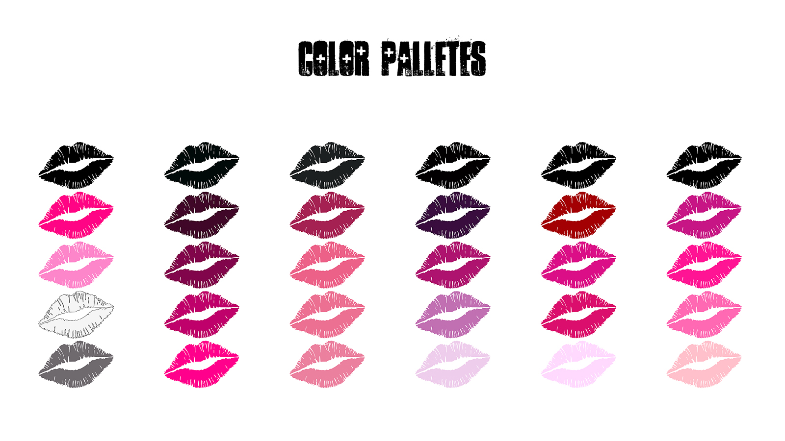
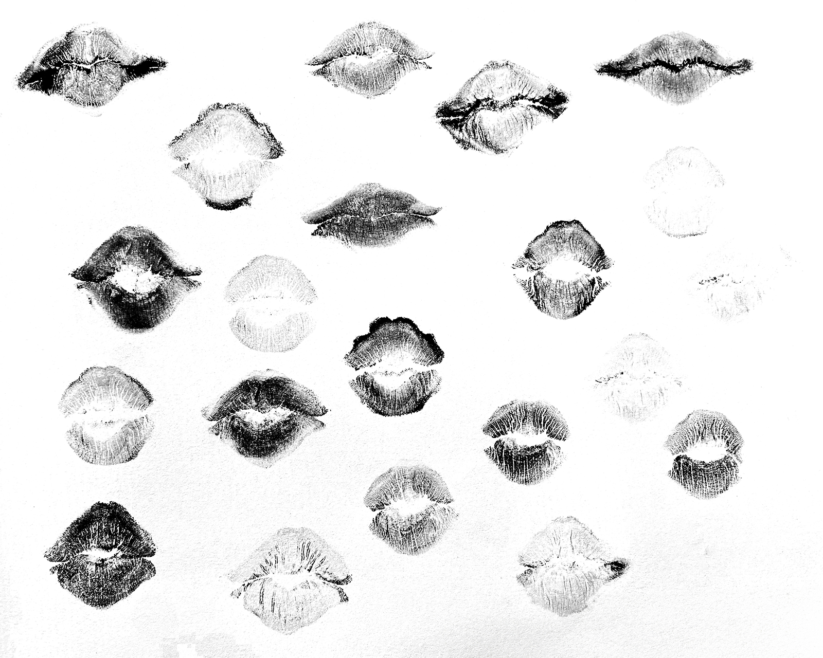
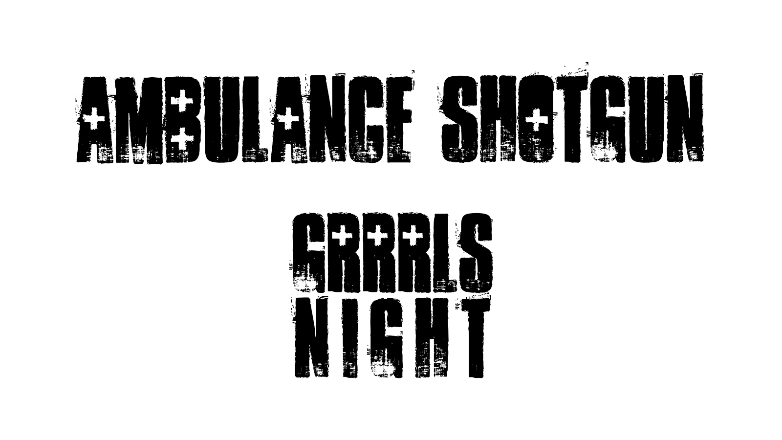
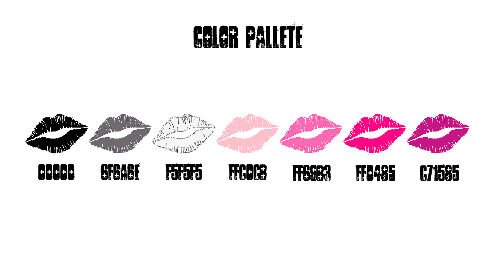
Grrrls Night
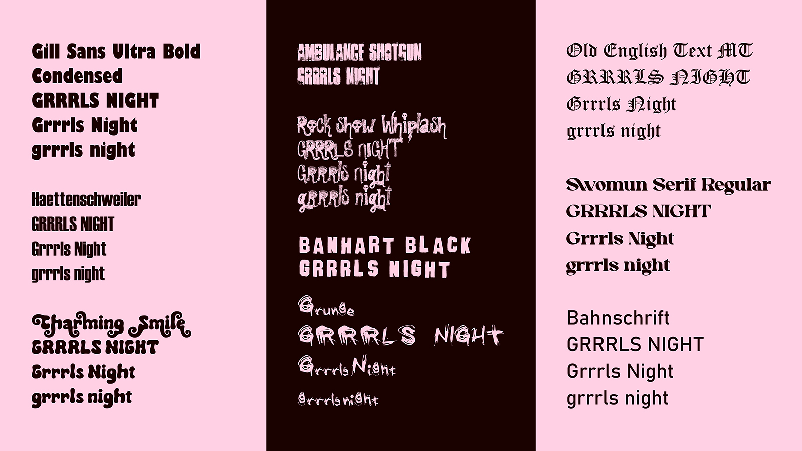
For Grrrls Night, a local event celebrating femme and queer artists, I developed a raw, expressive logo and brand kit that captures the energy of DIY music culture and underground art scenes. The core visual is a lip silhouette I physically created using black lipstick on paper, then scanned and converted into a high-contrast bitmap to preserve its gritty, tactile texture. This analog-to-digital process gives the identity an unapologetically handmade feel that aligns with the event’s focus on authenticity and community. Paired with distressed, heavy typography and a bold palette of hot pinks, blacks, and desaturated neutrals, the system is designed to be loud, flexible, and instantly recognizable across posters, merch, and social graphics while amplifying the voices the event exists to spotlight.
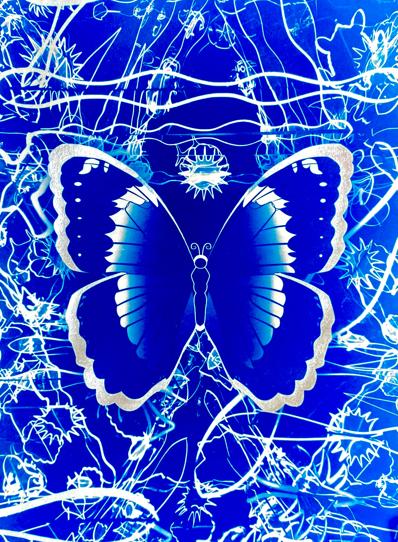
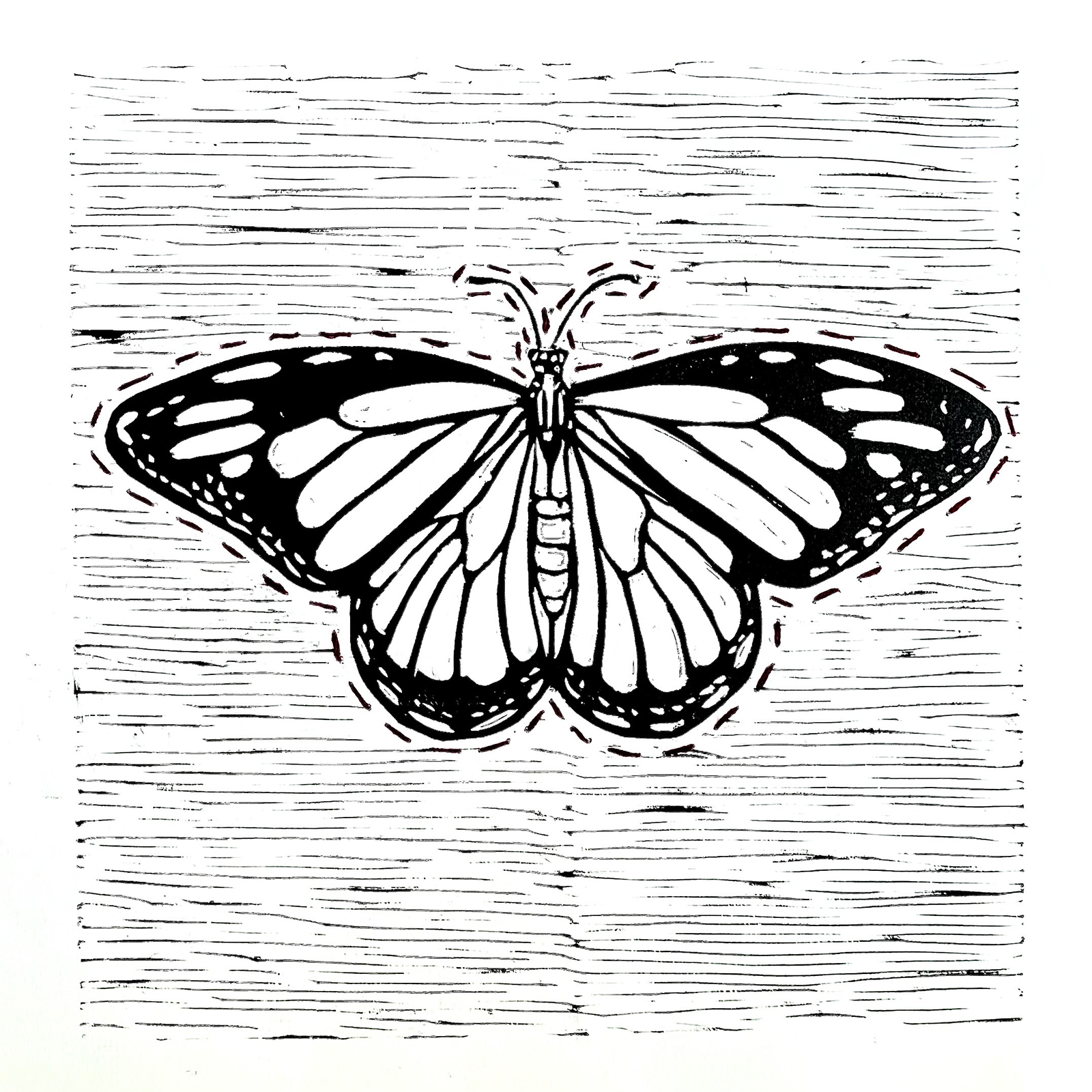
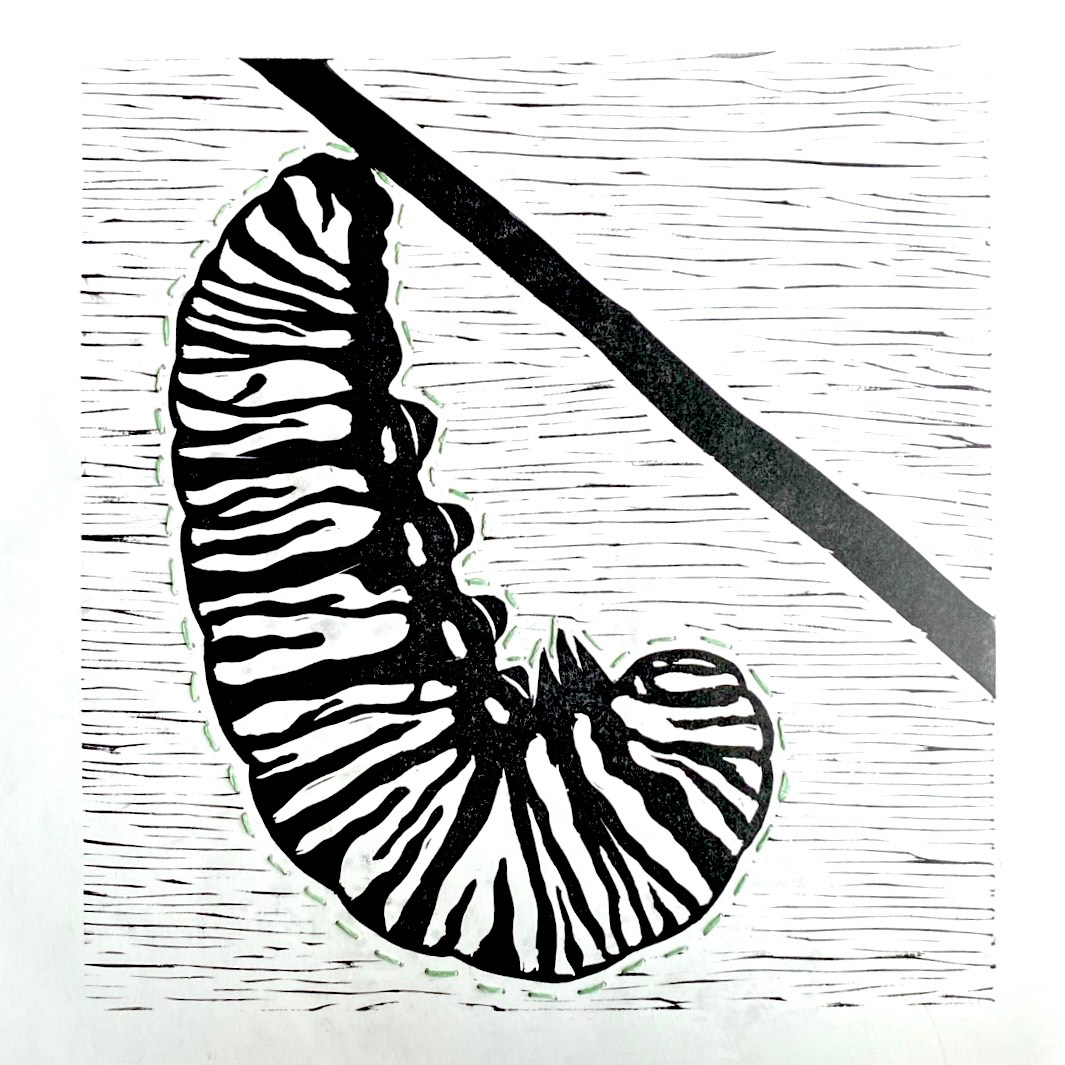
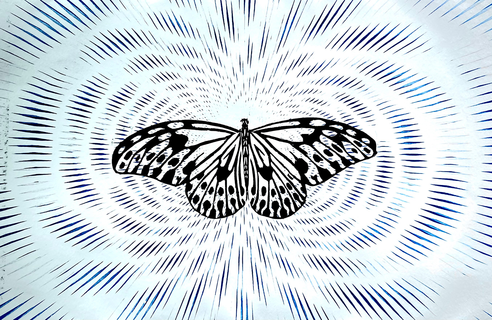
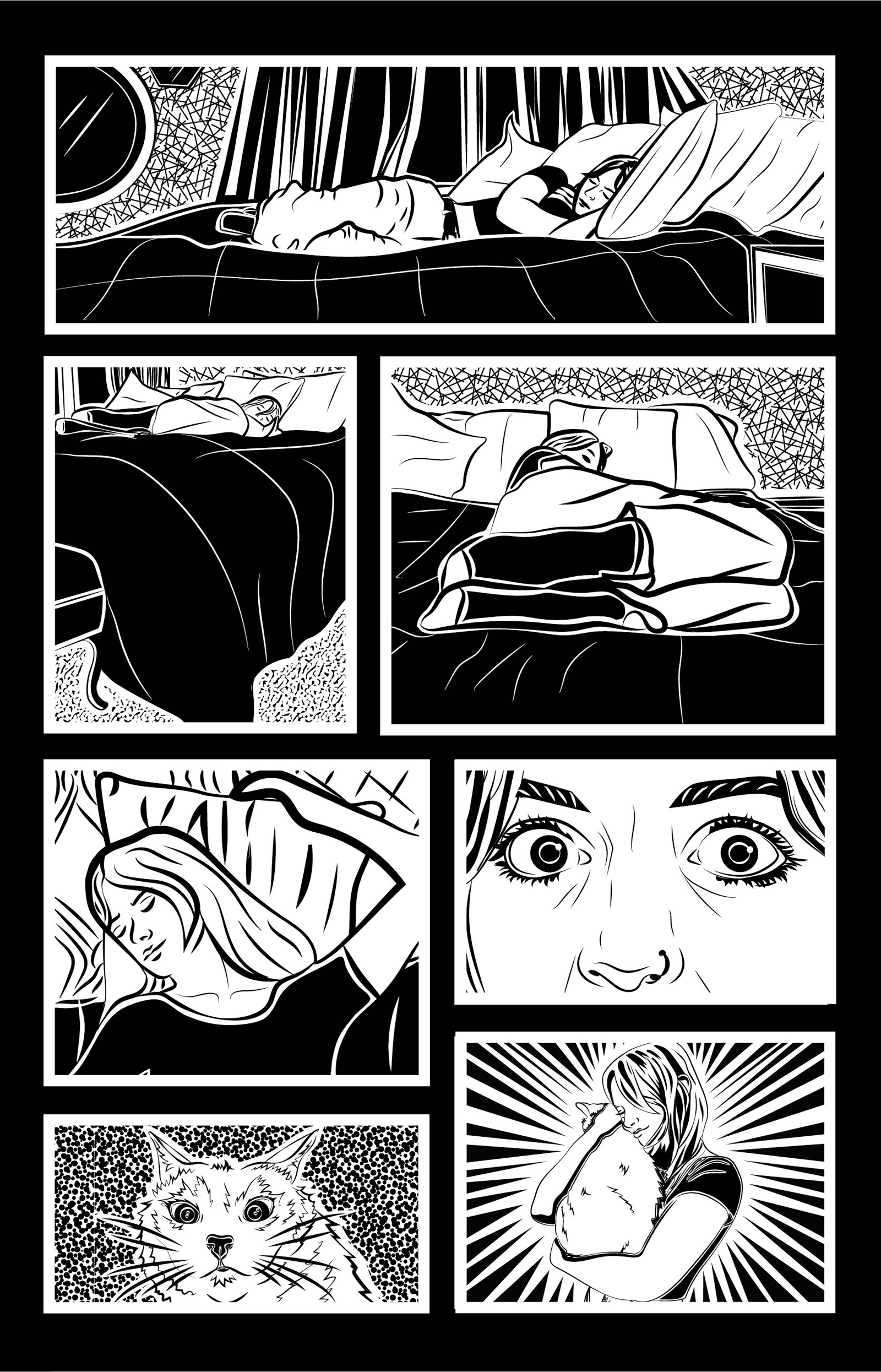
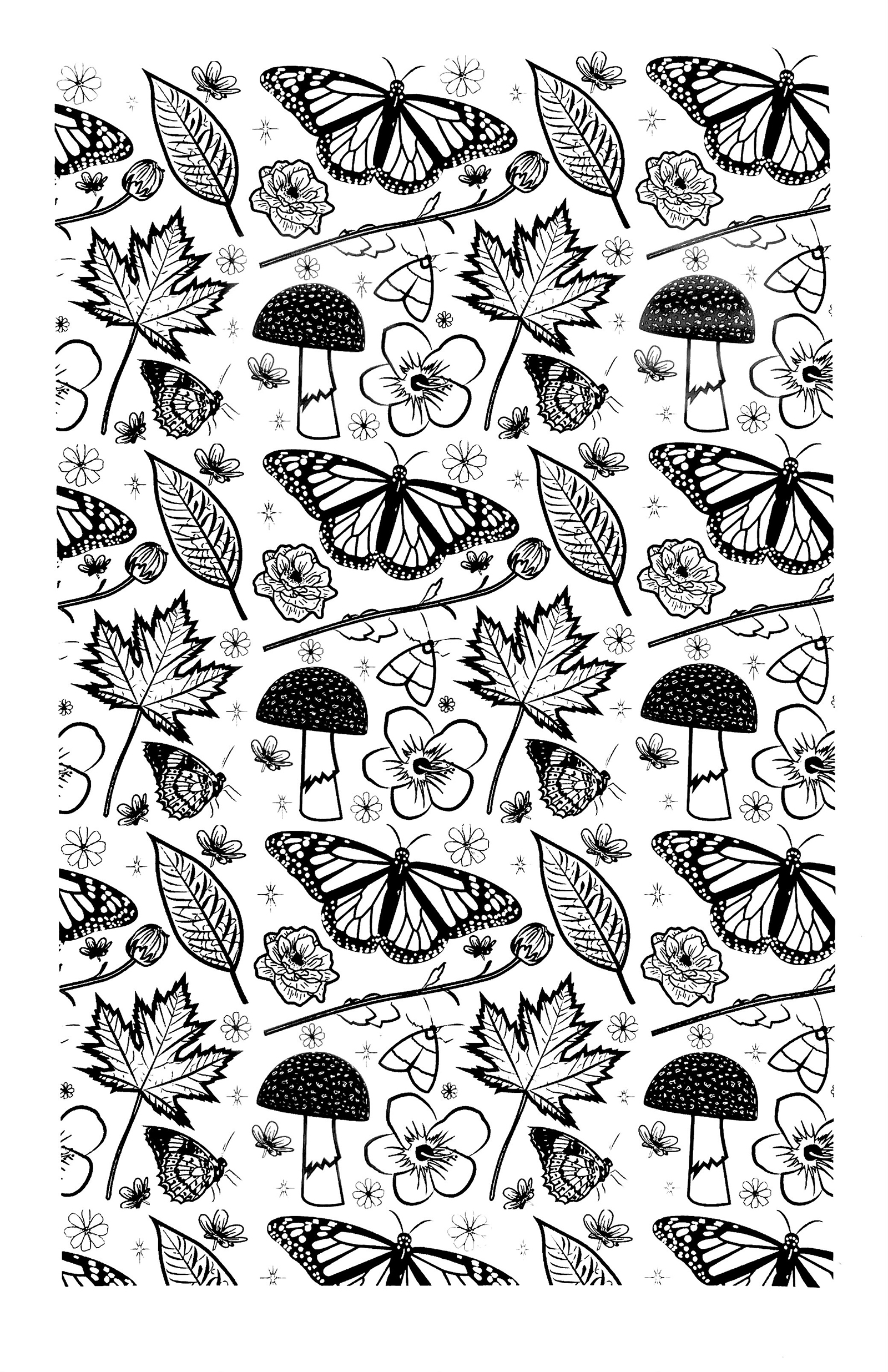
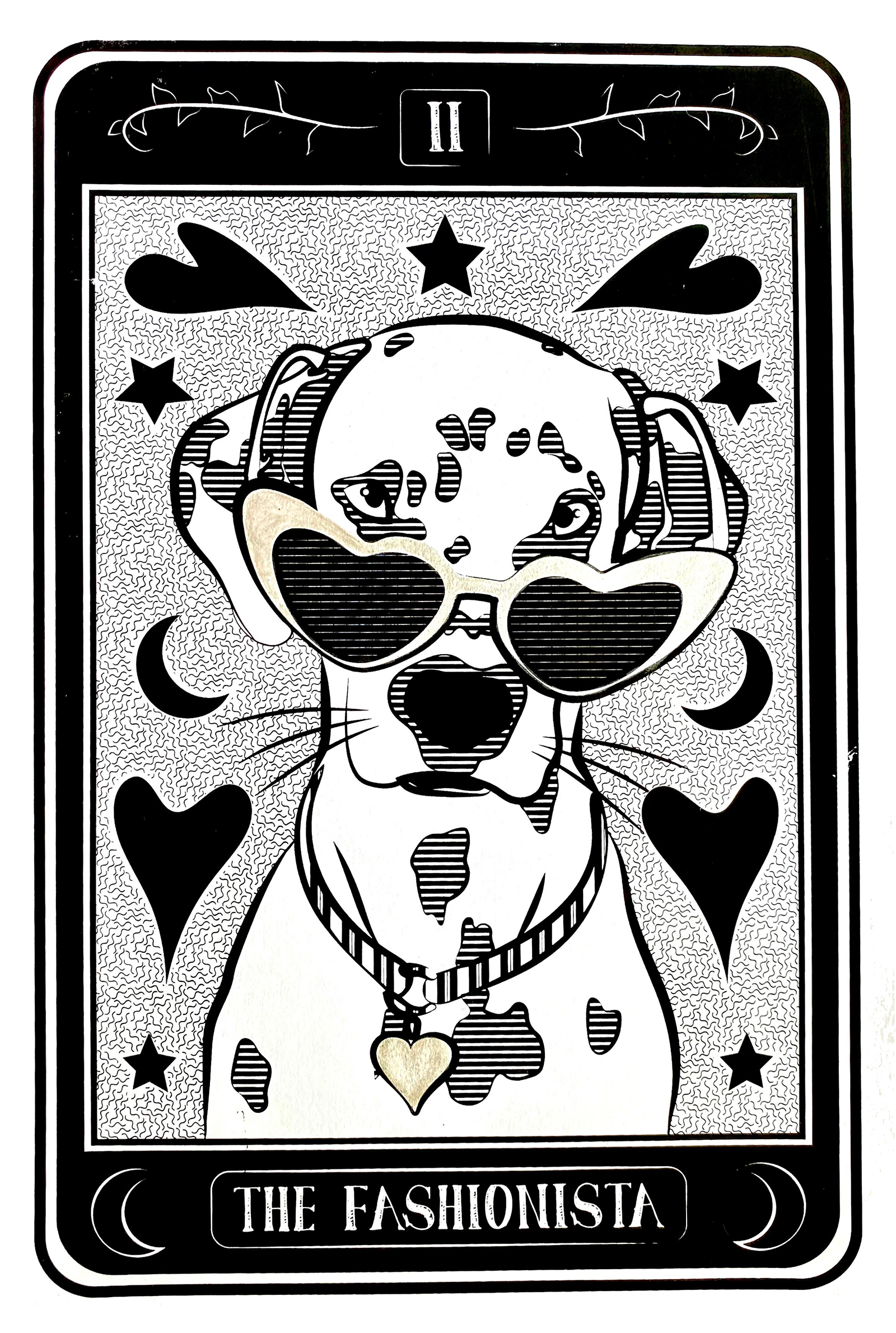
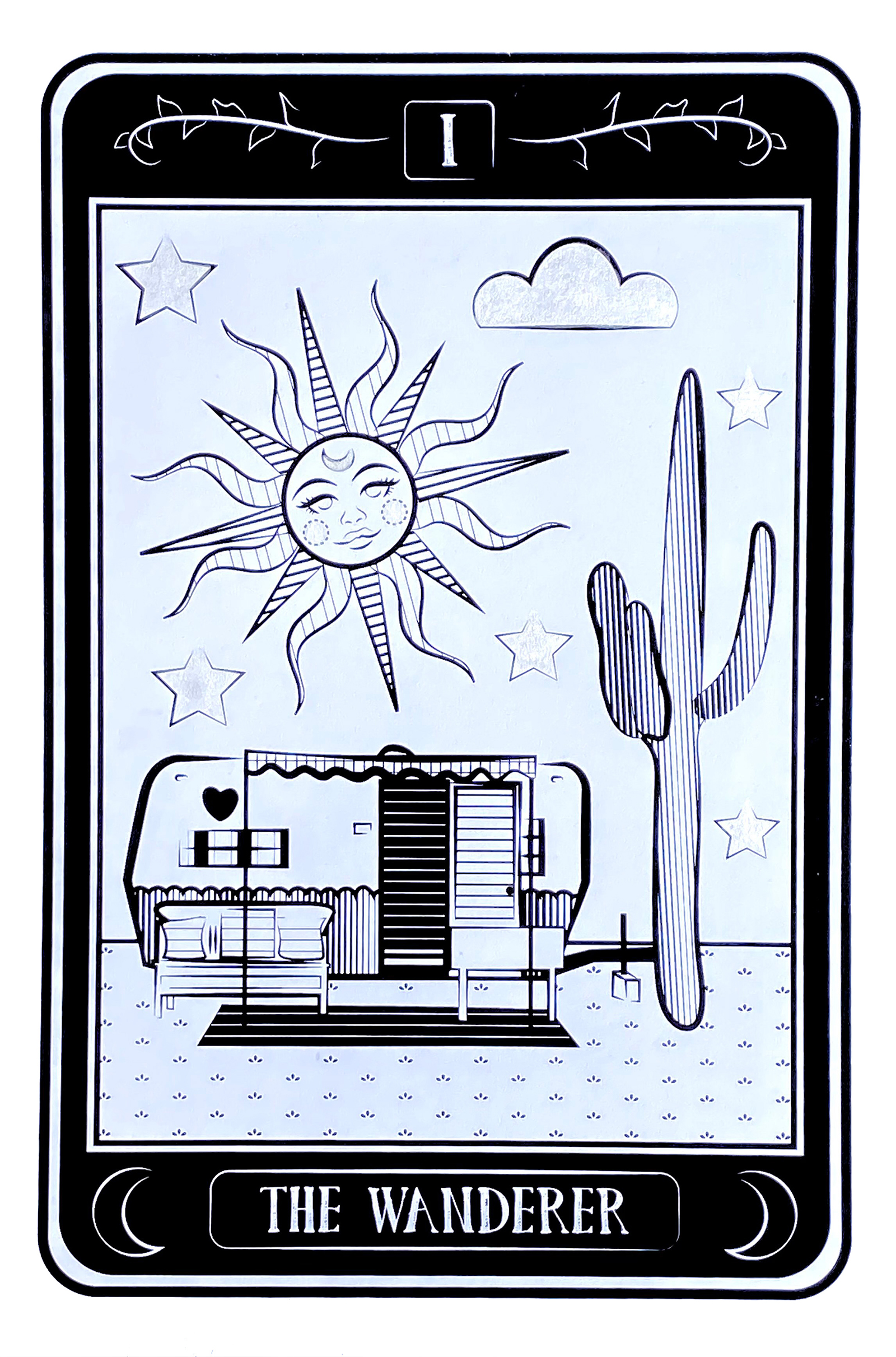
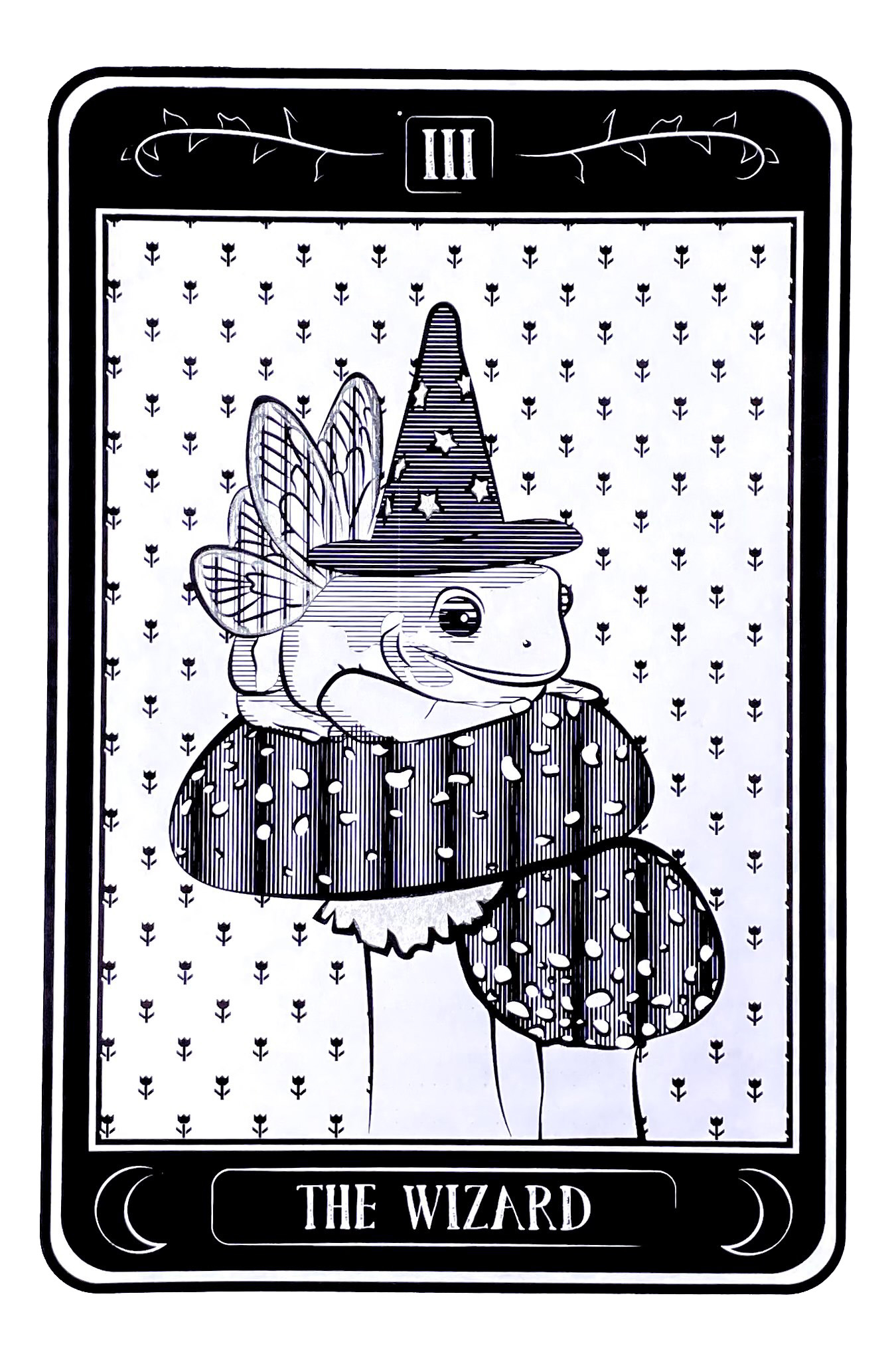
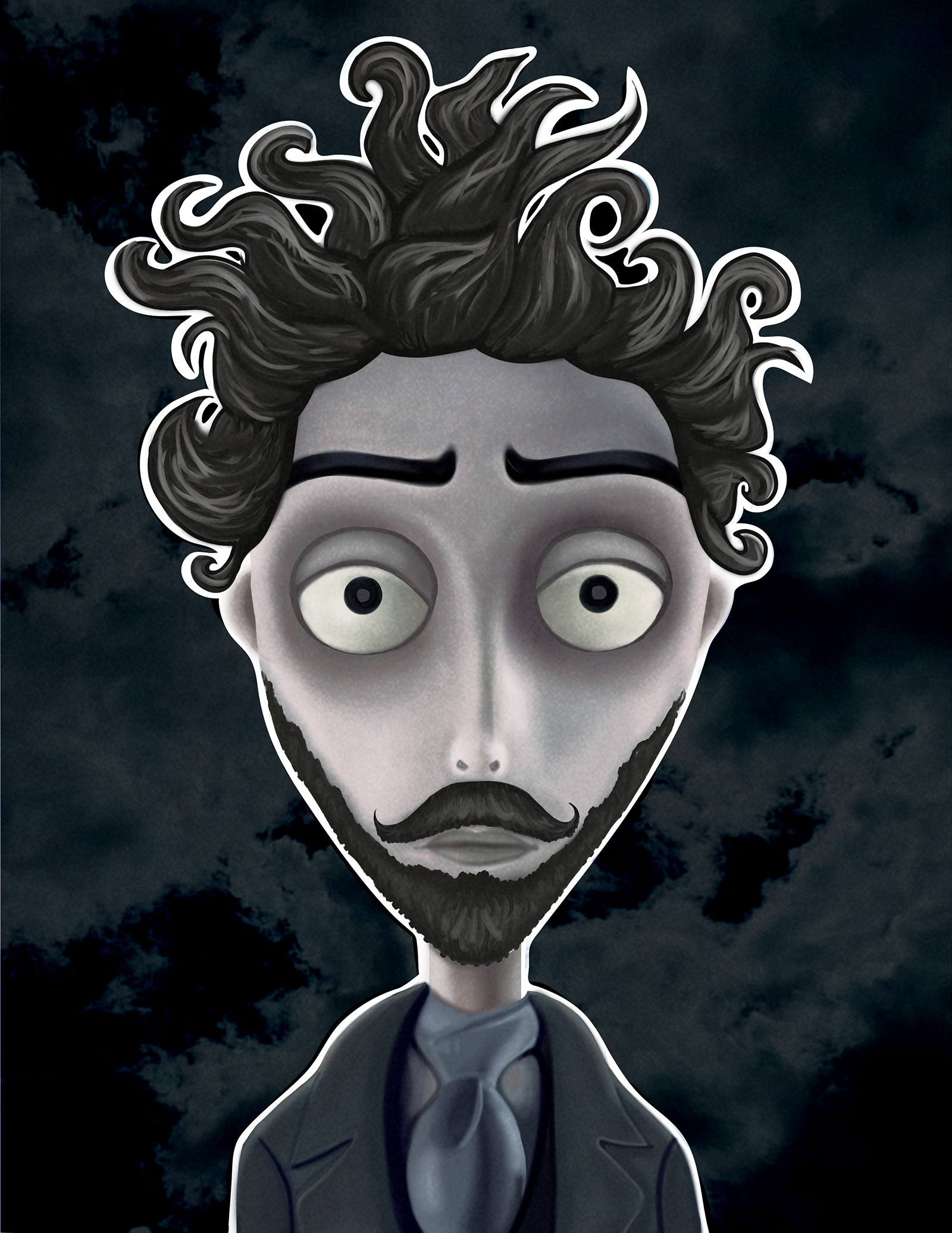
Analog Experiments & Playful Nature Studies
This collection brings together digital illustrations, screenprints, cyanotypes, and linocut prints that all share a slightly edgy, nature-inspired visual language. Animals and organic forms are used as storytelling devices, from a short comic capturing the chaotic humor of a cat abruptly waking its owner, to a whimsical tarot-inspired series featuring scenes like a wandering camper, a wizardly frog, and a sunglasses-wearing fashionista dog. Traditional printmaking processes add texture and unpredictability, with butterfly studies rendered through linocut and cyanotype techniques that emphasize contrast, silhouette, and natural patterning. The series is rounded out by a portrait of Tim Burton interpreted through his signature claymation aesthetic, blending homage with experimentation and reinforcing the overarching theme of surreal, slightly dark, but playful interpretations of the natural world.
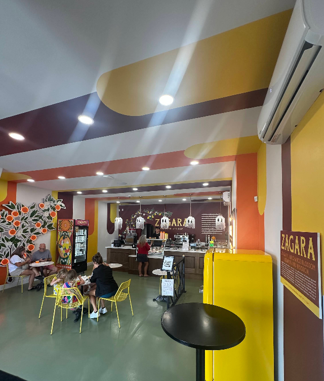
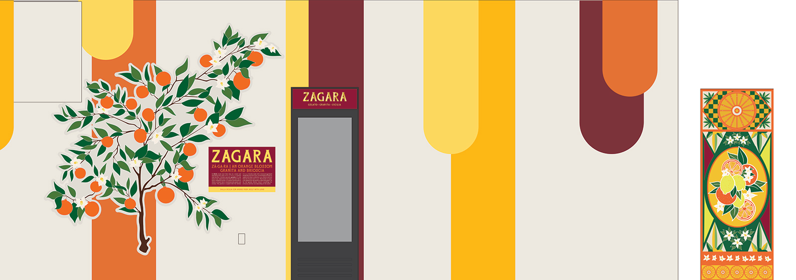
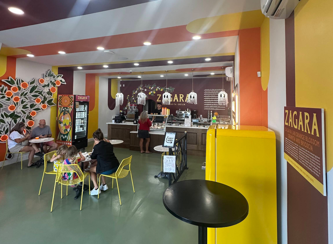
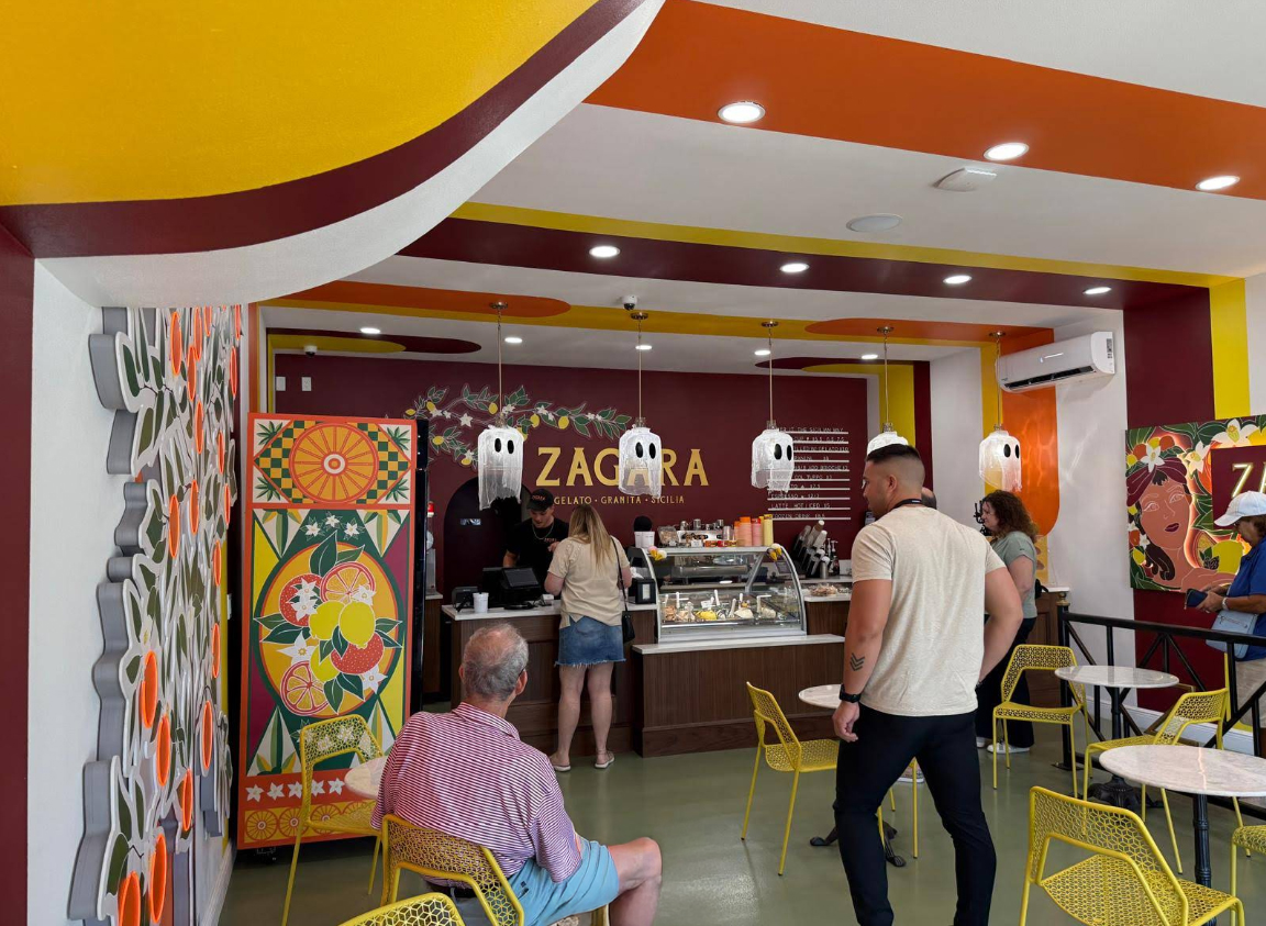
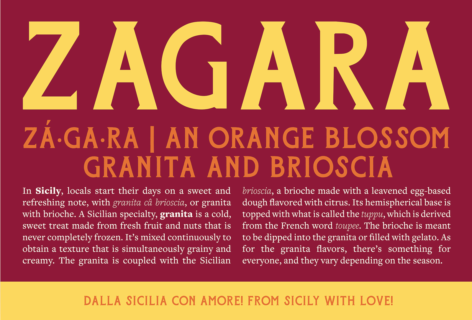
Zagara
Working as part of the team at Creative Arts Unlimited, I helped develop and produce environmental graphics for Zagara Sicilian Gelato, a Sicilian gelato shop inside Mazzaro’s in St. Pete. My role focused on designing a custom informational plaque and a large-format fridge wrap that visually tied the space together through bold Sicilian-inspired colors, citrus motifs, and layered geometric shapes. The plaque combined typographic storytelling with cultural context about granita and brioche, while the fridge wrap translated the brand’s vibrant Mediterranean palette into a functional, eye-catching focal point within the shop. Collaborating closely with the production team ensured the graphics were not only visually cohesive with the surrounding mural elements and orange tree installation but also precisely prepared for print, fabrication, and on-site installation.
Conclusion
Together, these projects showcase a wide-ranging, hands-on approach to design that moves fluidly between digital, print, product, and environmental work. From posters and apparel to large-scale wall graphics and wayfinding elements, each piece balances strong visual storytelling with real-world production and installation considerations.
Final Thoughts
Across mediums and contexts, the common thread is creating work that feels immersive, expressive, and built for its environment—whether that’s a concert venue, a community event, a retail shop, or a public waiting space. These projects highlight adaptability, collaboration, and a consistent focus on turning bold creative concepts into tangible, functional experiences.
