Sweetscape Terrarium Cake
Sweetscape is a DIY terrarium cake brand designed for a packaging course, turning dessert into a playful, plant-inspired experience. The kit invites users to build and decorate their own lifelike “terrarium” cake, blending baking, creativity, and whimsical botanical visuals into one interactive treat.
Hours to Complete
Brand Colors
Packaging Mockups
15+
7
4
Overview
Completed
November 2023
My Role
Graphic Designer
Scope
Brand concept development, packaging design, illustration, character design, typography selection, layout design, instructional graphics, and nutrition label formatting.
Tools
Photoshop and Illustrator
The project focuses on creating an engaging, step-by-step experience that feels equal parts baking kit and creative craft. Every panel of the box is designed to guide the user intuitively, from ingredient prep to final decoration, while maintaining a cohesive visual story around miniature, plant-like forms. Playful illustrations and clear instructional graphics transform technical baking directions into something inviting and easy to follow, encouraging experimentation rather than perfection.
The structural layout treats the packaging as both container and communication tool, using bold hierarchy and color blocking to separate information such as instructions, ingredients, and brand storytelling. By combining friendly character design with clean, functional labeling, the package balances whimsy and clarity, making the product feel giftable, interactive, and display-worthy even before it’s opened.
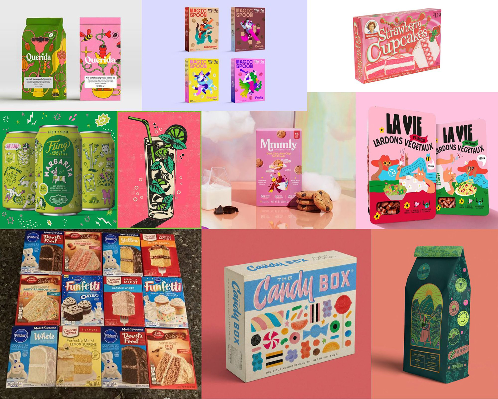
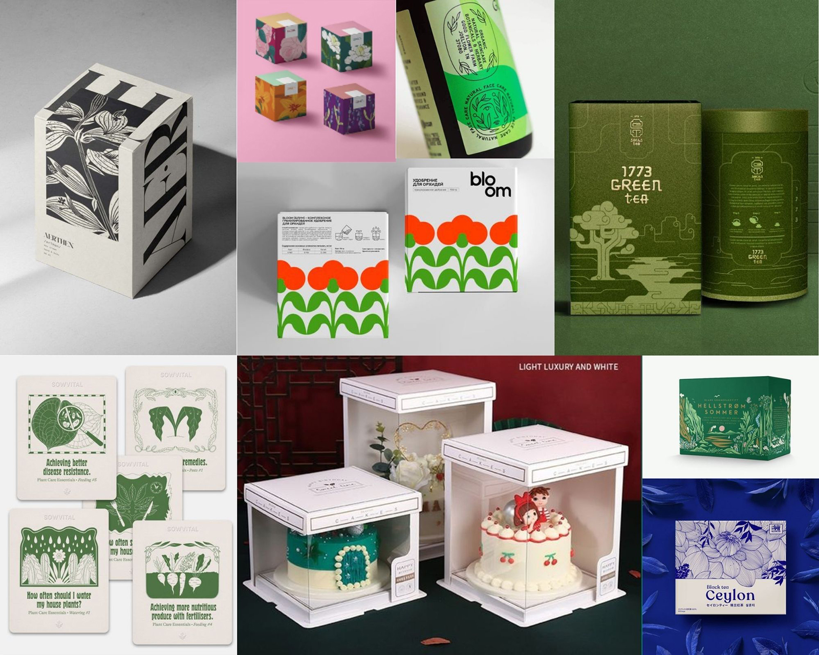
Moodboard
This moodboard blends whimsical dessert branding with lush, plant-inspired visuals to define the tone of Sweetscape. Rounded typography, pastel palettes, and friendly illustration styles are paired with structured, giftable box formats and garden-like motifs, establishing a balance between cute and curated. The references highlight how confectionery packaging can feel both collectible and alive, guiding the direction toward a product that looks handcrafted, colorful, and rooted in the visual language of miniature terrariums and blooming plants.
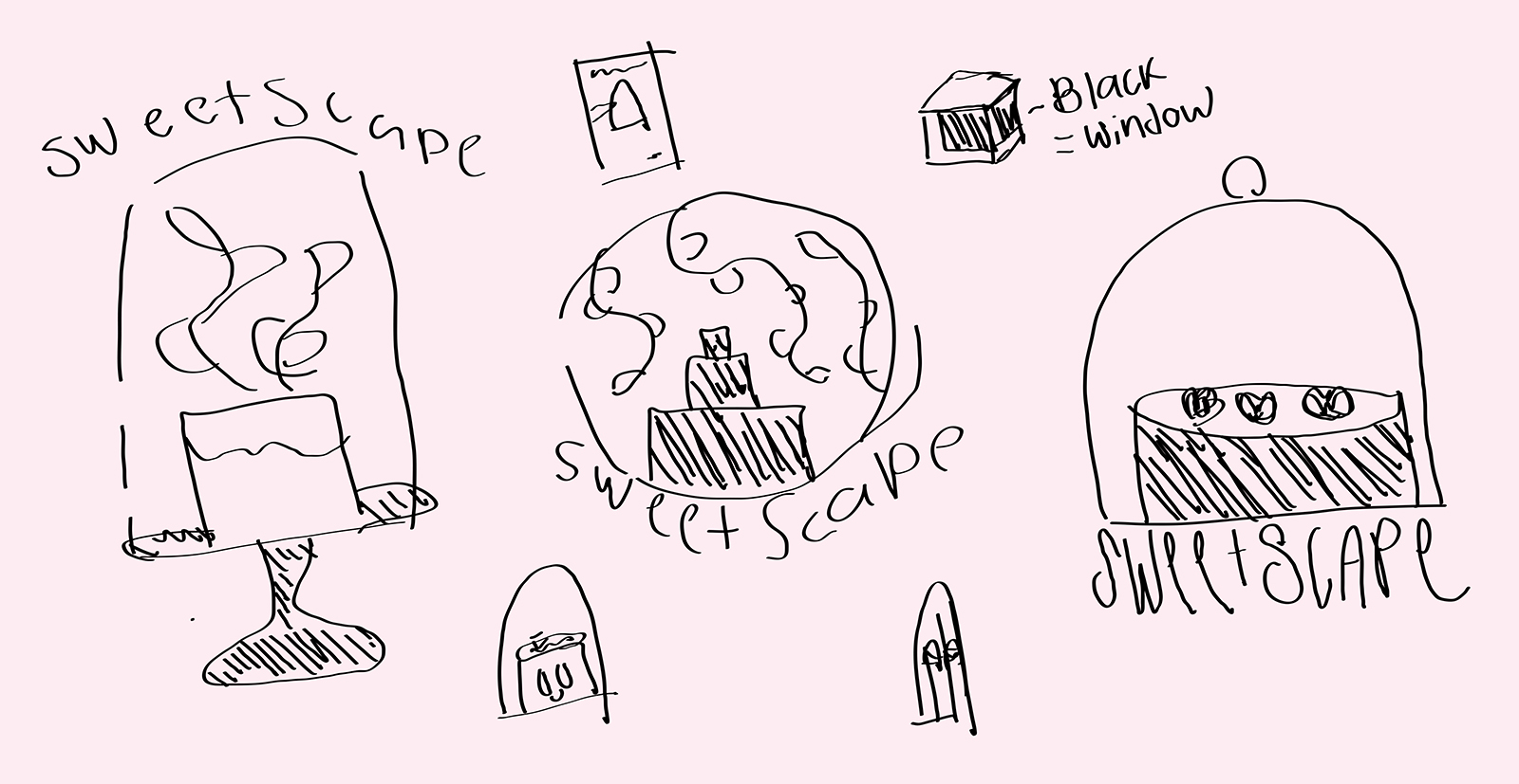
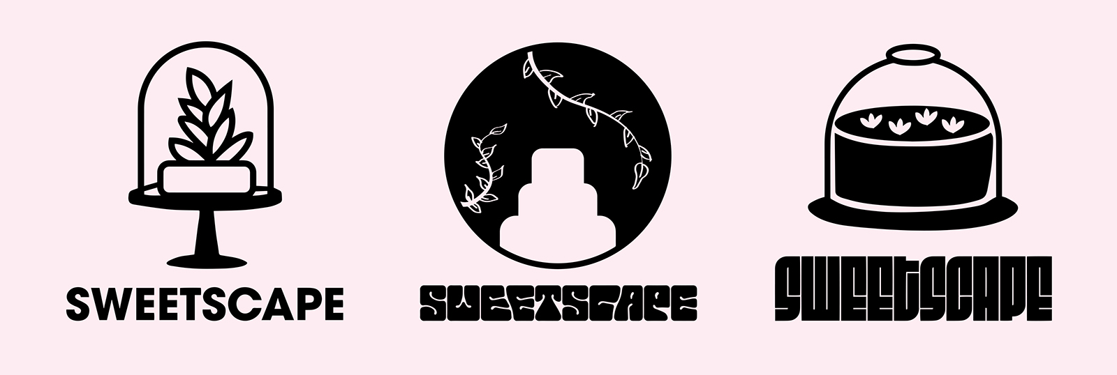
Early Concept Sketches & Icon Exploration
The initial sketches focused on translating the idea of a living terrarium into simple, recognizable silhouettes. Hand-drawn concepts experimented with domed glass covers, plant forms, and tiered cakes to find a symbol that clearly communicated both “dessert” and “botanical display.” These rough explorations were then refined into clean, minimal icons that could scale across packaging, labels, and small brand touchpoints. By reducing the idea to bold shapes and high-contrast marks, the final icons capture the whimsical, contained-garden feeling of a terrarium while remaining versatile and instantly readable as a cake brand.
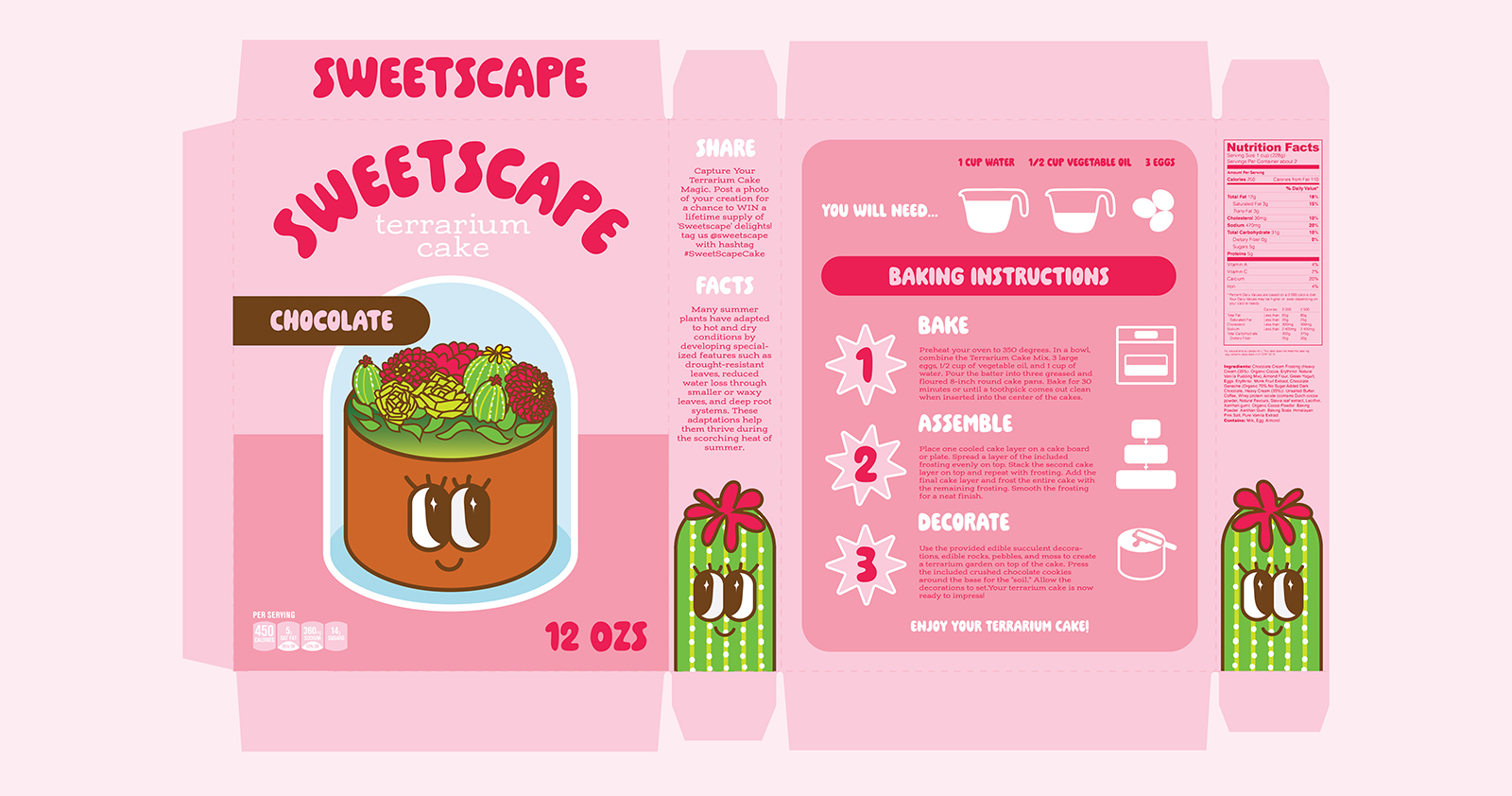
2-D Packaging Layout
The flat dieline translates the brand into a fully functional, print-ready package that balances playful visuals with clear, step-by-step guidance. Large, friendly typography and the smiling terrarium cake illustration anchor the front panel, while the surrounding sides deliver instructions, ingredients, and decorative details in an organized, easy-to-follow flow. Soft pink tones and rounded shapes create an inviting, candy-like feel, and repeating plant motifs tie every face of the box together so the design remains cohesive from every angle once assembled.
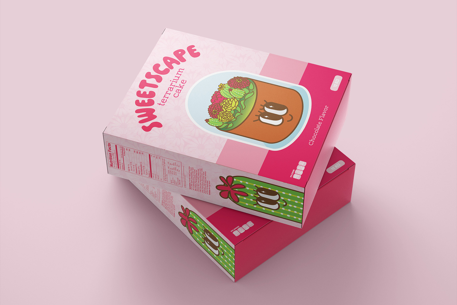
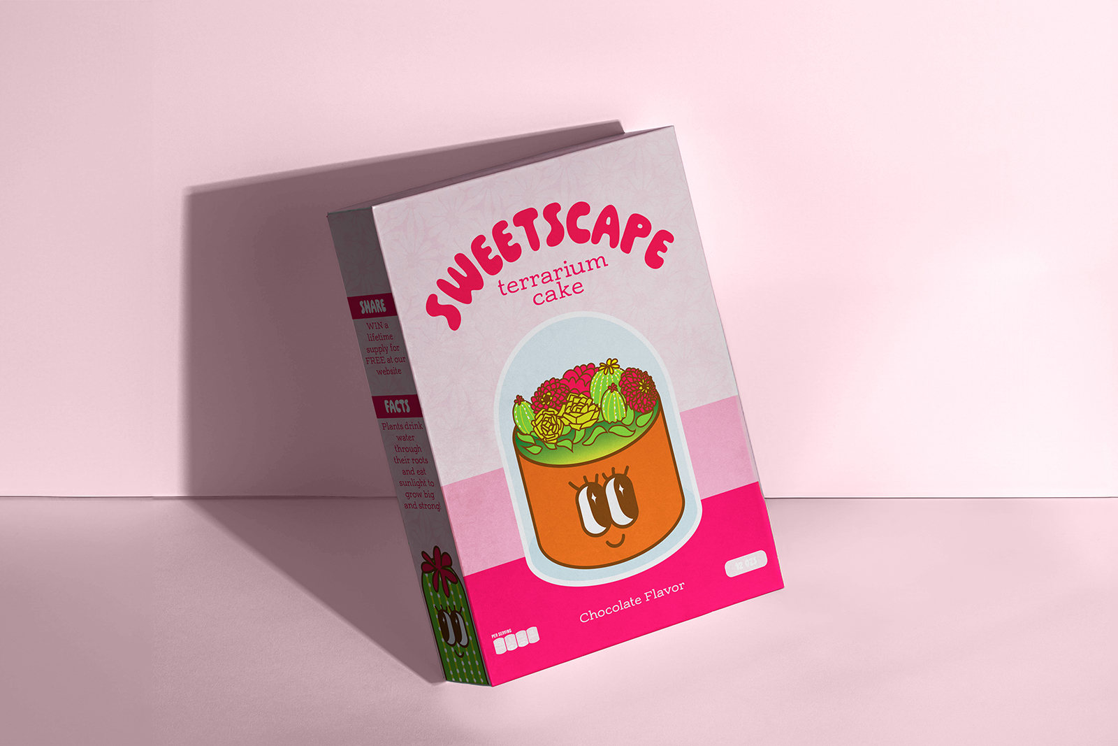
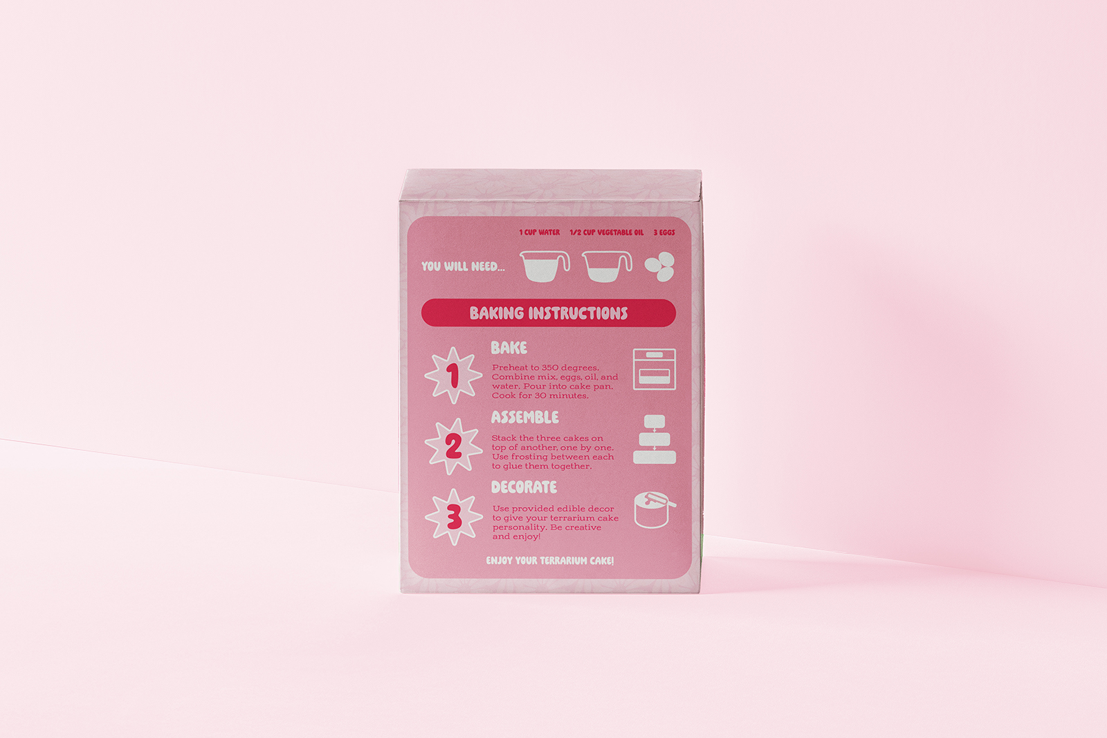
Final Packaging Mockups
The final mockups showcase the assembled box from multiple angles to demonstrate how the design wraps seamlessly around the structure. Viewing the packaging in 3D highlights the terrarium window, bold front branding, and illustrated side panels working together to create a giftable, display-worthy product. These perspectives confirm that the playful colors, clear instructions, and decorative plant elements stay cohesive and legible no matter how the box is handled or displayed.
Conclusion
This project transforms a simple cake mix into an interactive, visually engaging experience through thoughtful packaging and playful branding. By combining clear instructions with imaginative visuals, the design turns baking into a creative activity rather than just a recipe.
Final Thoughts
Sweetscape demonstrates how packaging can elevate a product into something memorable, giftable, and fun to build. It reflects my interest in blending illustration, storytelling, and structure to create designs that feel both functional and alive.
