The Art of Forensics
This exhibit uses forensic art and scientific facial reconstruction to visualize unidentified remains, giving visitors a chance to recognize and identify missing loved ones. I developed the branding, wayfinding system, and supporting apparel and stationery to create a respectful, clear, and cohesive experience around this sensitive and impactful work.
Unique Icons
Hours to Complete
Wayfinding Elements
16
20+
4
Overview
Completed
February 2023
My Role
Graphic Designer
Scope
Brand identity, wayfinding system, icon design, signage, apparel design, stationery design
Tools
Illustrator, Photoshop, and Ink
This project explores how visual communication can support forensic investigation and public awareness by humanizing unidentified cold cases. Centered on scientific facial reconstructions of unknown remains, the exhibit invites visitors to recognize and potentially identify missing loved ones, requiring a visual system that is both respectful and highly legible. The branding and wayfinding are built around abstract human silhouettes formed from ink and fingerprint experiments, where naturally pooling ink creates suggestive details like facial features or hair, symbolizing identity emerging from evidence. These organic marks became a flexible icon language used across signage, apparel, and stationery, creating a cohesive, empathetic environment that guides visitors clearly through sensitive and emotionally charged content.
The Challenge
The exhibit needed to communicate complex forensic science and deeply emotional subject matter in a way that was clear, respectful, and accessible to the general public. Traditional crime or investigation aesthetics risked feeling cold or sensationalized, while overly soft visuals could undermine the scientific credibility of the reconstructions. The design had to guide visitors smoothly through sensitive content while preserving the individuality and dignity of each unidentified person.
The Solution
A minimal, human-centered visual language was developed using organic ink and fingerprint silhouettes to represent identity emerging from evidence. These abstract icons created a consistent, empathetic wayfinding system that felt investigative yet personal, avoiding both sterility and dramatization. Paired with restrained typography and clear spatial hierarchy, the system helps visitors navigate the exhibit intuitively while keeping focus on recognition, remembrance, and potential identification.
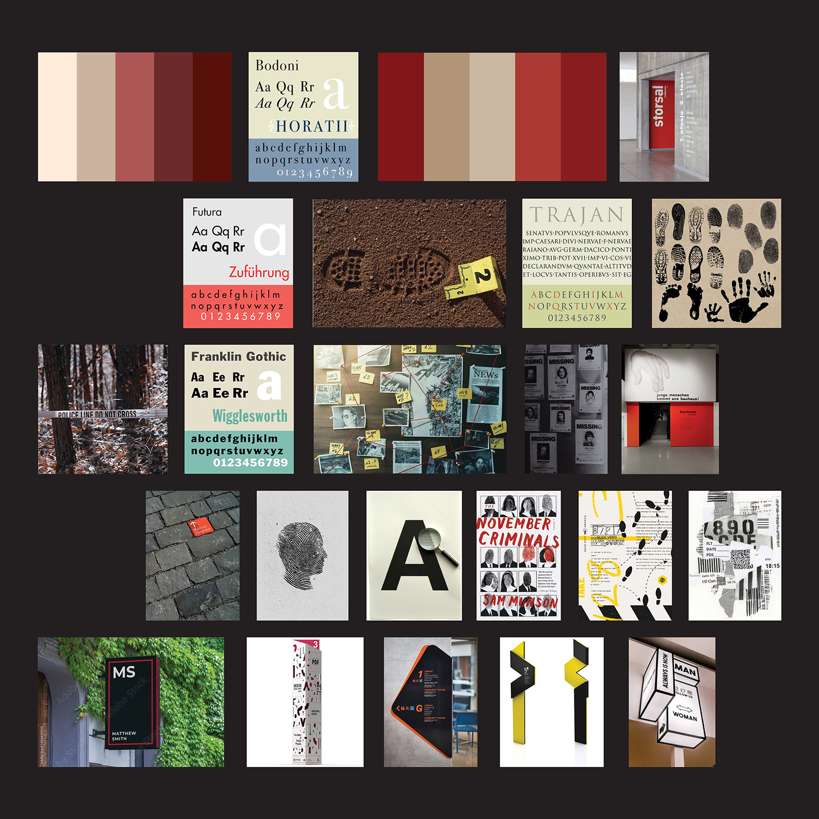
Visual Language & Forensic Atmosphere
The moodboard establishes a balance between scientific investigation and human presence, combining evidence-inspired textures with restrained, museum-like typography. Deep reds, neutral bone tones, and muted earth colors reference both forensic markers and archival materials, while fingerprint patterns, ink bleeds, and impression marks suggest identity emerging from trace evidence. Clean, authoritative typefaces paired with bold directional forms create a wayfinding language that feels institutional and credible without becoming cold or clinical. Together, these elements guide the exhibit toward a visual tone that is investigative, respectful, and quietly powerful.
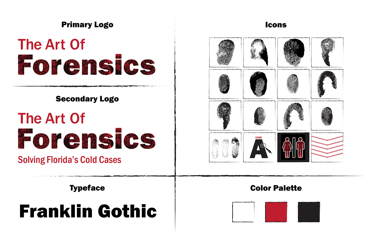
Brand Kit
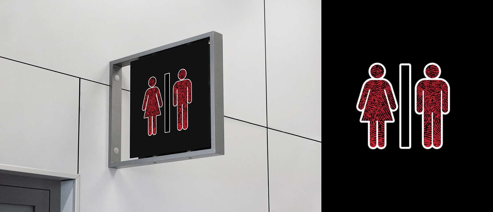
The identity system blends authoritative typography with fingerprint textures to express both scientific precision and human identity. Franklin Gothic provides a strong, institutional feel, while the distressed treatment of “Forensics” references trace evidence. A minimal palette of white, deep red, and black conveys urgency and respect. Fingerprint-based icons act as flexible markers across signage, apparel, and print, keeping every application rooted in the theme of uncovering identity.
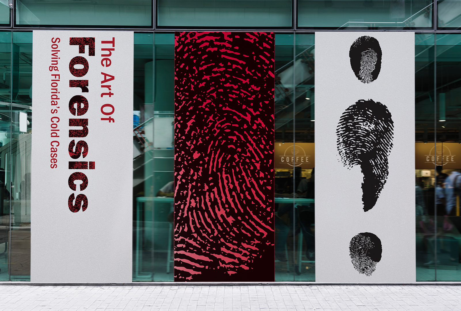
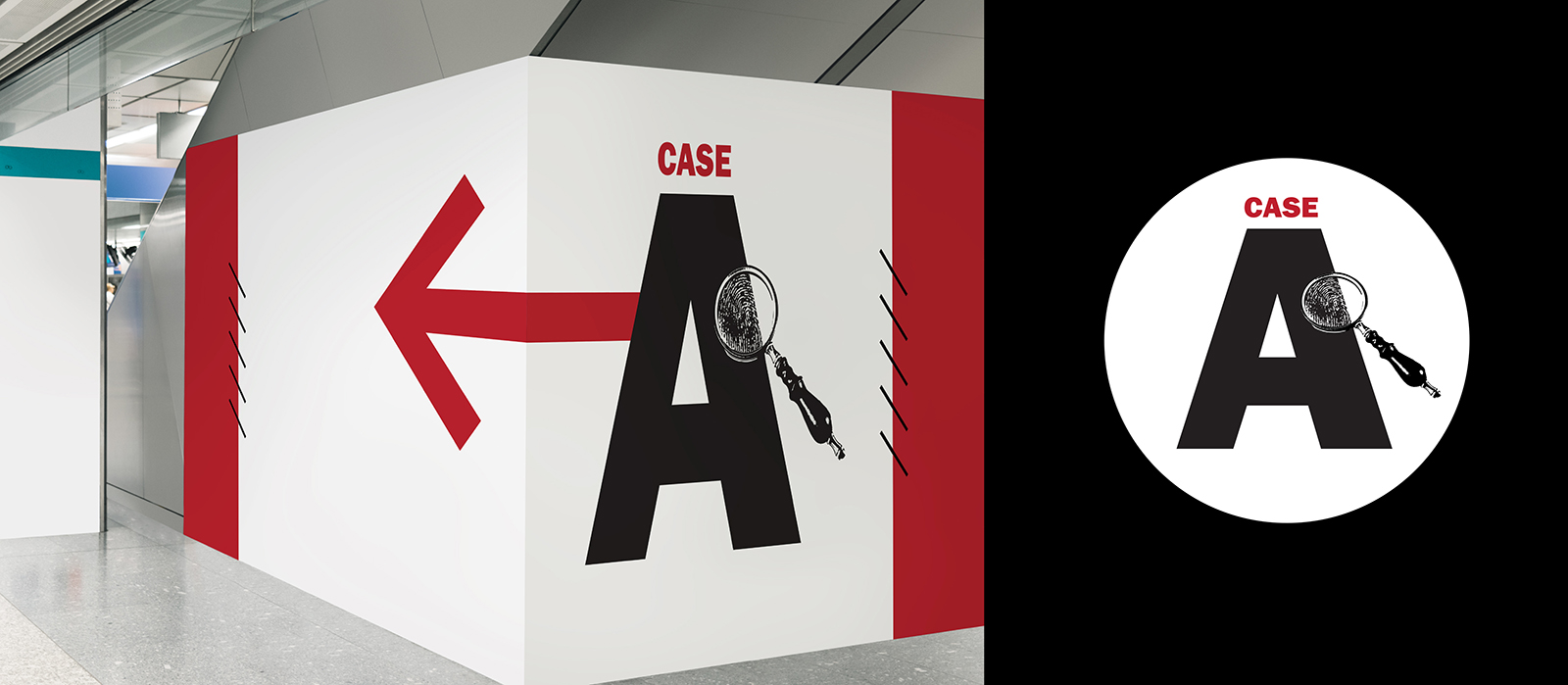
Wayfinding System
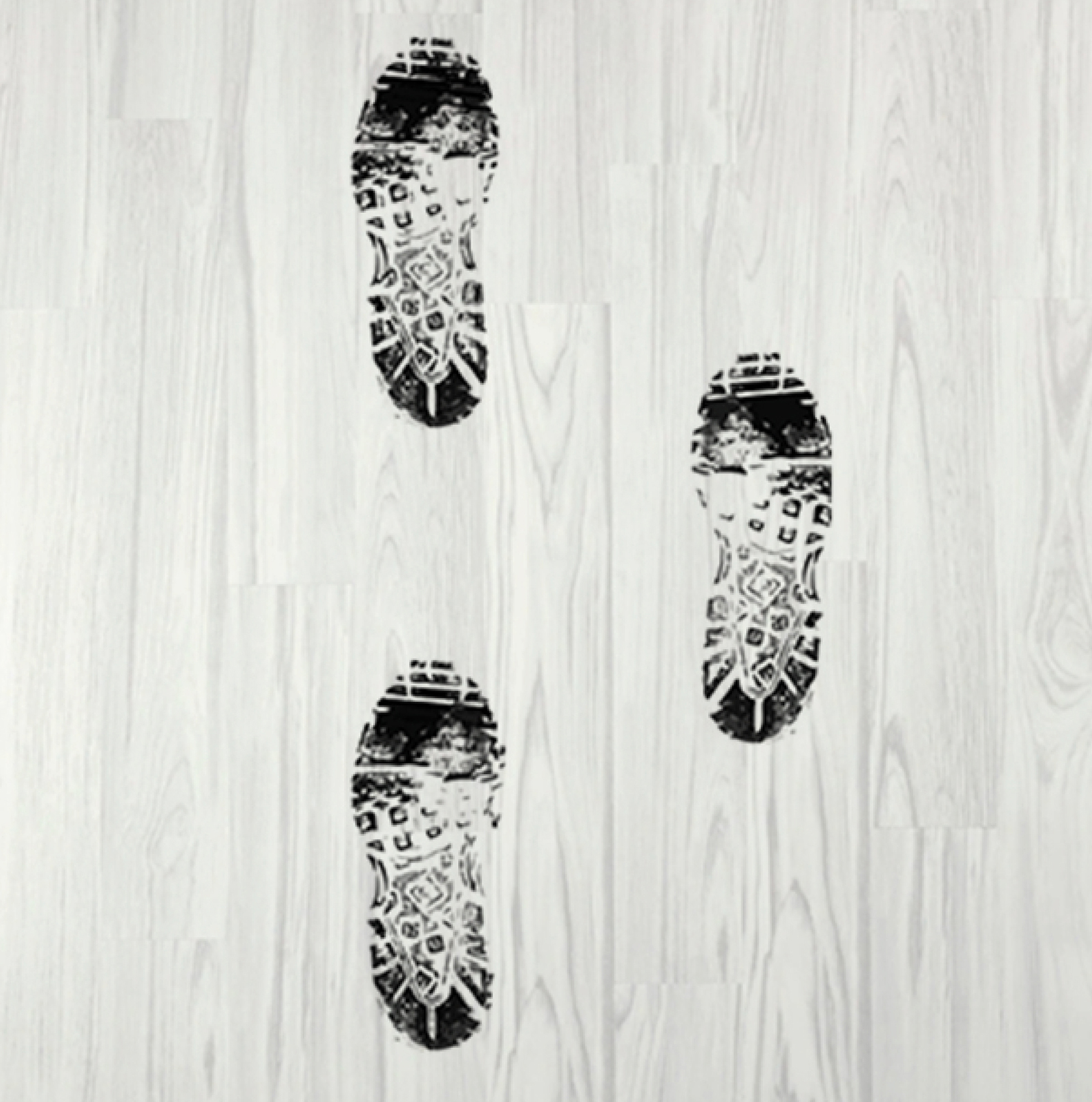
Bold typography, high-contrast red accents, and directional arrows create a clear, intuitive navigation system that mirrors the urgency and precision of forensic investigation. Fingerprint and footprint motifs act as visual trails throughout the space, guiding visitors between sections while reinforcing the exhibit’s central theme of identity and discovery.
Branded Apparel & Stationery
Every touchpoint of the exhibit extends the identity beyond the walls and into visitors’ hands. Each ticket includes a branded tote bag and pen, giving guests practical keepsakes that carry the exhibit’s visual language into everyday life. Staff members wear matching T-shirts and lanyards so visitors can easily identify knowledgeable guides, reinforcing both wayfinding and trust. Upon entry, guests also receive a branded wristband, turning admission into a subtle, wearable artifact that connects the experience, the people, and the purpose of the exhibit through a consistent, evidence-inspired graphic system.
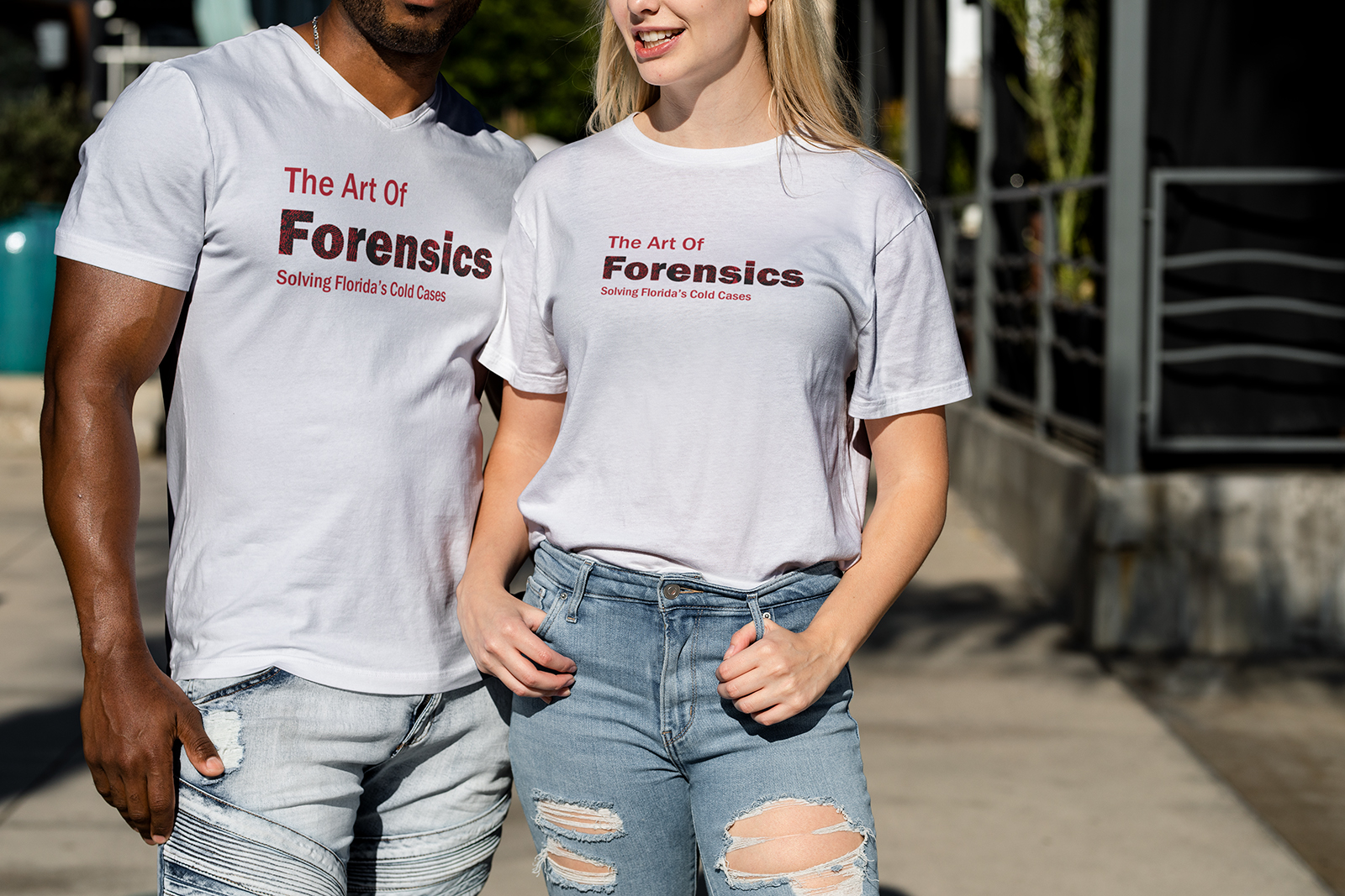
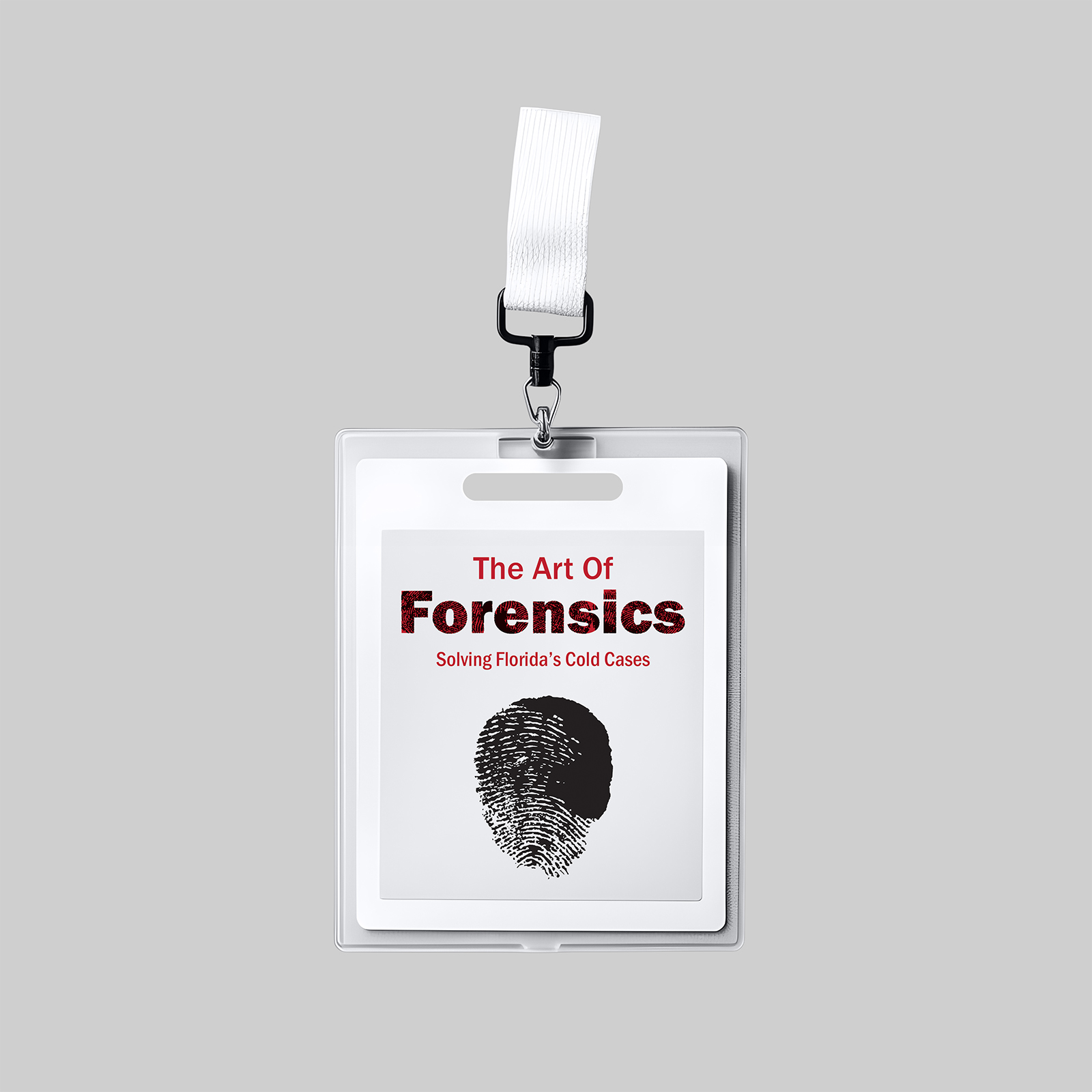
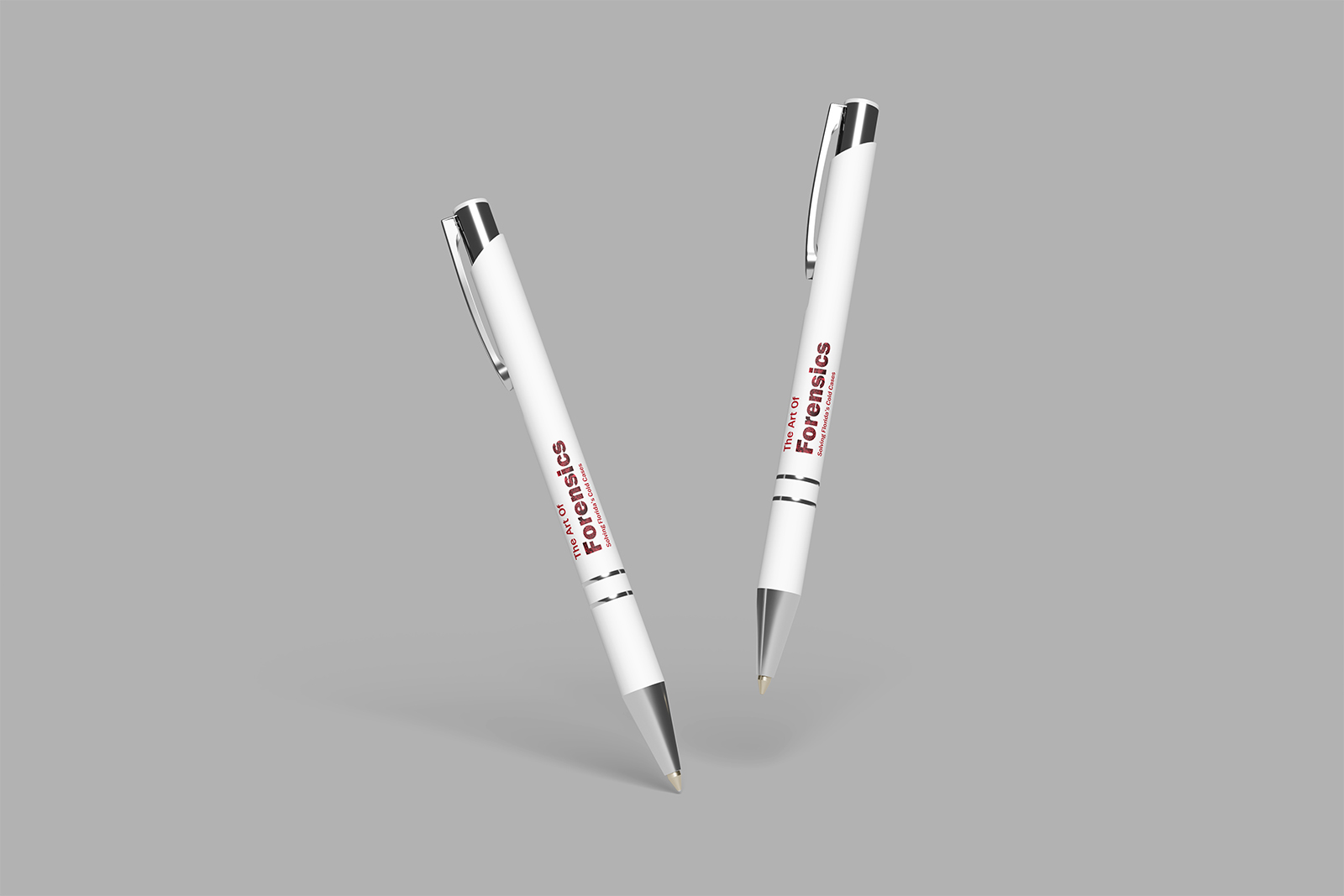
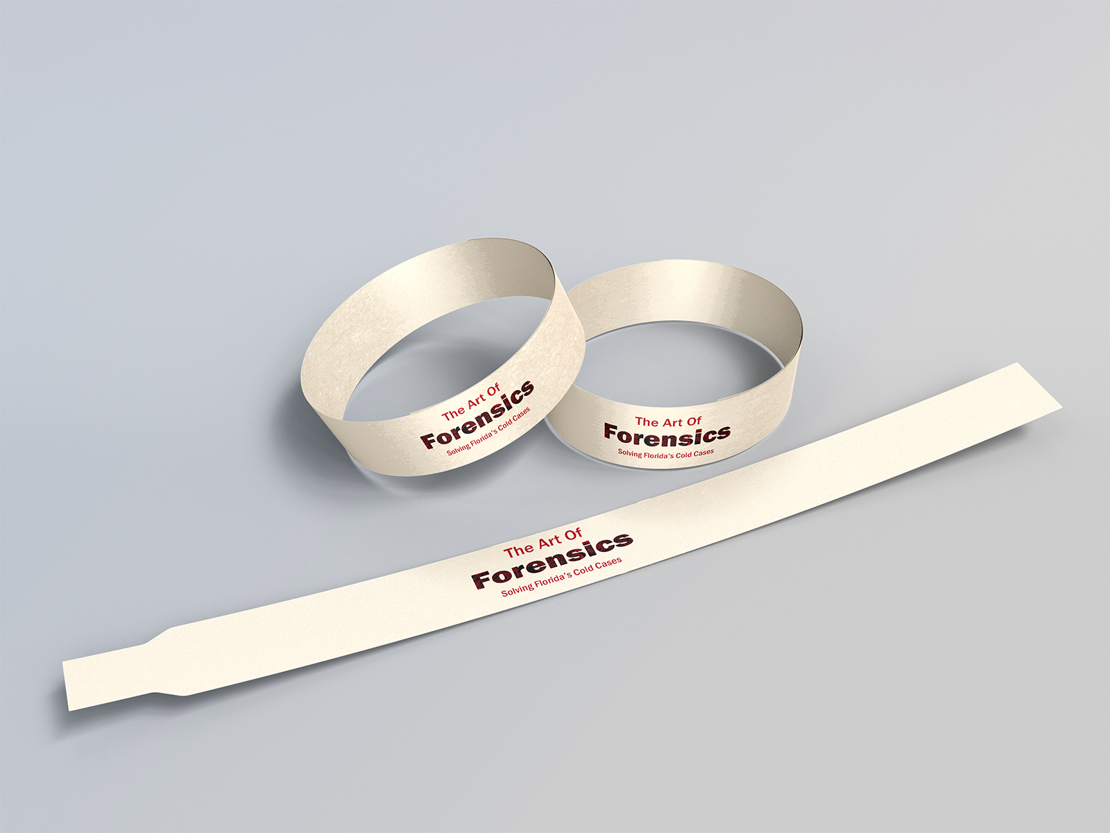
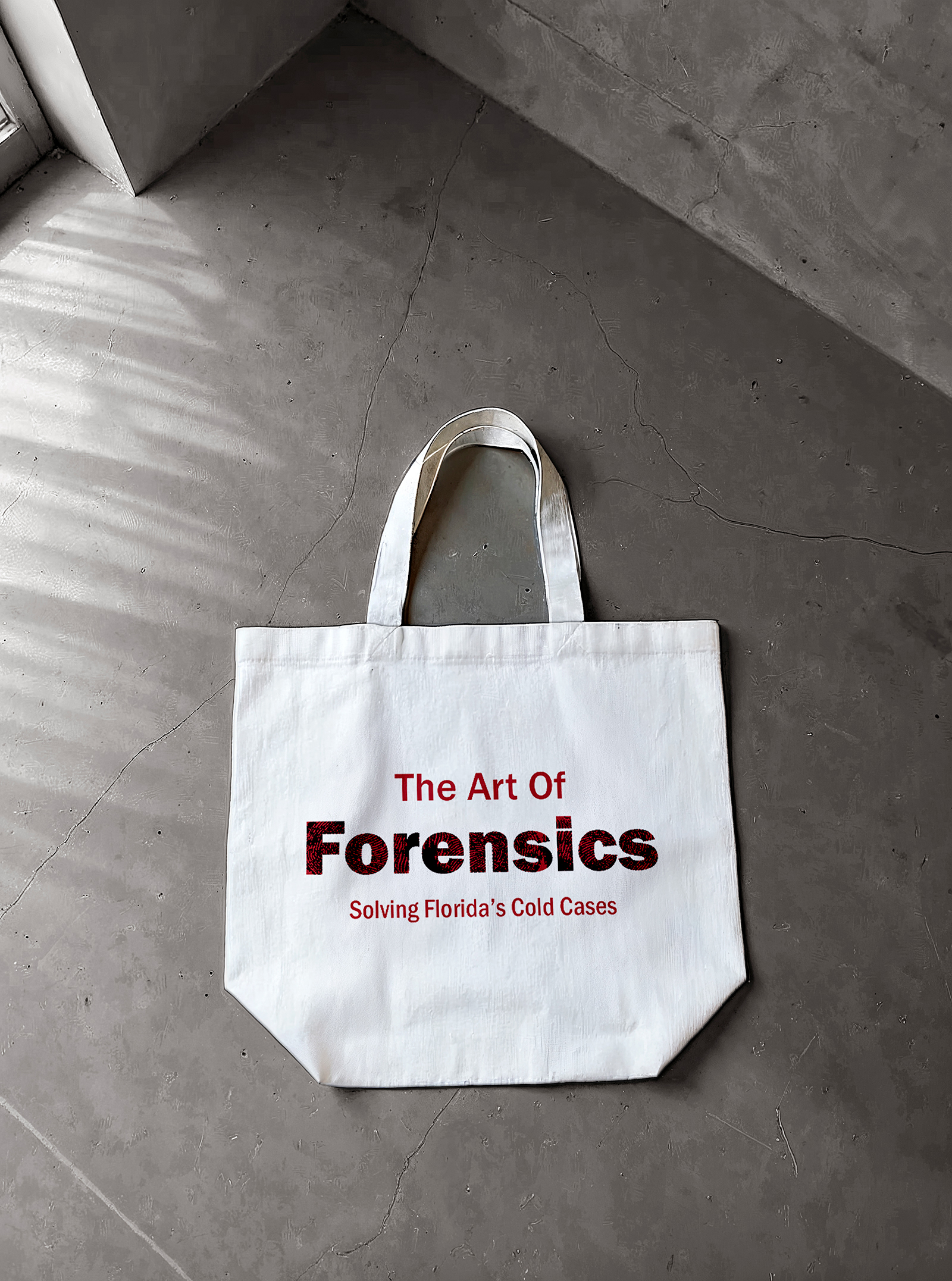
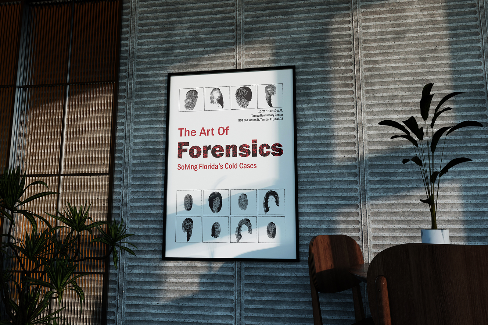
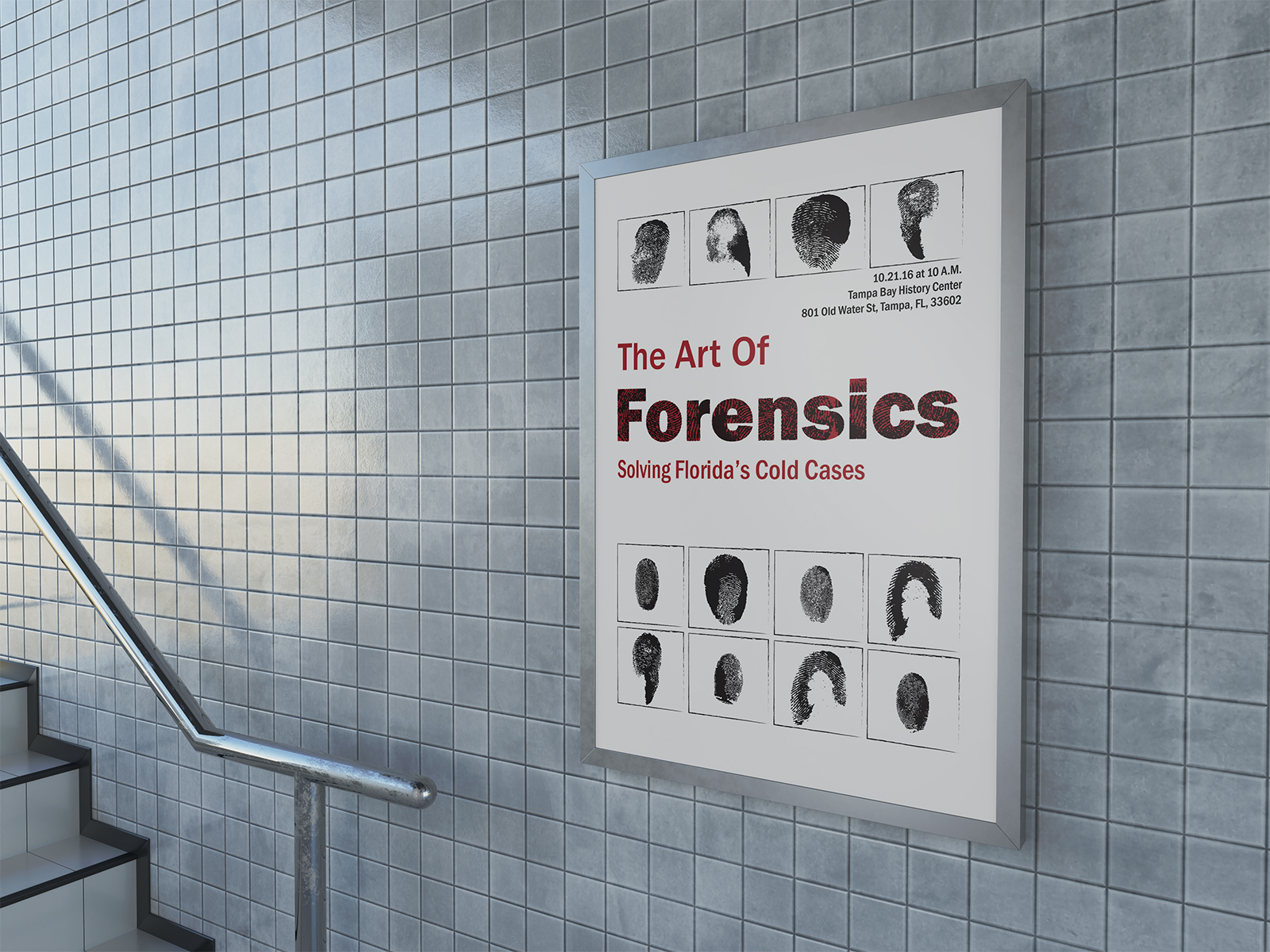
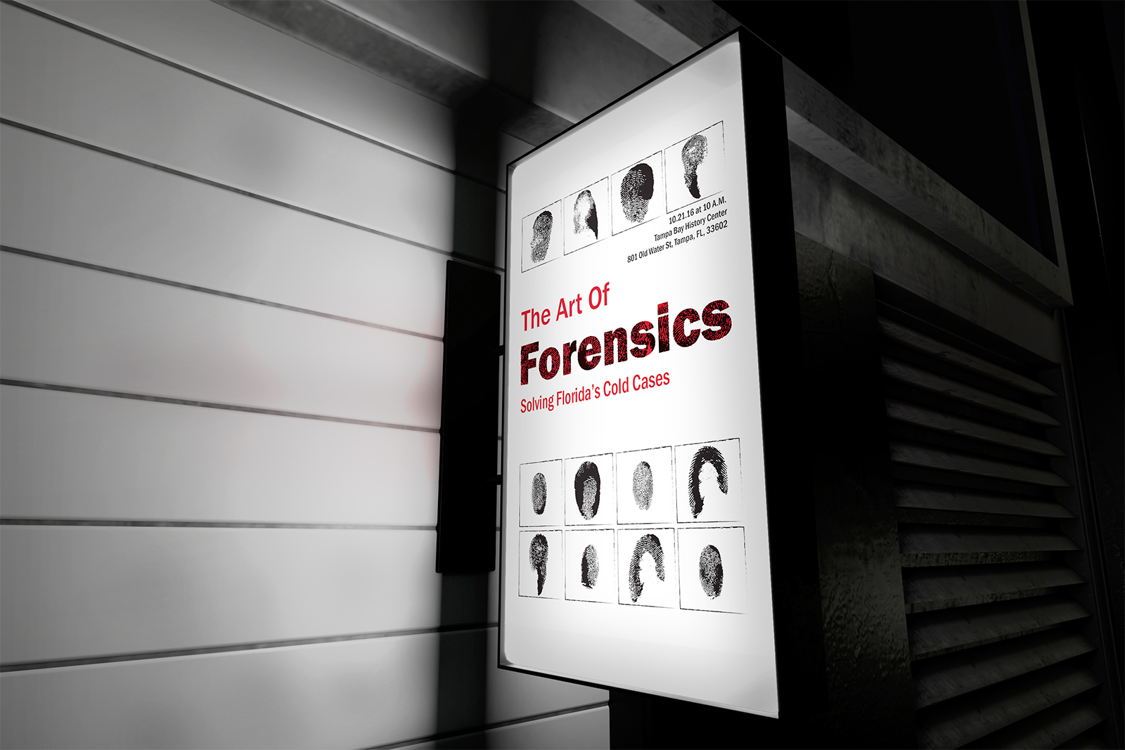
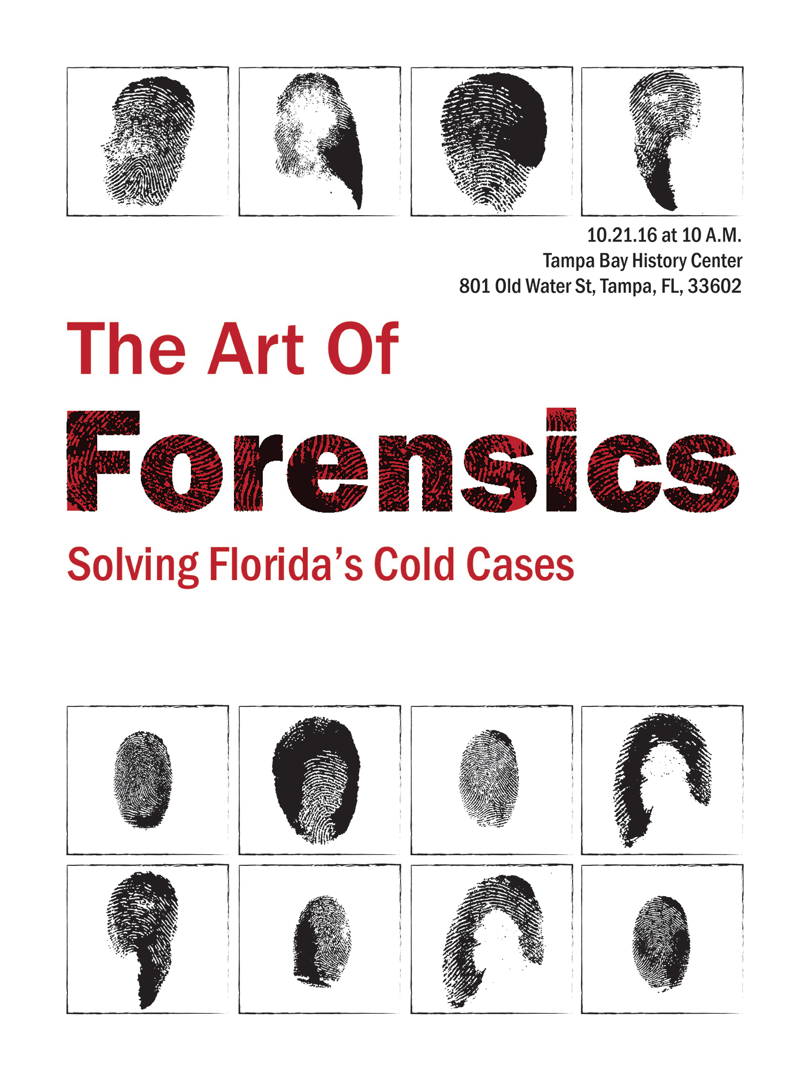
Exhibit Poster
Designed for high visibility in public spaces, the poster pairs bold Franklin Gothic typography with fingerprint textures to instantly convey the forensic theme. Repeating fingerprint silhouettes frame the title, hinting at unknown identities and ongoing investigations, while a stark red, black, and white palette ensures strong contrast and readability from a distance. The clean, structured layout makes the exhibit’s purpose and details clear at a glance, creating an eye-catching yet respectful invitation to engage with the stories behind each case.
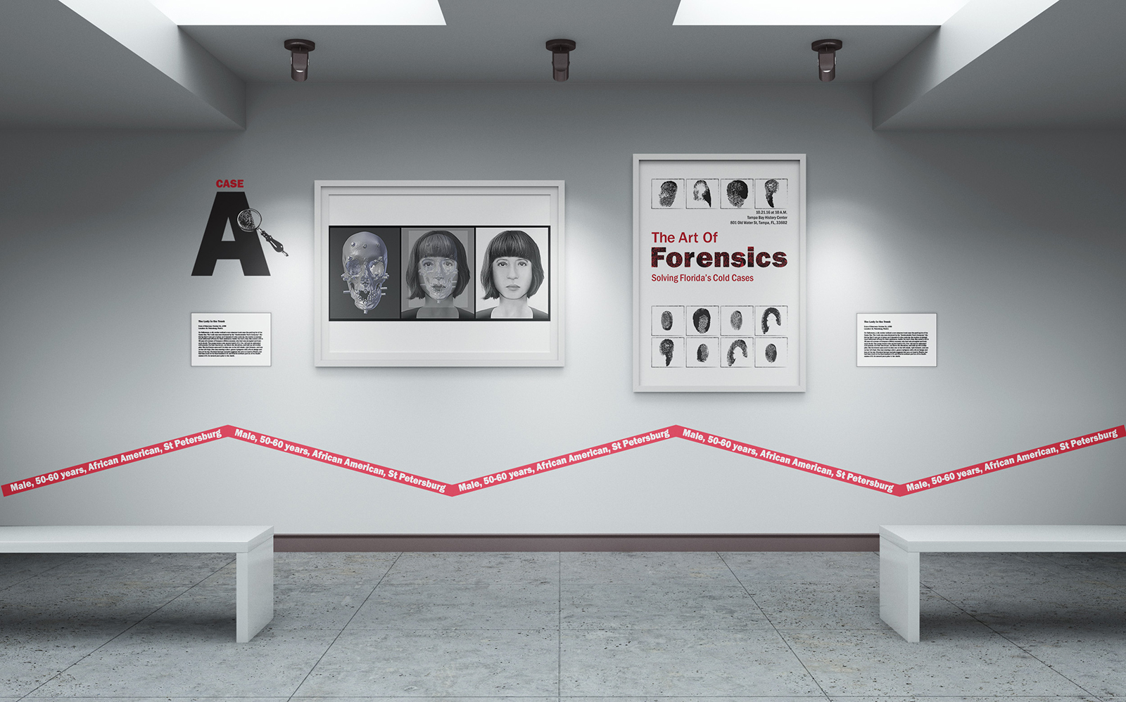
The Exhibit
Within the exhibit space, each reconstructed portrait is framed by a minimal, museum-style presentation to keep focus on the individual, while a continuous red “caution tape” graphic runs through the room listing broad identifying details such as age range, location, and demographics. Small, discreet plaques beside each piece provide case-specific context, including where the remains were discovered and notable evidence from the scene. This layered system lets visitors quickly grasp essential facts from afar, then step closer to engage with the deeper investigative story of each unidentified person.
Conclusion
This exhibit brings together science, design, and empathy to transform forensic data into human stories that can be seen, remembered, and recognized. By creating a clear visual identity and intuitive wayfinding system, the work helps visitors navigate complex cases while honoring the individuals at the center of each investigation.
Final Thoughts
The project demonstrates how thoughtful branding can serve a real social purpose, turning an informational display into an active tool for awareness and potential identification. Through restrained visuals and evidence-inspired graphics, the space invites reflection, curiosity, and the possibility of long-awaited closure.
